TLDR
• Core Points: A balanced palette of bold, earthy, and timeless hues dominates 2026 exterior design, emphasizing curb appeal, sustainability, and architectural context.
• Main Content: The article expands on seven standout exterior colour trends for homes in 2026, offering practical guidance, style cues, and considerations for climate, materials, and neighborhood aesthetics.
• Key Insights: Colour choices should complement architecture, regional light quality, and material textures; contrast can highlight details, while muted tones enhance timelessness.
• Considerations: Lighting, material compatibility, maintenance, resale impact, and local covenants influence colour decisions.
• Recommended Actions: Assess your home’s architecture, test samples on multiple surfaces, consult with a colour professional, and plan for long-term durability and resale appeal.
Content Overview
In 2026, home exterior colour choices are less about chasing the latest fad and more about achieving enduring curb appeal through carefully selected palettes that suit climate, materials, and architectural style. Homeowners are increasingly pairing traditional elements with modern accents to create welcoming facades that feel both fresh and timeless. The evolving trends emphasize subtle contrasts, durable finishes, and colour stories that connect indoor living with outdoor spaces. This article synthesizes expert recommendations, practical considerations, and design rationales to help homeowners choose exterior colours that will stand the test of time while reflecting personal taste and regional environment.
The year’s standout trends include a mix of warm neutrals, cool neutrals, earthy saturations, and statement hues used selectively to highlight architectural features. The guidance prioritizes testing and viewing colours in natural and artificial light, considering the texture and finish of exterior materials, and aligning colour choices with surrounding landscapes and neighborhood context. By focusing on cohesive palettes and mindful contrasts, homeowners can achieve a harmonious exterior that enhances curb appeal and resale value.
In-Depth Analysis
The 2026 exterior colour landscape is defined by seven prominent directions, each offering distinct opportunities to transform a home’s appearance while maintaining practicality and durability. Below, we explore each trend, including how to implement it, what to consider for different climates and materials, and how it interacts with architectural style.
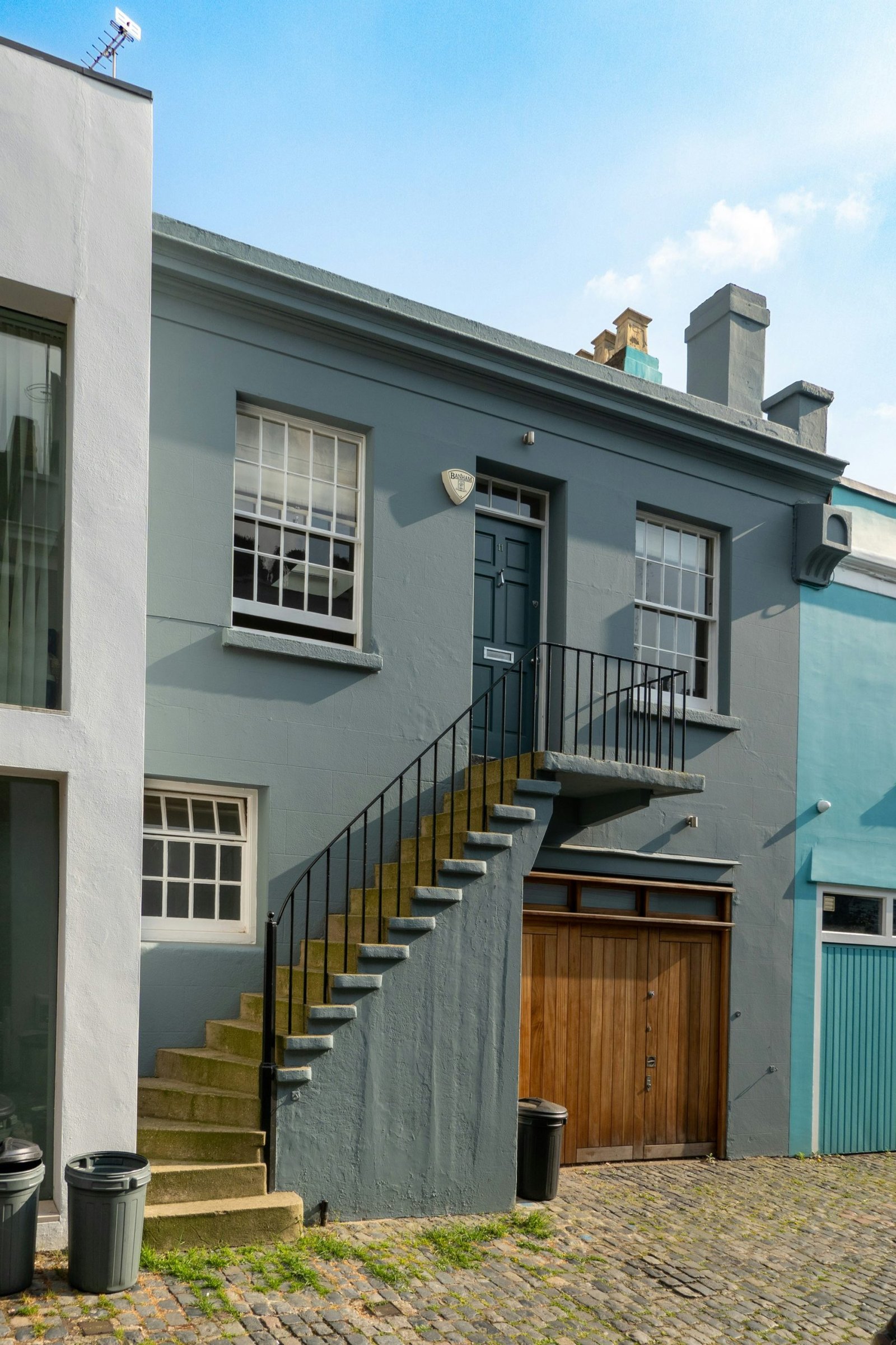
1) Timeless Neutrals with Subtle Warmth
Neutral palettes—creams, beiges, and greys with warm undertones—remain a cornerstone of exterior design. The appeal lies in their flexibility and ability to harmonize with a wide range of materials, from brick and stone to wood and metal. Slightly warm neutrals (vanilla, greige, taupe) help soften shadows and bring a welcoming glow to a façade. Implementation tips:
– Pair warm neutrals with natural textures like stone or timber accents to add depth.
– Use a deeper, contrasting colour for architectural details (e.g., trim, shutters) to define structure without overpowering.
– Consider climate: cooler light in northern regions can benefit from warmer neutrals to prevent a dull appearance; sunnier climates can tolerate cooler neutrals with strategic warmth.
2) Deep, Grounded Earth Tones
Earthy colours such as terracotta, olive, charred brown, and slate evoke a grounded, nature-inspired look that blends with landscape features. These hues work well on homes with stone masonry, timber cladding, or warm brick. Design notes:
– Use high-contrast trim (pale or crisp white) to highlight architectural lines or entryways.
– In regions with strong sun exposure, opt for pigments with excellent UV stability to maintain richness over time.
– Pair with natural greenery to reinforce a cohesive outdoor environment.
3) Soft, Muted Blues and Greens
Subtle blue-greens and sage tones provide a calming, contemporary vibe while remaining versatile enough for various architectural styles, from coastal to prairie homes. Application guidance:
– Test in the site’s natural light; these colours can shift with shade and sky colour.
– Combine with white or off-white trims for a crisp boundary that preserves readability of architectural details.
– Consider coastal settings or homes with extensive water views to complement surroundings.
4) Charcoal and Rich, Dark Hues
Dramatic exteriors in charcoal, anthracite, or deep espresso offer a modern, high-contrast look that can make architectural forms read more strongly. Best practices:
– Use a lighter trim to prevent the facade from appearing heavy or oppressive.
– Dark colours show dirt and efflorescence more readily; plan for more frequent cleaning and consider finishes with stain resistance.
– Works well on homes with strong geometric lines or mixed materials (metal panels, timber, stone).
5) Crisp Whites with Subtle Variants
White remains a perennial favourite for its versatility, cleanliness, and perceived size-enhancing properties. In 2026, whites are less stark and more nuanced, with slight warmth or coolness to suit surroundings. Implementation:
– Choose off-white or bone whites with undertones that harmonize with roof material and stone.
– Use darker or contrasting elements (doors, window frames) to avoid a flat look and to emphasize architectural features.
– White exteriors pair well with multiple landscape styles, from modern xeriscapes to lush, flowering gardens.
6) Pastel Accents for Architectural Details
Soft pastel accents are used strategically to highlight entryways, gables, or shutters without dominating the overall facade. This approach adds personality with restraint. Guidelines:
– Apply pastel tones to architectural details rather than large surface areas to maintain balance.
– Pair with neutral body colours to prevent visual overload.
– Suitable for homes in regions with abundant daylight, where pastels can glow without appearing fussy.
7) Material-Driven Colour Pairings
The colour story of a home increasingly accounts for the textures and materials used on the exterior. Instead of ignoring material qualities, designers select colours that complement brick, stone, wood siding, metal panels, and roofing. Practical considerations:
– Test how the chosen colour reads on different materials (e.g., brick versus siding) under various light conditions.
– Use colour variations that reflect the natural tones within the landscape (soil, rock, foliage) to achieve harmony.
– Consider architectural era and style; for example, mission-style homes benefit from earthy reds and browns, while modern builds may embrace high-contrast schemes anchored by a neutral foundation.

*圖片來源:Unsplash*
Additional considerations for 2026 trends:
– Lighting: Exterior lighting can dramatically affect colour perception; plan lighting to enhance the palette at night and during dusk.
– Finish and durability: Choose finishes that resist fading, mildew, and chalking, especially in regions with harsh sun, humidity, or extreme temperature swings.
– Curb appeal and resale: While fashion-forward colours can attract attention, timeless palettes typically sustain value longer. A strategic accent colour can provide a refreshed look without risking obsolescence.
– Local covenants and neighborhoods: Some communities restrict colour choices; verify homeowner association guidelines before selecting a palette.
The article also emphasizes the importance of samples and testing. Before committing, homeowners should:
– Paint large sample swatches on multiple surfaces (walls, trim, doors, masonry) to observe how colour shifts with light throughout the day.
– Consider the roof colour, landscaping, window frames, and entryway features when finalizing the palette.
– Consult with colour professionals or experienced painters who understand how different pigments interact with environmental conditions and materials.
Perspectives and Impact
The evolving 2026 exterior colour trends reflect broader shifts in home design philosophy. There is a move toward palettes that feel intentional and contextual rather than impulsively fashionable. Homeowners increasingly value:
– Personal expression within a cohesive neighbourhood aesthetic.
– Sustainability and material compatibility, with a focus on finishes that endure exposure and require less maintenance.
– The integration of exterior colour with interior design, facilitating a seamless transition between indoor and outdoor living spaces.
From an urban planning perspective, exterior colour choices contribute to streetscape coherence and local identity. In suburban and rural settings alike, a well-chosen palette can elevate perceived value and curb appeal without compromising architectural integrity. The trends also acknowledge the climate-specific needs of homes, advocating palettes that brighten or soften facades in response to microclimates, sunlight patterns, and regional flora.
Future implications suggest a continued emphasis on durable, low-maintenance finishes, environmentally mindful pigments, and a more intentional pairing of colour with material texture. As construction methods evolve and new materials emerge, palette strategies are likely to adapt, prioritizing longevity and adaptability to changing climate conditions. Homeowners and designers may increasingly rely on digital visualization tools to simulate how colours render across different times of day and seasons, enabling more informed decisions before procurement and application.
Key Takeaways
Main Points:
– Seven core directions define 2026 exterior colour trends, ranging from timeless neutrals to bold contrasts and material-driven pairings.
– Context and materials matter: colour must complement architecture, texture, and the surrounding landscape.
– Testing and durability are essential to ensure long-term curb appeal and value.
Areas of Concern:
– Overly trendy choices may date quickly; balance trendiness with timelessness.
– Dark colours require maintenance and surface preparation to maintain appearance.
– Local guidelines and climate can constrain palette choices; thorough planning is essential.
Summary and Recommendations
For homeowners embarking on a exterior colour refresh in 2026, the key is to build a palette that respects architectural lineage, site context, and material realities while allowing for a touch of contemporary personality. Start with a robust, neutral foundation—whether in warm greys, creams, or whites—and use carefully selected accents to highlight architectural features or add depth. Earthy tones provide warmth and grounding, while blues and greens can introduce calm, modern nuance. Darker hues deliver drama and sophistication, provided that trims and surfaces are thoughtfully lighter to maintain balance.
Crucially, testing is non-negotiable. View large swatches on different surfaces under varying light conditions and across seasons. Seek guidance from professionals who understand pigment behavior, material interactions, and maintenance implications. Consider the long-term resale impact, ensuring the chosen palette remains appealing beyond current fashion cycles. By following these steps and prioritizing durability, homeowners can achieve an exterior that feels fresh, cohesive, and enduring in the year ahead.
References
- Original: https://abeautifulspace.co.uk/7-best-home-exterior-colours-in-2026-inspiring-trends/
- Additional references:
- A Practical Guide to Exterior Paint Finishes and Durability
- Color Theory for Exterior Design: How Light, Material, and Surroundings Affect Perception
- Regional Exterior Colour Schemes: Aligning Palettes with Climate and Architecture

*圖片來源:Unsplash*