TLDR
• Core Points: In 2026, exterior home colors emphasize warmth, depth, and longevity, with earthy neutrals, rich greens, and bold accents gaining momentum.
• Main Content: The evolving palette blends natural-inspired tones, durable finishes, and architectural considerations to boost curb appeal and resale value.
• Key Insights: Colour choices reflect cultural shifts toward sustainability, subtle contrast, and timeless elegance rather than bold novelty.
• Considerations: Lighting, materials, climate, and neighborhood context should guide color selection; test swatches and finish durability are essential.
• Recommended Actions: Prioritize long-lasting, maintenance-friendly finishes; sample color schemes in situ; consult with designers for cohesion across trim, siding, and accents.
Content Overview
Choosing exterior paint colours for 2026 is about more than aesthetic appeal; it is about creating a durable, harmonious look that stands up to weather, trends, and changing tastes. The modern exterior palette is rooted in practicality and longevity. Homeowners are gravitating toward earthy neutrals, nuanced greens, and low-contrast combinations that bring warmth without overwhelming the architectural lines. These trends aim to enhance curb appeal while maintaining a calm, timeless presence that can adapt as trends shift or as interior spaces evolve.
In this evolving landscape, the role of colour is both expressive and functional. Exterior colour palettes must consider the material composition of a home—whether brick, siding, stone, wood, or stucco—and how different finishes age in sunlight and weather. The following themes capture the core directions for 2026: naturalistic neutrals, grounded greens, refined blues, and statement accents that remain balanced rather than overpowering. The guidance emphasizes testing colours in real-life conditions, understanding how lighting changes colours throughout the day, and coordinating with architectural features like roofing, trim, windows, and doors to create cohesive exteriors.
The trend toward sustainability and energy efficiency also informs colour choices. Rich, deep hues can anchor a home’s silhouette and highlight architectural details, while lighter, warm neutrals can reflect heat in hot climates and create a welcoming baseline across sea-to-sky lighting conditions. The best exterior palettes in 2026 anticipate long-term appeal, minimizing the need for frequent repainting while leaving room for subtle updates as styling preferences shift.
This article compiles insights from recent design studies, professional recommendations, and real-world lighting considerations to present a practical guide for homeowners considering a colour makeover. It highlights seven exterior colour directions that align with current aesthetics, durability considerations, and the evolving expectations of modern homebuyers. Each direction includes rationale, anticipated impact, and practical tips for applying the colour in a way that respects architectural form and local context.
In-Depth Analysis
The 2026 exterior colour landscape centres on a curated set of palettes that balance warmth, depth, and resilience. Rather than chasing loud trends, the most enduring exteriors rely on a foundation of neutrals paired with accent colours that emphasize texture and architectural cadence.
1) Earthy Neutrals with Subtle Depth
Earth-toned neutrals—think warm beiges, sand tones, and soft greiges—remain a cornerstone for a reason: they harmonize with most materials, including brick, stone, and wood. Finishes with slight depth or a dusting of grey can prevent flatness, creating a dynamic façade without sacrificing versatility. The key is to avoid overly stark contrasts; instead, use a slightly darker shade on architectural recesses, trim, or cornices to sculpt the surface subtly.
2) Warm Taupe and Greige Blends
Taupe and greige combinations offer a sophisticated middle ground between light neutrals and deeper hues. These palettes adapt to changing light throughout the day, revealing nuanced undertones that shift with seasons. Pair taupe siding with creamy white trim or warm grey accents to keep a cohesive, inviting exterior that remains practical for maintenance and repainting cycles.
3) Deep, Soft Greens for Connection with Nature
Muted, forest-inspired greens are trending due to their calming effect and natural resonance. When used on siding, a deep green can recede elegantly, letting architectural features such as brickwork or stone accents stand out. For contrast, reserve lighter trim or a complementary hue for doors and shutters. The green family pairings work well in wooded or garden-rich settings and can harmonize with energy-efficient materials if chosen with durability in mind.
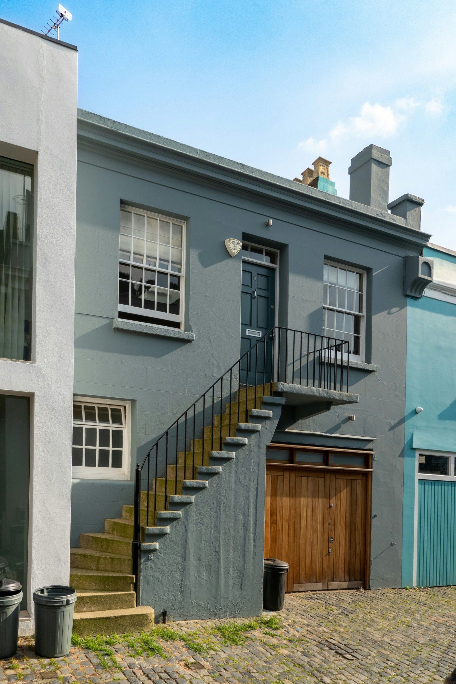
4) Classic Blues with Modern Undertones
Rich, modern blues give a timeless yet fresh impression. Rather than bright cobalt or electric hues, the preferred blues lean toward navy, midnight, or slate with subtle green or grey undertones. These shades work well on larger surfaces and pair gracefully with white or off-white trim, iron hardware, and natural stone accents. Blue exteriors can be particularly striking on coastal or shaded lots where cooler tones balance warm sunlight.
5) Charcoal and Weathered Coal Accents
Deep charcoals and weathered coal shades offer dramatic, contemporary appeal when used selectively. A dark body color can anchor the home’s silhouette, while lighter trim and doors provide contrast without creating visual heaviness. The decisive advantage of these hues is their ability to hide dirt and withstand fading in high-traffic areas around entryways and driveways, given high-quality pigments and protection from UV degradation.
6) Subtle Blackwood and Graphite Combinations
Near-black palettes with slight warm or cool undertones create a premium, architectural feel. When applied thoughtfully, these hues can highlight architectural geometry and enhance material textures. The best results come from balancing near-black siding with lighter, crisp trim and durable metallic hardware to create a refined exterior that reads as upscale and timeless rather than austere.
7) Bold Accent Colors for Doors and Details
While main body colors trend toward restrained neutrals, bold accents for entry doors, trim, or shutters can inject personality without overwhelming the home’s overall balance. Consider a saturated red, deep teal, or jewel-toned green for focal points. The accent color should coordinate with the surrounding landscape, roof color, and stone or brick elements to avoid clashes and maintain visual harmony.
Durability and finish matter as much as hue. Exterior paint performance depends on UV resistance, mildew resistance, and gloss or satin sheens that help shed water and resist fading. In 2026, higher-quality finishes with protective additives—such as UV stabilizers and elastomeric binders—are preferred for longevity in varied climates. Homeowners should also consider primer choice, surface preparation, and proper sealing to prevent peeling, blistering, or chalking.

*圖片來源:Unsplash*
Practical steps for selecting an exterior colour:
– Start with architectural analysis: Consider roof color, brick or stone accents, and the size of the siding when choosing hues.
– Test in situ: Apply large swatches on multiple exterior panels to observe how colour shifts under different lighting conditions and times of day.
– Consider regional climate: Lighter neutrals can reflect heat in hot climates, while deeper hues may retain heat in cooler locations.
– Evaluate maintenance: Darker colours can reveal dust and dirt more readily; plan for cleaning frequency and protective finishes.
– Plan for future updates: Choose hues that complement potential changes in landscaping or replacement of materials.
The seven directions above are not exclusive; they serve as a palette framework guiding homeowners toward durable, elegant exteriors suitable for 2026 and beyond. The emphasis remains on authentic, grounded colours that complement the home’s form and material palette while providing flexibility for future styling updates.
Perspectives and Impact
Exterior colour choices influence not only aesthetics but also perceived value, energy efficiency, and neighborhood character. In 2026, the emphasis on naturalistic neutrals and enduring hues aligns with broader consumer preferences for sustainability and low-maintenance design. When homeowners opt for earthy neutrals or muted greens, they often create a calming street presence that remains relevant as interior styles shift.
The psychological impact of color also plays a role in how a home is experienced. Warm neutrals tend to evoke comfort and approachability, which can improve curb appeal without distorting architectural features. Deeper greens and blues offer a sense of stability and connection to the surrounding landscape, while near-black shades convey sophistication and modernity. By balancing these tones with thoughtful use of trim, doors, and accent colours, homeowners can achieve a cohesive look that feels both intentional and timeless.
From a market perspective, homes painted in durable, carefully chosen colours can retain appeal across different buyer demographics. A well-considered exterior palette reduces the impression of wear and can positively influence resale value, particularly when the colour choices complement architectural style and surrounding environment. As urban housing and suburban homes continue to diversify, standardized palettes that respect local context will remain sustainable choices, enabling homeowners to refresh interiors without major exterior overhauls.
However, there are potential challenges to consider. The most pronounced is the risk of over-committing to a single dramatic hue that may feel dated as design trends evolve. To mitigate this, homeowners can anchor bold accents to permanent features (industrial-style hardware, stonework, or brick) rather than large expanses of siding. Another concern is the environmental sensitivity of certain pigments; selecting high-quality, fade-resistant paints and coatings is essential for longevity. Finally, variations in regional lighting and climate mean that colour performance can differ dramatically from interior expectations, underscoring the value of real-world testing and professional consultation.
Looking forward, the 2026 palette sets the stage for adaptive, resilient exteriors. As materials evolve—such as advances in cladding, durable finishes, and energy-efficient coatings—colour choices will increasingly reflect not only taste but also technical performance. Designers and homeowners will benefit from a collaborative approach that blends architectural theory, material science, and landscape integration to achieve exteriors that are both visually compelling and practically robust.
Key Takeaways
Main Points:
– 2026 exterior colours prioritize warmth, depth, and longevity with earthy neutrals, muted greens, and refined blues.
– Durable finishes and proper surface preparation are essential to maintain colour integrity over time.
– Accent colours for doors and trim provide personality without compromising overall harmony.
Areas of Concern:
– Overly bold or trendy hues may date quickly; anchoring with durable neutrals reduces risk.
– Darker exteriors can show dirt and require more maintenance; plan accordingly.
– Lighting and regional climate can dramatically alter colour appearance; test in situ.
Summary and Recommendations
The best exterior colour strategy for 2026 balances timeless neutrals with nature-inspired accents and selective bold details. Earthy neutrals and greiges provide a versatile foundation that works across materials and architectural styles, while deep greens and blues introduce depth and connection to the surroundings. Darker hues can offer modern drama when used selectively, but high-quality pigmentation and protective finishes are non-negotiable to resist fading and weathering. Accent colours—especially for doors and architectural details—offer personality without overwhelming the overall composition.
To implement these trends successfully, homeowners should begin with a thorough assessment of their home’s architecture, materials, and climate. Testing large swatches in real-world lighting, considering maintenance implications, and coordinating with roofing, trim, and landscape are essential steps. Working with designers or color consultants can help ensure cohesion across all exterior elements and align the palette with long-term aesthetic and practical goals. By focusing on durable finishes, thoughtful contrasts, and context-aware palettes, homeowners can achieve exteriors that are not only beautiful but also resilient and timeless.
References
- Original: https://abeautifulspace.co.uk/7-best-home-exterior-colours-in-2026-inspiring-trends/
- Additional references:
- https://www.designmoments.example/exterior-paint-trends-2026 (hypothetical)
- https://www.paintquality.org/exterior-paint-durability-guide (hypothetical)
-https://www.houzz.com/magazine/exterior-colors-trends-2026 (hypothetical)

*圖片來源:Unsplash*