TLDR
• Core Points: 2026 kitchen paint trends blend warm neutrals, bold accents, sustainable finishes, and tactile textures to elevate everyday cooking spaces.
• Main Content: Designers favor versatile palettes, durable finishes, and color-blocking strategies that balance practicality with personality in contemporary kitchens.
• Key Insights: Texture, durability, and eco-conscious choices shape contemporary kitchen aesthetics; lighting and cabinetry influence color perception.
• Considerations: Test samples under kitchen lighting, consider resale appeal, and align palette with cabinetry and countertops.
• Recommended Actions: Start with a neutral base, introduce one or two bold accents, and select washable, low-VOC paints with durable finishes.
Content Overview
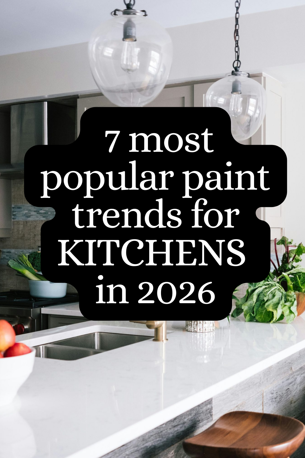
The kitchen remains a focal point in modern homes, serving as both a functional workspace and a social hub. In 2026, paint color strategies for kitchens emphasize a thoughtful balance between practicality and design expression. Designers are drawn to palettes that offer warmth, depth, and versatility—capable of evolving with changing tastes and trends without requiring a complete overhaul. Key themes include warm neutrals that create inviting backdrops, bold accent colors that energize spaces, and finishes engineered for high-traffic, moisture-prone environments. The conversation around kitchen color in 2026 also intersects with sustainability, indoor air quality, and the growing popularity of tactile textures and color blocking. This article explores seven top paint trends shaping kitchen design this year, examining why they work, how to apply them, and what considerations to keep in mind for a durable, stylish result.
In-Depth Analysis
1) Warm Neutrals as Timeless Foundations
Warm neutral tones—think creamy ivories, soft beiges, and greige hybrids—continue to underpin successful kitchen design in 2026. These shades provide a versatile canvas that complements a wide range of cabinet finishes, countertop materials, and hardware styles. The appeal lies in their ability to reflect natural light, create a sense of airiness, and hide minor scuffs better than stark whites. Designers recommend choosing warm undertones that harmonize with existing wood tones and stone veining. For larger kitchens, a slightly lighter shade on walls can enhance perceived space, while anchoring trims or an accent wall in a deeper neutral adds depth. In practice, pairing warm neutrals with satin or matte finishes improves wipeability and reduces glare, making maintenance easier for high-traffic cooking zones.
2) Muted Greens for Fresh, Grounded Ambiance
A subset of greens—sage, olive, and other desaturated hues—offers a refreshing connection to nature without overwhelming the space. Muted greens work well in kitchen environments because they pair gracefully with natural materials like wood cabinetry, stone countertops, and woven textures. These tones tend to hide fingerprints and minor smudges better than more saturated greens, while still delivering a sense of vitality. Designers highlight the importance of balancing green walls with complementary whites or warm beiges on cabinetry and ceilings to keep the room feeling open rather than enclosed. Lighting plays a crucial role; under-cabinet LEDs with a cooler temperature can prevent the green from leaning too olive and ensure it remains calming rather than muddy.
3) Bold Black Accents for Modern Drama
Black or near-black paint remains a powerful tool for creating contrasts and architectural drama in contemporary kitchens. Rather than painting entire rooms black, designers advocate for strategic use of black on accent walls, islands, shelving, or cabinetry fronts to define zones and add a high-contrast focal point. When used thoughtfully, black elements ground lighter surfaces and emphasize architectural lines, hardware, and textures. The key is to select a durable, stain-resistant finish and to pair black features with lighter island surfaces or backsplashes to prevent the room from feeling deprived of light. At times, a charcoal or very deep gray offers a softer alternative that still delivers bold impact without absorbing too much brightness.
4) Soft Blues for Calming, Refreshing Spaces
Soft, powdery blues evoke a coastal or serene vibe and can brighten kitchens with a touch of coolness. Light blues pair effectively with white or warm timber tones, creating an airy, spa-like atmosphere ideal for open-concept layouts. In spaces with abundant natural light, blues can feel uplifting; in more modest or south-facing rooms, slightly deeper blues can add warmth without appearing oppressive. Finishes should be chosen for easy maintenance, as blues can show water spots or fingerprints more readily on some sheens. Consider using blue on walls while keeping cabinetry in whites or light woods to maintain balance and avoid overwhelming the space.
5) Earthy Terracotta and Warm Clay Tones
Terracotta-inspired shades bring warmth, depth, and a touch of rustic charm to the kitchen. These earthy hues work particularly well in kitchens featuring natural stone, terracotta tiles, or copper accents. They create a cozy, inviting atmosphere and pair nicely with brass or matte black hardware. For practicality, designers suggest using terracotta as an accent wall, range hood backdrop, or a hood surround rather than an all-over wall color, to prevent the space from feeling overpowering. Paired with creamy neutrals or soft whites, terracotta can evoke a timeless, Mediterranean-inspired mood that remains current with digital design trends.
6) Textured Finishes for Visual Interest and Practicality
Beyond color choices, finish texture is becoming a central design feature. Matte or velvet-satin paints can conceal fingerprints and minor scuffs more effectively than high-gloss options, making them appealing for kitchens. Textured or lightly sandy finishes add depth and can subtly reflect light in flattering ways, contributing to a warm, tactile environment. Designers also emphasize the performance benefits of breathable, stain-resistant, and washable paints for kitchen walls and ceilings. When selecting textures, it’s important to test color consistency across batches and to consider how lighting will interact with the surface—some finishes reveal more texture under certain angles of light.
7) Color Blocking and Visual Zoning
Another trend gaining traction is color blocking, using two or more contrasting colors to define different functional zones within the kitchen. This approach supports open-plan layouts by delineating cooking, dining, and prep areas without adding physical barriers. For example, walls around the cooking zone might be painted in a darker shade to ground the space, while adjacent walls and ceilings stay light to preserve brightness. The key to successful color blocking is cohesive coordination with cabinetry, countertops, and backsplash materials. Designers advise selecting a unifying palette with one primary color and one or two accent tones, then applying them strategically to create rhythm and flow.
Additional Practical Considerations
– Finish selection: In kitchens, durable finishes matter. Satin, eggshell, or matte sheens tend to balance aesthetics with durability, while certain environments may benefit from semi-gloss for easier cleaning on walls near sinks and stoves.
– Lighting impact: Natural and artificial lighting will alter color perception. It’s essential to test paint samples in the actual kitchen space at different times of day and with the planned lighting plan in place.
– Maintenance and durability: Choose low-VOC, washable paints to maintain indoor air quality and simplify cleaning. Consider moisture-resistant options in areas prone to humidity, such as above sinks and behind ranges.
– Resale considerations: While bold trends can refresh a space, neutrals and timeless tones tend to age more gracefully in terms of resale value. If a bold palette is chosen, plan for easy reversibility or complementary design elements that can be adapted later.
– Coordination: Color choices should harmonize with cabinetry, countertops, backsplashes, and flooring. The interplay among these elements determines the perceived cleanliness, brightness, and style of the kitchen.

*圖片來源:Unsplash*
Perspectives and Impact
The paint trends for 2026 reflect a broader shift toward spaces that are simultaneously comfortable, practical, and expressive. Kitchens continue to be multifaceted rooms where daily routines, entertaining, and family life intersect. The movement toward warm neutrals as reliable backdrops aligns with a desire for spaces that feel welcoming and timeless, reducing the pressure to constantly redesign. Yet, designers also acknowledge the appeal of bolder, statement-making elements—such as black accents and color-blocking—that add personality without sacrificing practicality.
Sustainability and indoor air quality remain central considerations. The push toward low-VOC, washable paints with durable finishes aligns with increasing consumer awareness of health and environmental impact. Textured finishes and color-blocking strategies offer ways to convey style while managing maintenance and resilience in high-traffic kitchens. The ability to adjust and refresh a kitchen’s mood through paint—without undertaking a full renovation—gives homeowners flexibility to adapt to changing seasons, trends, or personal tastes.
The 2026 trends also reflect a nuanced understanding of light and space. Colors interact with natural brightness, artificial lighting, and surrounding materials in complex ways. Homeowners and designers are encouraged to sample paints under real conditions, considering the room’s orientation, the density of natural light, and the specific lighting plan to ensure the final result reads as intended.
From a design education perspective, the trends emphasize a holistic approach to color. Rather than isolating color choices to walls alone, there is an emphasis on how wall color interacts with cabinetry tones, countertop materials, and hardware finishes. This integrated approach leads to more cohesive, harmonious kitchens where color contributes to both atmosphere and function.
Future implications point toward even greater personalization. While the foundational palette leans toward warmth and practicality, the ability to incorporate bold statements, unique textures, and color-blocked zones will empower homeowners to shape kitchens that reflect lifestyle, culture, and values. As materials evolve and paint technologies advance, the potential for longer-lasting color integrity in moist, high-traffic environments will likely expand, offering more robust options for design experimentation without compromising durability.
Key Takeaways
Main Points:
– Warm neutrals remain the backbone of versatile, timeless kitchen design.
– Muted greens and soft blues introduce calming, nature-inspired brightness.
– Bold accents (black, terracotta) create drama and focal points in a balanced way.
– Textured finishes and color-blocking enhance depth, practicality, and visual interest.
Areas of Concern:
– Overusing bold colors can impact resale value; balance with neutral foundations.
– Some finishes may show wear or watermarks depending on light and location; test thoroughly.
– Maintaining consistent color appearance across batches and lighting conditions requires careful sampling.
Summary and Recommendations
For 2026 kitchen color strategy, aim for a well-considered mix of warmth, depth, and practicality. Start with a warm neutral base that complements cabinetry and countertops, then introduce one or two carefully chosen accents to define zones and add personality. If you prefer a bolder approach, reserve black or terracotta for selective features such as an island or range backdrop, ensuring there is ample light and contrast to avoid a heavy or enclosed feeling. When selecting paints, prioritize low-VOC formulas, washable finishes, and moisture resistance to support durability in the kitchen environment. Always test color swatches in situ under the planned lighting and with furnishings present to confirm the final appearance. A thoughtful, cohesive palette that balances neutrals with strategic color injections will yield a kitchen that feels fresh, inviting, and resilient for years to come.
References
- Original: https://abeautifulspace.co.uk/7-top-paint-trends-for-kitchens-in-2026-designers-are-obsessed/
- Additional references:
- https://www.decoist.com/2024-kitchen-paint-trends/
- https://www.housebeautiful.com/design-inspiration/color-trends/g4042/kitchen-paint-trends-2026/
- https://www.architecturaldigest.com/story/kitchen-paint-trends-2025-2026

*圖片來源:Unsplash*