TLDR
• Core Points: Calm, nature-inspired hues dominate 2026 interiors, blending balance, warmth, and versatility across living spaces.
• Main Content: A curated palette of seven shades offers approachable options for walls, textiles, and accents, enhancing mood and function.
• Key Insights: Neutral bases with soft color, sustainable vibes, and adaptable colors that pair across styles from minimal to cozy maximalism.
• Considerations: Lighting, room function, and existing furnishings influence shade choice and finish.
• Recommended Actions: Select a primary wall color from the palette, test samples in natural light, and layer complementary accents for depth.
Content Overview
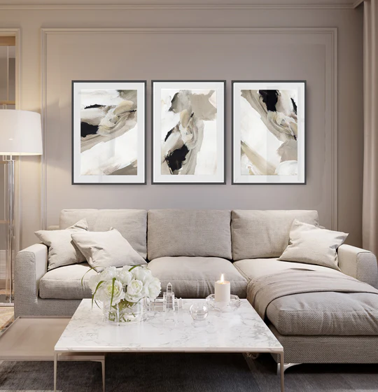
As the interior design world moves into 2026, paint colour trends are shifting toward calming, versatile palettes that bring a sense of balance and grounding to modern homes. The trend report highlights seven key shades poised to appear across walls, cabinetry, upholstery, and decorative accents. Designers emphasize color as a tool for mood regulation, helping households create spaces that feel both tranquil and functional in daily life. Rather than loud statements, these hues lean into softness, depth, and natural resonance, offering broad compatibility with a range of architectural styles—from contemporary to traditional, and from Scandinavian-inspired minimalism to warm, collected spaces.
This article synthesizes expert perspectives on how paint can shape atmosphere, comfort, and practicality in 2026. It also provides practical guidance on selecting and applying these colors, considering lighting, room use, and personal taste. By embracing seven carefully chosen shades, homeowners can achieve cohesive interiors that adapt to evolving needs and preferences while maintaining a fresh, modern aesthetic.
In-Depth Analysis
The 2026 paint palette centers on seven stylish shades that reflect a broader cultural shift toward wellness, sustainability, and tactile comfort. These colors are designed to work in harmony with natural light and varied textures, enabling cohesive schemes across walls, ceilings, trim, cabinetry, and soft furnishings. Below is an overview of the conceptual direction behind each shade, typical applications, and how they interact with different design contexts.
1) Soft Sage Green
– Concept: A gentle, restorative green with earthy undertones that evokes nature without shouting color.
– Applications: Feature walls in living rooms, kitchens with white or wood accents, and bedroom headboards or bedding.
– Why it works: Sage offers a calming backdrop that pairs well with wood tones, brass hardware, and organic textiles. It signals freshness while remaining understated.
2) Warm Terracotta Beige
– Concept: A warm, sandy beige with subtle clay-influenced undertones that add warmth and depth.
– Applications: Wall color in open-plan spaces, upholstery, and cabinetry in kitchens and living areas.
– Why it works: The warmth anchors spaces and complements both cool and warm accents. It creates a welcoming, timeless foundation that evolves with accessories.
3) Dusty Blue-Grey
– Concept: A muted blue-grey that reads as sophisticated neutrality, with hints of coolness and softness.
– Applications: Main walls in bedrooms and home offices, or as an accent for kitchens and bathrooms.
– Why it works: Its versatility makes it an easy pairing with timber textures, charcoal accents, and crisp whites, contributing to a serene, composed environment.
4) Savory Olive
– Concept: A muted olive with olive leaf undertones that infuses spaces with a subtle organic mood.
– Applications: Accent walls, cabinetry or built-ins, and textiles such as cushions or throws.
– Why it works: Olive lends depth without heaviness and harmonizes with other greens, browns, and stone hues, creating a garden-inspired interior vibe indoors.
5) Muted Taupe
– Concept: A balanced taupe that sits between warm and cool neutrals, offering an adaptable base.
– Applications: Large wall areas, ceilings, or trim to unify varying elements in a room.
– Why it works: Taupe is a dependable neutral that accommodates a range of accent colors and materials, maintaining timeless appeal.
6) Sage-Blue Blend
– Concept: A twilight-inspired mix of blue with green notes for a sophisticated, relaxing ambiance.
– Applications: Bedrooms, studies, and bathrooms where a refined, tranquil mood is desired.
– Why it works: The color’s complexity adds interest without overpowering, letting textiles and natural materials remain focal.
7) Charcoal with Warm Undertones
– Concept: A deep, charcoal shade enriched with subtle warmth to avoid stark contrast.
– Applications: Feature walls, cabinetry, or fixtures in kitchens and living areas; ideal as an anchoring color alongside lighter tones.
– Why it works: Dark hues with warmth ground a space and create dramatic, modern drama without feeling oppressive when balanced with lighter surfaces.
Beyond individual shades, the report emphasizes strategic color usage:
– Layering: Combine wall colors with softer textiles, wood, and metal finishes to create depth and visual interest.
– Light and Space: Natural daylight influences color perception; gloomy rooms may benefit from lighter, brighter variants, while well-lit spaces can handle deeper tones.
– Cohesion: Use a shared family of hues across rooms to maintain a cohesive flow, even when each space serves a different function.
– Finishes: Consider matte or eggshell finishes for walls to reduce glare and enhance the tactile quality of colors.
The seven shades are designed to be approachable, enabling homeowners to experiment with color in a low-risk way. Testing swatches in different lighting conditions and observing color shifts through the day helps ensure chosen tones feel right in real-life settings. The guidance also notes that repainting remains a practical, reversible update, allowing homeowners to refresh their interiors as tastes and needs evolve.

*圖片來源:Unsplash*
In practice, the palette supports a wide range of styles. For modern, minimal interiors, these colors offer serene backdrops that foreground furniture, texture, and architectural lines. For cozy, traditional, or eclectic spaces, the same hues can be layered with warmth through textiles, rugs, and art, maintaining a curated yet comfortable feel. The emphasis on calm tones reflects a broader consumer desire for interiors that support wellbeing, productivity, and relaxation amid fast-paced lifestyles.
The article also touches on sustainability considerations. The choice of paint brands, low-VOC formulations, and durable finishes can influence air quality and long-term satisfaction with a space. While color trends guide aesthetic decisions, they intersect with practical concerns like maintenance, durability, and environmental impact. As such, homeowners are encouraged to select products that align with both mood and health priorities for long-lasting results.
Perspectives and Impact
Paint colour trends for 2026 align with evolving preferences toward tranquility, connection to nature, and adaptable living environments. The seven shades offer versatile tools for shaping moods across rooms, enabling homeowners to craft spaces that feel both contemporary and timeless. Several broader implications emerge from adopting these trends:
- Mood-first design: Colors are increasingly treated as active elements in wellbeing, influencing how people feel in daily life. Calming tones support rest, focus, and social interaction, depending on placement and lighting.
- Flexibility in interiors: The palette supports evolving interior roles. A room that functions as an office today might become a guest room tomorrow; color choices that harmonize with multiple functions provide resilience.
- Materiality and texture: The impact of color is amplified by material choices. Wood, stone, textiles, and metals interact with these hues to create layered, tactile environments that feel curated rather than formulaic.
- Accessibility and inclusivity: Neutral and nature-inspired tones tend to be broadly appealing, reducing decision fatigue and making it easier for people with varied tastes to find a starting point.
- Sustainability considerations: Color selection dovetails with brand choices for low-VOC paints and durable finishes, reinforcing a priority on air quality and long-term cleanliness in living spaces.
Future implications include continued integration of color with wellness trends, eco-conscious materials, and smart home aesthetics. As consumers become more discerning about how a color affects comfort and productivity, designers may place greater emphasis on how light plays with color throughout the day, and how color schemes can be adjusted seasonally without major renovations. The palette from 2026 thus represents a shift toward practical elegance—colors that are not just fashionable but functional and adaptable.
Industry professionals may respond by offering expanded shade libraries with complementary trim, ceiling options, and even curated accessory collections to support cohesive room design. Homeowners, meanwhile, can approach color selection with confidence by considering lighting conditions, furniture styles, and personal rituals that shape how a space feels during different moments of the day.
Key Takeaways
Main Points:
– A seven-shade palette centers on calm, natural-inspired hues suitable for modern homes.
– Colors are chosen for versatility, mood influence, and compatibility with various design styles.
– Practical guidance emphasizes testing, lighting considerations, and layered textures.
Areas of Concern:
– Misjudging lighting could make colors appear differently than expected.
– Overreliance on trends without considering long-term preferences may lead to dissatisfaction.
– Maintenance and finish choices impact perceived hue and durability.
Summary and Recommendations
The Paint Colour Trends for 2026 present a thoughtfully curated set of seven shades designed to calm and unify modern interiors. By emphasizing nature-inspired neutrals, soft cools, and warm undertones, the palette supports a wide range of styles—from sleek, contemporary spaces to cozy, traditional rooms. The key to success lies in integrating these colors with appropriate lighting, materials, and textures, while keeping a clear sense of function for each room.
For homeowners seeking to refresh a space this year:
– Choose a primary wall color from the palette that aligns with the room’s function and lighting.
– Test swatches in natural light at multiple times of day to observe color shifts.
– Layer with textiles, wood tones, and metal accents to create depth and warmth.
– Consider sustainable paint options and low-VOC formulas to support healthier living environments.
– Maintain flexibility by selecting colors that can evolve with future design updates, so the space remains relevant and comfortable over time.
In sum, 2026’s paint trends offer accessible, adaptable, and soothing hues that empower homeowners to create interiors that feel modern, serene, and livable.
References
- Original: https://abeautifulspace.co.uk/paint-colour-trends-for-2026-7-stylish-shades-transforming-modern-homes/
- Additional reading:
- https://www.thespruce.com/paint-colour-trends-2026-xxxxx
- https://www.housebeautiful.com/room-decorating/colors/g4202/paint-trends-2026/
- https://www.architecturaldigest.com/story/paint-colour-trends-2026

*圖片來源:Unsplash*