TLDR
• Core Points: A calmer, more grounded palette dominates 2026, with seven key shades shaping interiors through versatile neutrals, soft greens, warm earthy tones, and restrained, sophisticated hues.
• Main Content: The trend report highlights seven paint colours poised to redefine modern living spaces, emphasizing balance, comfort, and longevity.
• Key Insights: Color choices lean toward timeless appeal over fleeting fashion, prioritizing harmony with natural materials and lighting.
• Considerations: Lighting, room function, and furniture coordination remain critical to successful implementation.
• Recommended Actions: Select one or two core shades as anchors, build complementary accents, and test samples in real lighting before committing.
Content Overview
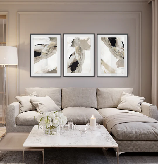
As homeowners and designers plan for 2026, paint colour trends are pivoting toward serenity, depth, and adaptability. The emphasis is on colours that feel intentional yet approachable, capable of transforming spaces without overpowering them. The seven shades highlighted for the year are chosen for their versatility and enduring appeal, ensuring interiors remain stylish over time while accommodating evolving lifestyles and needs.
The current landscape in colour psychology suggests that people increasingly seek environments that foster calm, focus, and wellbeing. This has led to a shift away from loud, high-contrast schemes toward hues that pair well with natural light, sustainable materials, and ergonomic, comfortable furnishings. The seven shades identified for 2026 are designed to work across different rooms—from living areas and kitchens to bedrooms and home offices—while remaining adaptable to a range of design styles, from minimal to eclectic.
In presenting these trends, the article notes that the final look of a room is influenced by more than just wall colour. It depends on the quality of light, the texture of surfaces, the warmth of timber or stone, and the openness or enclosure of the space. By selecting colours that harmonize with these elements, homeowners can achieve cohesive and inviting environments that feel current without being trendy in a way that quickly dates.
This year’s palette emphasises calm neutrals, soft greens, warm earthy tones, and refined, understated accents. The overarching theme is balance: colours that are expressive enough to define a mood while staying subtle enough to complement a wide range of furnishings and decorations. The practical takeaway is that paint choices should support mood, function, and durability, ensuring spaces are both beautiful and livable.
In-Depth Analysis
The seven standout shades for 2026 are presented as versatile workhorses for modern interiors. Each hue is described with its ideal applications, elevated by how it interacts with natural and artificial light, as well as with various materials such as wood, fabric, and metal.
1) A Calm Neutral Foundation
As a backbone for interiors, a restrained neutral acts as a quiet canvas that unifies space. The recommended neutral is designed to pair effortlessly with both warm and cool accents, offering flexibility for evolving styles and furnishings. It provides a sense of spaciousness in smaller rooms and serves as a stabilizing influence in open-plan layouts.
2) A Soft Sage or Green-leaning Neutral
Green hues are reframing how we perceive “green” in interior design. The suggested shade delivers a gentle botanical feel without overwhelming the room. It works particularly well in spaces rooted in nature-inspired design, such as living rooms with natural textures, plant accents, and stone or timber surfaces. This colour aims to bring a sense of renewal and calm, complementing light-forward schemes and creating a connection to the outdoors.
3) Warm Terracotta and Clay Tones
Earth-inspired reds and burnt clay tones provide warmth and character. These shades are useful for adding depth to a room without creating a heavy atmosphere. They pair beautifully with wood finishes and textiles in natural fibres, offering a soft, inviting presence in kitchens, lounges, and bedrooms. The intention is to evoke comfort and hospitality, echoing earthy landscapes and rustic charm.
4) Weathered Taupe with Subtle Grey Undertones
Taupes with understated greys offer a sophisticated, mature option that bridges contemporary and traditional aesthetics. This hue can anchor living spaces and home offices alike, supporting clean lines and modern furniture while maintaining a welcoming ambience. The subtle coolness helps balance warmer accents and can prevent rooms from feeling too monochrome.
5) Charcoal or Deep Slate for Accents
A deeper shade serves as a strategic accent to ground a light palette. Used selectively on feature walls, cabinetry, or architectural trim, this hue provides contrast and drama without overpowering the room. It pairs well with lighter neutrals, natural wood, and metallic highlights, enhancing depth and focal points in a living area or dining room.
6) Hearth-toned Beige or Cream
Near-white or warm beige tones offer a refined alternative to stark whites. These shades read as soft, luminous, and versatile, making them ideal for spaces that require brightness without clinical feel. They work well in kitchens and bathrooms that benefit from a clean, airy atmosphere, particularly when paired with natural stone or wood accents.
7) Muted Navy or Ocean-inspired Blue
A restrained blue can introduce a sense of quiet confidence and serenity. This shade works well for bedrooms, bathrooms, or home offices where a focused, tranquil mood is desirable. When combined with whites, creams, and warm woods, it creates a timeless, sophisticated look that remains flexible as trends evolve.
Across all seven shades, the emphasis is on achieving harmony with light, texture, and function. The article stresses the importance of introducing colour gradually—testing samples in different lighting conditions and observing how the hue interacts with furnishings and architectural features before committing to a full room renovation.
The broader message is that 2026’s palette favors longevity and adaptability. Rather than adopting bold, high-contrast schemes that risk dating quickly, homeowners are urged to embrace colours that support wellness, readability, and comfort. These colours are chosen for their compatibility with a wide range of materials and their ability to enhance the tactile quality of spaces—curating environments that feel both modern and timeless.

*圖片來源:Unsplash*
Perspectives and Impact
Industry professionals suggest that the 2026 palette reflects a broader cultural shift toward sustainable living and mindful consumption. As people spend more time at home, the visual environment becomes a critical aspect of wellbeing, productivity, and relaxation. The seven shades are positioned to support this shift by offering versatility and subtlety rather than showy, trend-driven statements.
Residential design now often leans toward layered textures—natural woods, stone, textiles, and ceramics—that interact with these seven hues to create depth and interest. The emphasis on calm neutrals and nature-inspired greens aligns with a growing preference for biophilic design principles, which seek to connect people with the natural world through interior aesthetics. In practice, this means fewer stark contrasts and more nuanced tonal relationships that elevate everyday living.
From a practical standpoint, home improvement experts highlight several implications:
– Light and brightness: The impact of natural and artificial light on these shades is significant. Small shifts in light can alter how a colour reads, so samples and lighting considerations are essential before large-scale painting projects.
– Regional and architectural context: The same shade can look markedly different in various architectural styles and climates. Designers recommend tailoring the choice to the room’s orientation and function.
– Sustainability and materials: These colours pair well with sustainable materials and finishes, supporting a cohesive eco-conscious approach to interior design.
– Longevity: Because the palette favours more timeless hues, homeowners can expect longer-lasting satisfaction and reduced need for frequent refreshes.
The report also notes that personalisation remains important. While these seven shades provide a solid framework, individual preferences, furniture styles, and artwork should guide how bold or restrained a room becomes. The practical strategy involves selecting one or two anchor colours and building a layered palette with complementary tones, textures, and decor elements.
In terms of market implications, paint manufacturers may expand their ranges around these seven core shades, offering extended palettes and finish options (matte, eggshell, satin, etc.) to support varied lighting and usage scenarios. Consumers can anticipate more curated, designer-backed palettes that simplify decision-making without compromising flexibility.
Overall, the 2026 colour trend outlook encourages a balanced approach to interior design—one that values calm atmosphere, sustainable materials, and thoughtful composition. The seven shades serve as a versatile toolkit for creating modern homes that feel both current and enduring.
Key Takeaways
Main Points:
– A calm, versatile palette dominates 2026, focusing on neutrals, greens, warm earth tones, and restrained accent shades.
– Colour choices are designed for longevity, adaptability, and harmony with natural light and materials.
– Successful implementation relies on thoughtful lighting, room function, and cohesive furniture and decor.
Areas of Concern:
– Over-reliance on neutral tones could risk spaces feeling sterile if textures and lighting aren’t carefully considered.
– Regional lighting conditions may affect how shades read, necessitating thorough testing and adaptation.
– The push toward sustainability should be balanced with personal style to avoid compromising comfort or mood.
Summary and Recommendations
The 2026 paint colour forecast emphasizes calm, adaptable hues that enhance modern living spaces without imposing rigid trends. Homeowners are encouraged to adopt one or two core shades as anchors and to craft layered palettes through complementary colours, textures, and materials. By prioritising light interaction, material warmth, and functional needs, interiors can achieve a refined, timeless look that remains comfortable and relevant year after year.
Practical steps:
– Start with a core neutral or soft green as the primary wall colour to create calm foundations.
– Introduce warmth with terracotta or clay accent elements—through furniture upholstery, rugs, or art.
– Use a deep, restrained accent (charcoal or navy) sparingly to establish depth and focal points.
– Test swatches in different rooms and lighting conditions, and observe over several days.
– Coordinate with existing wood finishes, fabrics, and metals to ensure a cohesive, inviting space.
If you’re renovating or redecorating in 2026, this palette offers a versatile framework that supports contemporary aesthetics while remaining durable and timeless. By focusing on balance, comfort, and sustainable design principles, you can create interiors that feel both fresh and enduring.
References
- Original: https://abeautifulspace.co.uk/paint-colour-trends-for-2026-7-stylish-shades-transforming-modern-homes/
- Additional references:
- Interior design trend reports and colour forecasting resources from major paint manufacturers
- Biophilic design and colour psychology research related to interior environments
Forbidden:
– No thinking process or “Thinking…” markers
– Article must start with “## TLDR”
Ensure content is original and professional.

*圖片來源:Unsplash*