TLDR
• Core Points: The yellow paint trend in 2026 risks overstimulation, clashes with many spaces, and rapid market shifts.
• Main Content: While sunny hues can energize rooms, color trends are volatile; practical considerations and personal taste should guide choices over hype.
• Key Insights: Yellow can affect mood and lighting; it requires thoughtful pairing, testing, and lighting; long-term fit matters more than short-term hype.
• Considerations: Lighting, room function, existing furnishings, resale value, and maintenance influence suitability.
• Recommended Actions: Sample colors in multiple lighting conditions, balance with neutrals, and prioritize timeless appeal over trendiness.
Content Overview
Color trends shape how we experience our homes, yet they are not universal solutions. In 2026, a bright yellow paint trend has gained attention across social media, home decor magazines, and design platforms. Proponents argue that yellow injects energy, warmth, and optimism into spaces. Critics warn that the hue can date quickly, overpower a room, and become visually fatiguing, especially in small or poorly lit areas. This article examines the yellow paint trend with a critical yet balanced lens, drawing on design principles, psychological considerations, and practical guidance to help homeowners and designers decide whether yellow is a viable long-term choice. The goal is not to dismiss color experimentation but to encourage informed decision-making that aligns with personal preferences, architectural features, and real-world use.
Historical context shows that color trends cycle through seasons and years but individual spaces respond differently to bold hues. Yellow, in particular, has a long-standing association with positivity, sunlight, and energy. However, its varied wavelengths—from pale butter tones to vivid mustard and neon—offer divergent effects on mood, perceived space, and compatibility with natural light. In 2026, the trend’s momentum is amplified by social platforms showcasing bold rooms and DIY projects, potentially influencing homeowners to adopt yellow without full consideration of their space’s unique characteristics. This article aims to provide a grounded assessment, emphasizing testing, layering, and moderation rather than immediate, widespread adoption.
In-Depth Analysis
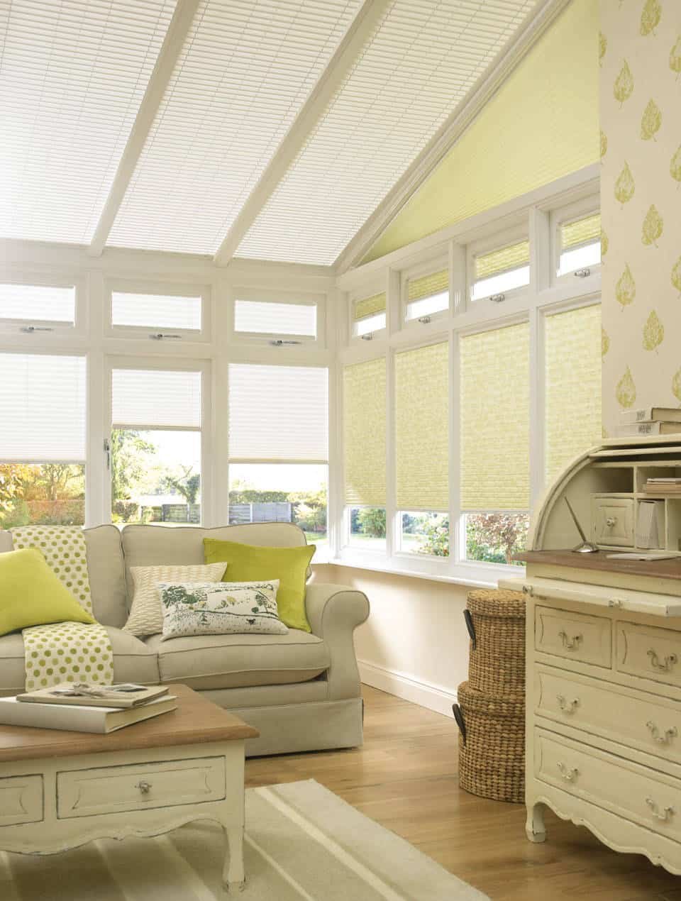
Yellow as a design statement is not a singular color but a spectrum. Lighter yellows can brighten dim interiors and reflect natural light, creating a cheerful atmosphere when paired with cool whites, greiges, or soft blues. Deeper yellows—mustard, ochre, or sun-kissed hues—bring warmth and can anchor larger spaces or act as accent walls in open-plan layouts. Yet this versatility comes with caveats.
Lighting plays a pivotal role. Natural daylight shifts throughout the day, influencing how yellow appears on walls. In morning light, a pale yellow can feel inviting; in late afternoon or in rooms with limited windows, the same shade may read tingier or more saturated than intended. Artificial lighting compounds this variability. Warm LED bulbs (2700–3000K) tend to enhance yellow’s warmth, while cool or neutral LEDs (3500–4000K) can make certain yellows look greener, gray, or more desaturated. Therefore, selecting a yellow without testing under your actual lighting setup can lead to unexpected results.
Room size and architectural features matter. In small rooms, high-saturation yellows or strong warm yellows can visually compress space and become overwhelming if not balanced with ample neutral or cool elements. In larger rooms with strong architectural features, yellow can serve as a unifying accent or tool to emphasize focal points—provided it is scaled and proportioned thoughtfully. Open-plan living areas demand careful color choreography so that adjacent rooms with different lighting conditions stay cohesive.
Color psychology suggests yellow can evoke happiness, energy, and optimism. For some occupants, these associations translate into a mood boost and a sense of vitality. For others, especially those prone to sensitivity to bright, high-contrast colors, yellow can feel overstimulating, leading to fatigue over time. Personal temperament, activity patterns, and the room’s function should inform whether yellow is a suitable long-term color choice.
Practical considerations also influence decision-making. Maintenance is a practical concern: lighter yellows may show dirt and wear more readily, while highly saturated yellows can reveal scuffs, fingerprints, and marks on high-traffic surfaces. The paint finish matters as well; matte or eggshell surfaces soften reflectivity and can hide imperfections, but they may be harder to clean. In spaces such as kitchens or bathrooms with moisture and humidity, selecting a durable, washable finish is important.
Coordination with existing furnishings is essential. Yellow interacts strongly with wood tones, metals, textiles, and artwork. It can harmonize with natural wood floors, brass hardware, and earthy textiles to create a cohesive warmth. Conversely, it can clash with certain cool-toned furniture, bright blues, or dark palettes if not balanced correctly. A common strategy is to use yellow as an accent rather than a dominant field color, allowing other hues to ground the space while yellow provides pops of energy in accessories, cushions, or a featured wall.
Durability and trend longevity are practical considerations. Trends can drive short-term popularity, but spaces are rarely refreshed yearly. If you anticipate staying in a home for several years, choosing a color with enduring appeal is often wiser than chasing a trend. That said, using yellow in small doses—through decor, textiles, or a single accent wall—can allow you to enjoy its mood benefits without committing the entire room to a bold hue.
Accessibility remains a critical factor. For color-sensitive individuals or spaces designed for rest and focus, high-contrast combinations or overly saturated yellows can impede readability and create visual fatigue. Ensuring sufficient contrast for text on walls, identifying color-safe guidance for color-blind accessibility, and testing with sample swatches in real-world lighting can mitigate potential issues.
Finally, growth and resale considerations are worth noting. While a bold color can reflect personal taste, extremely saturated or unconventional yellows may limit buyer appeal in some markets or with future homeowners who prefer neutral palettes. If resale value is a priority, many designers recommend reserving bold hues for decor elements rather than permanent wall colors, enabling future owners to adjust more easily.
Perspectives and Impact
The yellow paint trend in 2026 has sparked diverse opinions among designers, homeowners, and researchers. Proponents argue that yellow can illuminate interiors, create warmth, and foster creativity. They point to examples of sunny kitchens, sunlit living rooms, and playful children’s spaces where yellow provides a sense of optimism and energy. In this view, yellow acts as a catalyst for social interaction and mood enhancement, particularly when balanced with cooler neutrals or natural textures.

*圖片來源:Unsplash*
Opponents caution against overreliance on trends. They emphasize that color choices should be anchored in function, light, and long-term satisfaction rather than momentary popularity. They highlight the risk of color fatigue, the potential mismatch with architectural style, and the difficulties of maintaining a consistent look as furniture and decor evolve. Some designers advocate for testing color in small, reversible ways—such as painted furniture, accent walls, or textiles—before committing to large-scale wall changes.
From an architectural and interior-design standpoint, yellow’s impact varies by space type and purpose. In kitchens and dining areas, yellow can stimulate appetite and sociability; however, too much intensity can overwhelm fatigue in long meals or work sessions. In bedrooms and study zones, softer or muted yellows may support a cheerful ambiance without compromising rest or focus. Hallways and entryways, often small and highly traversed, may benefit from a warm, inviting tone but run the risk of feeling narrow if overly saturated.
Economic and environmental contexts influence adoption. The proliferation of DIY painting tutorials and affordable paint options lowers barriers to experimentation. This democratization accelerates trend spread but can also result in inconsistent quality across applications. Consumers should consider paint durability, VOC content, and the environmental footprint of the products they choose, especially when repaint cycles are frequent.
Cultural associations with color also shape perception. While yellow universally links to sunshine and warmth in many Western contexts, cultural interpretations can vary. In some traditions, yellow carries spiritual or ceremonial significance, which may inform how different communities respond to its presence in the home. Designers increasingly recognize the importance of building spaces that honor diverse sensitivities and preferences, rather than prescribing a single color narrative.
Technological tools offer opportunities to simulate outcomes before committing to paint choices. Virtual room visualization, color-calibration apps, and daylight simulations enable more precise assessments of how yellow will perform in specific spaces. These tools empower homeowners to compare several shades, finishes, and lighting scenarios side by side, reducing the risk of regret after a costly paint job.
The broader takeaway is nuanced: color trends can inspire experimentation, but successful implementation hinges on deliberate planning. Yellow should be considered as part of an integrated design system—one that accounts for light, furniture, textiles, and the room’s function. For some spaces and households, yellow can be a compelling, joyful choice; for others, it may be better reserved for accents or seasonal updates.
Key Takeaways
Main Points:
– Yellow is a versatile hue across a spectrum, but its effectiveness depends on lighting, space size, and function.
– Bold yellows can energize rooms but risk visual fatigue and trend-driven obsolescence if overused.
– Testing in real conditions and using yellow as an accent rather than a dominant wall color increases success.
Areas of Concern:
– Inconsistent lighting can drastically alter yellow’s appearance.
– Maintenance concerns with lighter or highly saturated yellows.
– Potential resale implications of bold wall colors in certain markets.
Summary and Recommendations
The zeal for yellow paint in 2026 reflects a broader desire to infuse spaces with energy and optimism. However, color decisions should be anchored in practicality and personal preference rather than trend momentum alone. homeowners and designers can benefit from adopting a balanced approach: use yellow strategically, test thoroughly, and maintain flexibility to adjust as tastes and lighting conditions evolve.
If you decide to pursue yellow, consider these actionable steps:
– Start with testing: apply multiple swatches on different walls and in both natural and artificial light, over several days.
– Use yellow as an accent: paint a single wall, install yellow textiles, or incorporate yellow through decor elements to maintain versatility.
– Pair thoughtfully: balance warm yellows with cool neutrals, natural textures, and metallic accents to create depth and harmony.
– Prioritize durability and maintenance: choose washable finishes for high-traffic areas and kitchens, and be mindful of dirt visibility on lighter yellows.
– Consider future-proofing: reserve substantial wall color changes for later, while keeping decor adaptable to evolving styles.
Ultimately, the yellow paint trend can be a source of joy and vitality when approached with care. By assessing your space’s lighting, size, function, and personal preferences, you can decide whether yellow enhances your home in 2026 or whether it should remain a carefully applied accent that complements a broader, enduring design strategy.
References
- Original: https://abeautifulspace.co.uk/why-you-should-not-embrace-the-yellow-paint-trend-in-2026/
- Additional references:
- Understanding how lighting affects color perception in interior design
- Color psychology: how hues influence mood and behavior
- Practical guide to selecting paints: finishes, durability, and maintenance
Forbidden:
– No thinking process or “Thinking…” markers
– Article starts with “## TLDR”

*圖片來源:Unsplash*