TLDR
• Core Points: Yellow paint trends can overwhelm spaces, fade with lighting, and pose maintenance challenges; balanced palettes are often more timeless.
• Main Content: The 2026 yellow paint trend attracts attention but risks intensity, mood shifts, and practical drawbacks for everyday living.
• Key Insights: Color psychology, lighting, and interior function matter; alternatives and moderation can yield better long-term satisfaction.
• Considerations: Personal preference, room purpose, and upkeep should guide color choices rather than chasing trendiness.
• Recommended Actions: Use soft or accent yellows, test samples in multiple lighting conditions, and pair with grounded neutrals.
Content Overview
Yellow has emerged as a notable trend in interior design for 2026, buoyed by social media highlights and marketing campaigns that celebrate sunny, optimistic tones. Brands and designers alike have showcased vibrant yellows across living rooms, kitchens, and even bathrooms, suggesting warmth and energy. However, while the color can illuminate a space and evoke cheerful associations, it also presents several practical and perceptual challenges. The purpose of this article is not to demonize yellow, but to provide a balanced assessment of why embracing the bold trend may not be the best long-term strategy for many homes. We will consider color psychology, lighting effects, maintenance considerations, and how to integrate yellow in a safe, durable way that respects daily living, budget, and future design flexibility.
Historical context and cultural associations of yellow
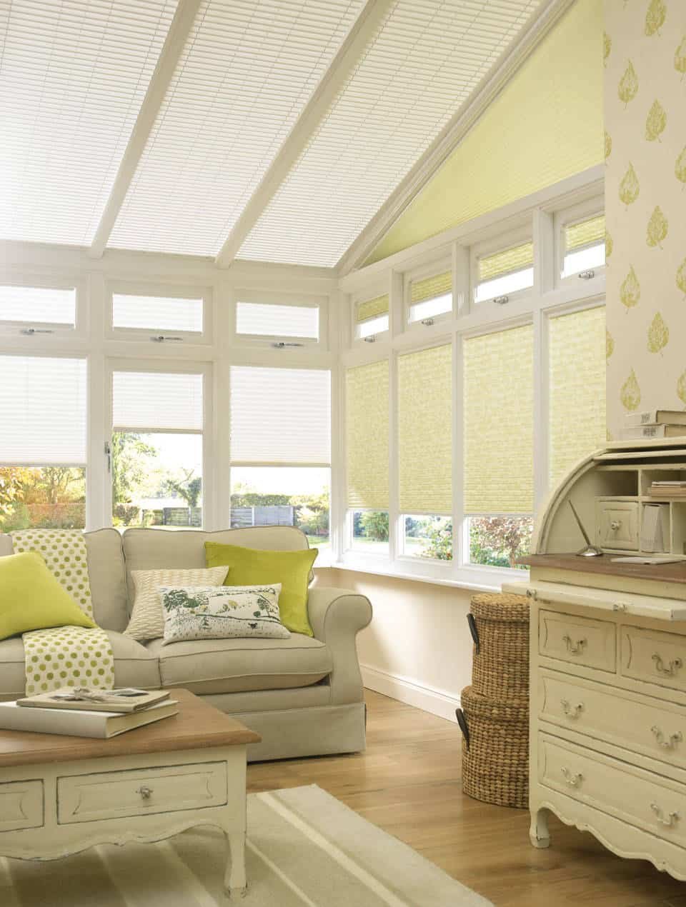
Yellow has long carried varied meanings across cultures. It can symbolize happiness, creativity, and vitality in many contexts, but it can also communicate caution or overstimulation when used in large swaths. In interior design, these associations play out in how people perceive space—intensity, warmth, and energy levels can shift considerably based on hue saturation, brightness, and surrounding materials. The 2026 trend emphasizes brighter, more saturated yellows, which can be visually striking but may overwhelm smaller rooms or poorly lit interiors. Understanding these dynamics helps set realistic expectations for how yellow will behave in daily life.
The design landscape and media influence
The surge of yellow in 2026 is propelled by social media content, influencer partnerships, and collaborations with paint brands offering expansive palettes. Prospective buyers and renovators may feel pressure to adopt the look to stay current. However, trends are inherently time-bound. A color choice rooted in novelty risks feeling dated as fashions evolve or as redecorating cycles accelerate. More importantly, design decisions should align with practical considerations—how a color performs under different lighting, how it ages with wear, and how easy it is to harmonize with existing furniture and fixtures.
Why yellow can be tricky in real rooms
– Lighting interactions: Natural light, incandescent bulbs, and daylight-spectrum LEDs all alter the perception of yellow. What looks sunny in a showroom can feel garish or flat in your kitchen at dusk or in rooms with limited natural light.
– Saturation and scale: Highly saturated yellows can visually shrink or expand a room in ways that may feel disproportionate. In small or low-ceiling spaces, bold yellow walls may create a sense of enclosure or overwhelm architectural details.
– Maintenance and upkeep: Pushing bright yellows across walls or cabinetry tends to reveal dirt, fingerprints, and scuffs more quickly. Frequent cleaning or touch-ups can become a recurring task, increasing time, effort, and cost.
– Mood and functionality: Color has a measurable impact on mood and behavior. While yellow can boost energy and creativity, it can also contribute to overstimulation or fatigue if used excessively or in rooms intended for rest or focus.
A measured approach to yellow
For many households, dipping a toe into the yellow trend is more prudent than a full-scale commitment. Consider these strategies:
– Use as an accent: Introduce yellow through accessories, textiles, artwork, or a single feature wall rather than painting large expanses. This preserves flexibility and reduces perceptual risk.
– Opt for softer or warmer tones: Not all yellows are equal. Parchment, butter, or sun-kissed hues can offer warmth without the intensity of primary or neon yellows.
– Balance with neutrals: Pair yellow with grounded neutrals such as warm whites, greiges, taupes, or charcoal accents. This grounding helps prevent the space from feeling overly energetic or chaotic.
– Test in multiple lighting scenarios: Paint swatches on different walls and observe them at different times of day and under various light sources before committing.
– Consider finish and texture: The finish (matte, eggshell, satin) affects how color reads. A slightly textured application can mitigate glare and soften the overall effect.
Material and architectural considerations
The way yellow interacts with materials and architectural features matters. Natural wood tones, stone, and metal finishes can either harmonize with or clash against yellow hues. For example:
– Warm woods (maple, cherry, teak) can complement yellow walls, reinforcing a cohesive warmth.
– Cool-toned surfaces (gray stone, black metal) create a modern, high-contrast juxtaposition that can feel deliberate and contemporary but may also risk visual fatigue over time.
– Glossy finishes on cabinetry or tiles can amplify brightness and echo the intensity of the color, making precise color matching and maintenance more critical.
Practical guidance for different spaces
– Living areas: A soft yellow feature wall or yellow accents can uplift a room designed for socializing. Use it sparingly to avoid competing with upholstery, art, and lighting.
– Kitchens: Yellow is historically associated with warmth and appetite, but a full-room yellow can be distracting during meals. Consider yellow in cabinetry fronts or front-facing architectural details rather than the entire room.
– Bathrooms: Yellow tiles or accents can inject sunshine into a small space, yet moisture and soap scum can highlight color variation. Ensure good ventilation and choose durable, easy-to-clean finishes.
– Bedrooms and study areas: For spaces intended to rest or focus, lean toward calmer tones or use yellow as a small accent to maintain a tranquil atmosphere.
Cost and durability considerations
The cost of adopting yellow depends on the scope and product choice. Premium paints with excellent coverage, durability, and washability add upfront cost but reduce ongoing maintenance. If yellow is used on high-traffic surfaces or large areas, the long-term maintenance burden should be weighed against the initial savings. Additionally, color swatches that appear yellow in a showroom can read differently at home; budget for testing and potential repainting if the result is unsatisfactory.
Sustainability and longevity
Trends shift, but well-considered color choices can endure. A yellow palette anchored by versatile neutrals and adaptable decor allows for easier refreshes without complete redos. Choosing sustainable, low-VOC paints is always advisable for indoor air quality, especially in rooms used by children, pets, or individuals with sensitivities.

*圖片來源:Unsplash*
In-Depth Analysis
The 2026 yellow paint trend reflects broader design impulses toward optimism, brightness, and personalization. Proponents highlight how yellow can illuminate spaces and create inviting, energetic atmospheres. Critics, however, warn that bold yellows can be polarizing, demanding careful calibration with lighting, furniture, and overall architectural style. This tension—between the mood-boosting potential of yellow and its risk of visual fatigue—drives a pragmatic approach to its use.
Color psychology and human perception
Color psychology suggests yellow can stimulate mental activity and evoke happiness, which explains its appeal in kitchens, home offices, and creative studios. Yet the same stimulus can tire occupants over long periods, leading to restlessness or distraction. In bedrooms or relaxation zones, more muted or cooler tones are generally recommended to promote calm. The decision to incorporate yellow should therefore consider room function and how long occupants spend in that space each day.
Lighting as a determining factor
Lighting is a decisive variable in how yellow reads. In rooms with abundant natural light, yellow can feel airy and welcoming. In north-facing rooms or spaces with limited daylight, the hue may take on a cooler or dull cast, or appear more intense than intended as artificial lighting interacts with the wall color. Designers often advise testing paint under multiple lighting scenarios, including daylight, warm incandescent, and cool LED, to avoid misinterpretation of the color before committing.
Aesthetics vs. practicality
Aesthetic appeal does not always align with long-term satisfaction. People sometimes fall in love with a color in a showroom but grow tired of it after months of daily use. The need for repainting or touch-ups can become a practical burden when the color is particularly demanding to maintain. In such cases, the initial excitement of a trendy hue must be weighed against ongoing upkeep costs, potential repaint cycles, and the effort required to redecorate around a strong color.
Alternatives and complementary strategies
If you’re drawn to the energy of yellow but wary of its intensity, consider these alternatives:
– Softer yellows or warm neutrals: Choose lighter, less saturated hues or yellows with a cream or beige base to preserve warmth without overpowering the room.
– Yellow as an accent: Use yellow in accessories, textiles, artwork, or small furniture pieces to capture the trend’s spirit without dominating the space.
– Layered color approach: Combine yellow with complementary tones such as blues, greens, or terracotta to create a balanced, dynamic palette that remains adaptable.
– Seasonal updates: Instead of a long-term color commitment, rotate accent elements seasonally to refresh the space without repainting.
Perspectives and Impact
The rise of the yellow paint trend in 2026 reflects broader cultural and stylistic currents, including a desire for brighter, more optimistic interiors in response to challenging times. As with any trend, there are implications for the design industry, homeowners, and the resale value of homes:
– Industry implications: Paint brands may expand yellow-focused lines, offering varied formulations, sustainability options, and color science tools to help consumers predict how colors perform in real spaces.
– Homeowner considerations: Individuals should assess personal preferences, lifestyle, and the costs of maintenance before committing to a bold hue for prominent surfaces. The risk of feeling dated or overwhelmed by color should be weighed against the potential for a room to feel refreshed and inviting.
– Market impact: Homes with versatile color palettes tend to appeal to a broad audience. A very saturated yellow on key surfaces could conflict with neutral decor that future buyers may prefer, potentially affecting resale flexibility.
Key Takeaways
Main Points:
– Bold yellow can energize a space but risks overstimulation and visual fatigue in some rooms.
– Lighting conditions dramatically influence yellow’s appearance; testing is essential.
– Accent use, softer tones, and grounding neutrals offer safer paths to incorporate yellow trends.
Areas of Concern:
– Maintenance challenges and visibility of stains on yellow surfaces.
– Risk of making spaces feel smaller or overly vibrant.
– Potential for the color to feel dated as trends evolve.
Summary and Recommendations
If you are considering the 2026 yellow paint trend, approach the change thoughtfully and incrementally. Start with small-scale applications, such as accent walls, cabinetry doors, or decorative elements, rather than repainting entire rooms. Select softer or warmer yellows that harmonize with your existing furniture and architectural features. Test samples under multiple lighting conditions and observe the color at different times of day to ensure it behaves as you expect. Pair yellow with stable neutrals to maintain balance and longevity, and reserve bold declarations for areas where you want a focal point or a mood-driven statement. By prioritizing flexibility, maintenance practicality, and personal preference, you can enjoy the energy yellow offers without compromising long-term satisfaction in your home environment.
References
– Original: https://abeautifulspace.co.uk/why-you-should-not-embrace-the-yellow-paint-trend-in-2026/
– Additional reading:
– The Impact of Lighting on Color Perception in Interior Design
– Sustainable Paint Options: VOCs, Durability, and Low-Most Maintenance Finishes
– How to Use Accent Walls Effectively in Modern Interiors
Note: This article provides a balanced, practical assessment of the yellow paint trend for 2026, emphasizing thoughtful application, lighting considerations, and lasting design strategies rather than a blanket endorsement or rejection of the trend.

*圖片來源:Unsplash*