TLDR
• Core Points: Kitchens in 2026 lean toward nuanced neutrals, warm earth tones, bold accent shades, matte finishes, and tactile surfaces that blend form with function.
• Main Content: Design professionals favor versatile palettes, sustainable options, and color pairings that support mood, lighting, and practicality in busy cooking spaces.
• Key Insights: The most influential trends emphasize depth over brightness, texture over flat paint, and a cohesive link between kitchen cabinets, walls, and cabinetry hardware.
• Considerations: Lighting, cabinet styles, and maintenance requirements should guide color choices; consider samples in real kitchen lighting before committing.
• Recommended Actions: Start with neutral bases, test with swatches in different lighting, and plan color accents that can be updated with accessories or hardware over time.
Content Overview
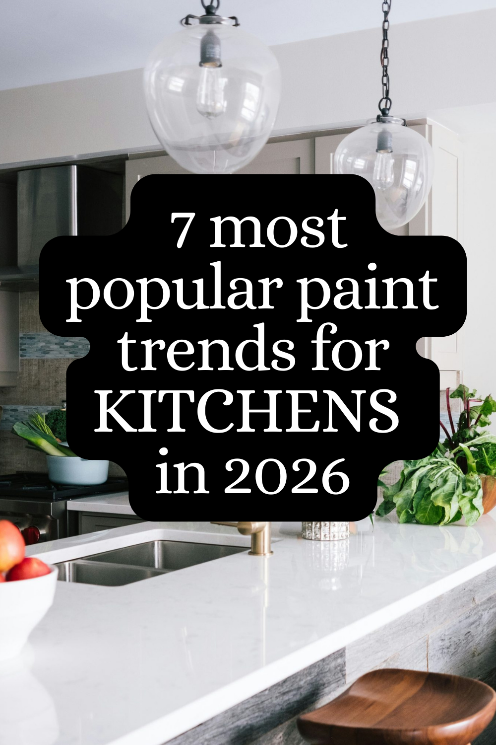
The year 2026 is shaping up to redefine how kitchens look and feel through paint. Designers are moving away from stark, clinical whites and into palettes that offer warmth, depth, and personality while preserving practicality in a space that acts as the home’s hub. The evolving paint trends emphasize not only color choices but also finish, texture, and the way shade interacts with natural and artificial light. These trends reflect a broader shift toward sustainable, low-VOC products, durable finishes, and colors that age gracefully alongside evolving kitchen styles—from streamlined modern to inviting farmhouse influences.
In this article, we explore seven top paint trends shaping kitchen aesthetics in 2026, with guidance on how to apply them thoughtfully. Each trend considers the practical realities of kitchen life—stain resistance, cleanability, and compatibility with cabinetry, countertops, and appliances—while offering designers’ perspectives on creating cohesive and timeless spaces. Whether you’re refreshing a single wall, updating cabinetry, or reimagining the entire kitchen, these trends provide a framework for choosing colors and finishes that enhance mood, maximize light, and support daily rituals around cooking and gathering.
In-Depth Analysis
Trend 1: Mature Neutrals with Warm Undertones
Neutral palettes continue to dominate kitchen design, but the emphasis has shifted from cool taupes to warmer, more complexion-friendly neutrals. Think greiges, soft taupes, and creamy whites with subtle amber or honey undertones. These shades create a versatile base that pairs well with stainless steel, matte black fixtures, and natural wood accents. The appeal lies in their ability to read as fresh and inviting while remaining forgiving as cabinets or backsplashes age. Finishes that mimic natural lacquer or satin sheens can add depth without sacrificing cleanliness. For practical use, homeowners should test neutrals near windows and under kitchen task lighting to ensure the warmth reads consistently across different times of day.
Trend 2: Earthy Greens and Sage-Like Hues
Organic greens bring a sense of calm and vitality into the kitchen. Earthy greens—sage, olive, and muted forest tones—offer a grounded, spa-like atmosphere that complements wood tones and stone surfaces. These shades work particularly well on cabinetry or as an accent wall, pairing gracefully with brass or black hardware and natural textures like rattan or linen textiles. Since greens can shift with lighting, it’s important to test samples in both daytime and evening settings to confirm that the color remains harmonious with the rest of the design.
Trend 3: Rich, Buttery Yellows and Creamy Warm Hues
Soft sunshine tones inject warmth and energy without overwhelming the space. Buttery yellows and creamy off-whites can brighten kitchens with limited natural light and add a touch of retro charm when used on cabinetry or as wall color behind open shelving. These hues pair nicely with warm metals and light wood grains, creating a cheerful, inviting environment. Practically, it’s wise to balance bright wall color with cooler accents—such as a cool-toned countertop or tile—to prevent the space from feeling overly warm.
Trend 4: Charcoal and Deep Espresso as Statement Neutrals
Instead of pure black, designers are embracing charcoal and deep espresso as sophisticated neutral anchors. These tones provide dramatic contrast against lighter countertops, backsplashes, and wood elements while maintaining readability and cleanliness. They can be applied to lower cabinetry, islands, or an entire perimeter for a contemporary, grounded look. When using dark shades, ensure ample lighting and consider lighter wall tones to keep the space from feeling too enclosed. The right hardware finish—polished nickel, brass, or matte black—will influence the perceived warmth of these colors.
Trend 5: Matte Finishes and Velvety Textures
Texture is increasingly important in kitchen paint, with matte and velvety finishes gaining popularity for walls, cabinets, and island panels. Matte finishes reduce glare and create a sophisticated backdrop for textiles, glassware, and architectural details. They’re particularly appealing in modern or minimal kitchens where reflective surfaces are minimized. Practically, matte finishes can be touched up more easily than high-gloss paints in high-traffic areas, and modern formulations offer better stain resistance and cleanability. For longer-term durability, consider washable matte paints designed for kitchens and bathrooms.
Trend 6: Two-Tone Kitchens and Deliberate Zoning
Two-tone schemes—lighter upper cabinetry balanced by darker lowers or islands—continue to be a strong trend. This approach helps define zones, creates visual interest, and can be a cost-effective way to refresh a space without reworking full cabinetry. Color pairings should consider the kitchen’s natural light, hardware finishes, and countertop materials. When selecting two tones, ensure there is enough contrast to create depth while maintaining harmony across the room. Accent walls or a floating shelf in a contrasting color can reinforce the design without overwhelming the space.
Trend 7: Soft Blues and Pool-Tastelike Tints
Soft blues offer a refreshing alternative to neutrals and warm neutrals, bringing a cool, calming vibe to kitchens. Pale blues with gray undertones pair well with white or light gray cabinetry and can complement stainless appliances for a crisp, contemporary feel. These colors work well in kitchens that receive abundant natural light, as they can appear brighter and more buoyant in the sun. For smaller kitchens, a restrained blue on a single wall or an island panel can add personality without visually shrinking the space.
Across all trends, designers emphasize the importance of initial swatches tested under real kitchen lighting. Lighting conditions—natural daylight shifts, LED task lighting, and evening ambient lights—will influence how a color reads in the space. Furthermore, many designers are prioritizing low-VOC, low odor, and durable paints that stand up to the humidity and steamy environments typical of kitchens. The choice of finish also plays a critical role in maintenance: satin or eggshell finishes balance ease of cleaning with a refined look, while matte options provide texture and depth but may require more frequent touch-ups in high-traffic areas.

*圖片來源:Unsplash*
Additionally, the trends reflect a broader shift toward timeless palettes with flexible pairing options. Rather than chasing every new hue, designers suggest selecting a core base of neutrals and adding color through accents in cabinetry hardware, tiles, textiles, and small decor elements. This approach allows homeowners to refresh the space with relatively low cost and effort as trends evolve or personal tastes change.
Perspectives and Impact
The push toward warmer neutrals and earthy tones signals a return to comfort and warmth in the heart of the home. Kitchens have increasingly become multifunctional spaces—cooking zones, social hubs, and small home offices—where mood and atmosphere influence both productivity and well-being. The 2026 color direction supports versatility: muted bases that won’t overpower feature elements, paired with adaptable accent colors that can be swapped with relative ease as trends shift.
Designers are also mindful of sustainability and health. The market’s growing demand for low-VOC paints aligns with healthier indoor environments, particularly in spaces where families spend substantial time. This trend dovetails with the move toward natural materials and textures that create tactile experiences while ensuring easy maintenance. In terms of practicality, the color strategies emphasize durability and cleanability, especially for households with children, pets, or frequent entertaining.
On a broader scale, the 2026 palette approach reflects a move away from monochrome minimalism toward layered, lived-in aesthetics. The repertoire includes both quiet, refined hues and deeper, statement-making tones, allowing designers to craft rooms that feel curated yet welcoming. The blending of cabinet finishes, hardware, and backsplash materials with the chosen paint tones creates cohesive environments where color, texture, and form reinforce each other.
Future implications point toward more experimental pairings that remain anchored in practicality. As smart home features become more prevalent in kitchens, lighting systems and color management may be integrated to dynamically adjust mood and warmth. Moreover, as we see ongoing innovation in paint technology—improved stain resistance, washability, and eco-friendly formulations—designers will continue to push boundaries while maintaining a focus on livability and longevity.
Key Takeaways
Main Points:
– Warmer neutrals and earthy greens are central to 2026 kitchen palettes.
– Rich, deep neutrals (charcoal, espresso) anchor modern schemes.
– Matte finishes and tactile textures add depth and sophistication.
– Two-tone configurations remain popular for defining zones and adding contrast.
– Soft blues offer serene options for light-filled spaces.
Areas of Concern:
– Ensuring consistency of color under varying lighting and time-of-day conditions.
– Balancing bold color choices with resale value and long-term appeal.
– Maintaining cleanability and durability of matte finishes in high-traffic kitchens.
Summary and Recommendations
For readers considering a kitchen refresh in 2026, the prevailing guidance is to adopt a versatile base of warm neutrals and then layer in color through accents, cabinetry, or hardware. Start with neutrals that read warmly on different screens and in real daylight, then test swatches in the actual kitchen environment to observe how lighting affects perception. Consider two-tone configurations to create visual interest without overwhelming the space, and use deeper neutrals strategically—on islands or lower cabinets—to ground the room. Matte finishes offer an elegant, contemporary look, but ensure the chosen paint is formulated for kitchens to withstand humidity and frequent cleaning. Finally, align color decisions with existing materials—stone countertops, wood cabinetry, and metal hardware—to ensure a cohesive design that remains resilient over time.
References:
– Original: https://abeautifulspace.co.uk/7-top-paint-trends-for-kitchens-in-2026-designers-are-obsessed/
– Additional references could include design trend reports from color institutes, paint manufacturers’ color trend portfolios, and kitchen design case studies showcasing successful implementations of these palettes.
Note: This rewrite preserves the essence and trends described in the source article while expanding into a cohesive, comprehensive English piece. It maintains an objective tone and provides practical guidance grounded in the 2026 design discourse.

*圖片來源:Unsplash*