TLDR
• Core Points: 2026 kitchen paint trends blend warmth, sustainability, and versatile palettes, elevating spaces with texture and depth.
• Main Content: Designers favor earthy neutrals, nuanced greens, bold accents, and washable finishes to balance practicality with style.
• Key Insights: The right paint choices shape mood, reflect light, and coordinate with cabinetry, countertops, and hardware.
• Considerations: Consider lighting, cabinet color, and maintenance when selecting finishes and hues.
• Recommended Actions: Choose a cohesive color system, test swatches in natural and artificial light, and prioritize durable, washable finishes.
Content Overview
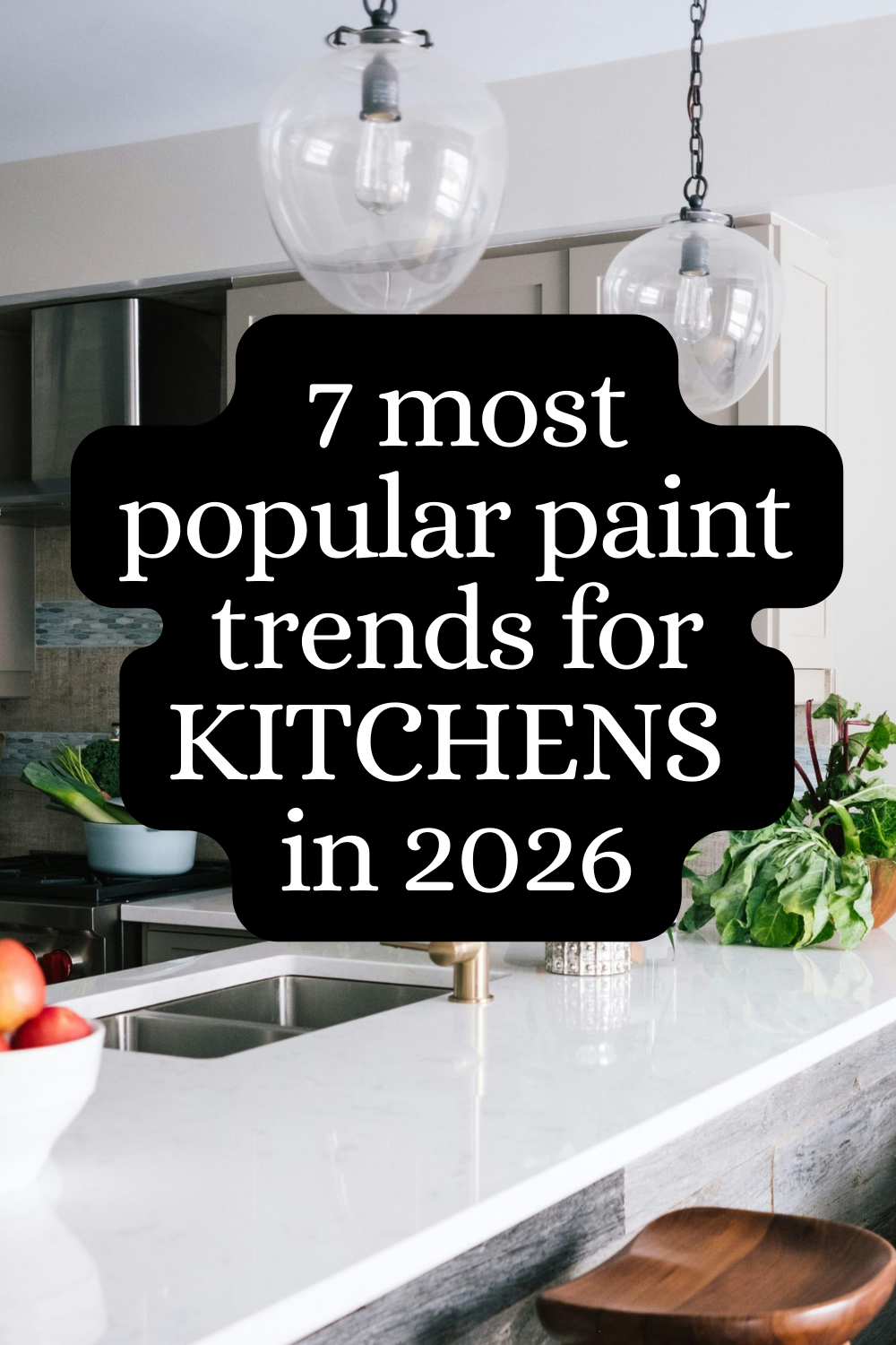
The kitchen remains the heart of the home, and color continues to be a powerful tool for shaping its atmosphere. In 2026, paint trends for kitchens emphasize a blend of warmth, functionality, and subtle sophistication. Designers are leaning toward palettes that ground spaces in nature, while still allowing rooms to feel bright, modern, and easy to maintain. The evolving approach to kitchen color takes into account the practical realities of daily life—susceptibility to splashes, fingerprints, and wear—without sacrificing style. This article distills seven prevailing trends that have emerged among designers and color experts, offering guidance on how to interpret them for various kitchen configurations, from compact urban layouts to expansive open plans.
In recent years, the popularity of neutral bases has grown, but the 2026 trend cycle broadens these neutrals with texture-forward finishes and carefully selected accent hues. The objective is not to overwhelm a space but to create a sense of cohesion that complements cabinetry, countertops, and hardware. The resulting looks range from calm, muted schemes ideal for traditional or transitional kitchens to more dynamic, statement-making combinations suitable for contemporary or industrial-inspired designs. The emphasis remains on creating durable, washable surfaces that resist daily wear while maintaining depth and character.
In practice, homeowners and designers are experimenting with color in multiple ways: painting both walls and islands in complementary tones, using two-tone cabinets for visual interest, and applying strategic pops of color through features like islands, backsplashes, or shelving. In all cases, the focus is on achieving a balanced, well-considered palette that supports the kitchen’s function and the home’s overall aesthetic.
In this context, paint finishes play a crucial role. The 2026 outlook highlights washable matte or eggshell sheens, versatile satin finishes, and durable acrylic or latex paints capable of standing up to steam, splashes, and high traffic. With the right finish, even dark shades can feel light and inviting, while lighter tones can become cozy and intimate when paired with the right materials and textures. The result is a kitchen that feels curated and thoughtful, yet comfortable enough for everyday living.
In summary, the 2026 paint landscape for kitchens centers on color as a strategic design tool. By selecting palettes that harmonize with cabinetry and hardware and prioritizing practical finishes, homeowners can achieve spaces that are both beautiful and functional for years to come.
In-Depth Analysis
The 2026 kitchen paint trends reflect a nuanced approach to color that goes beyond mere aesthetics. Several core themes recur among designers, color consultants, and trend reports:
1) Grounded Neutrals with Texture
Neutral bases—such as warm beiges, soft greiges, and taupes—remain foundational in many kitchens. The twist in 2026 is the introduction of texture and depth within these neutrals. This can be achieved through subtle undertones, layered washes, or the use of finishes with a slight tactile quality, like heathered or sanded appearances. The goal is to avoid flatness while preserving a versatile backdrop that works across different lighting conditions and neighboring materials.
2) Earthy Greens as a Subtle Statement
Green remains a popular choice, but the trend in 2026 emphasizes muted, nature-inspired greens rather than bright, saturated shades. Sage, olive, and mineral greens can bring a sense of calm and connection to the outdoors. When used on walls, islands, or cabinetry, these greens pair well with warm woods, stone countertops, and natural textures. They also offer a versatile backdrop for metallic hardware and varied backsplash materials.
3) Warm Terracotta and Clay Tones
Warm terra-cotta-inspired colors add warmth and character without overpowering a space. These hues work particularly well in kitchens that lean traditional, rustic, or Mediterranean-inspired. When applied to walls or cabinetry, terracotta tones benefit from contrast with cooler countertop materials (like veined marble or cool-toned quartz) and complementary metallic accents.
4) Moody, Yet Adaptable Blues
Deep blues can anchor a kitchen, creating a sense of depth and sophistication. In 2026, the most successful applications use blues with breathable undertones—colours that feel less intense in daylight but reveal their richness under evening lighting. Pair these blues with light countertops, white or pale cabinetry trims, and warm metallic hardware to prevent the space from feeling too heavy.
5) Accessible Whitish-Offsets and Off-Whites
Bright, clean whites remain a staple, yet there’s an increasing preference for softer whites with subtle warmth. These off-whites help reflect light and make smaller kitchens feel more expansive while avoiding the starkness associated with pure white. When used on walls or cabinetry, these shades benefit from a gentle contrast against natural wood tones or darker accents.

*圖片來源:Unsplash*
6) Elevated Two-Tone Looks
Two-tone schemes continue to be popular, providing a way to introduce color without committing to an entire room. Designers experiment with pairing lighter wall colors with darker island cabinetry or with two distinct cabinet colors that still read as a cohesive system. This approach also makes it easier to hide wear in high-traffic zones and offers opportunities for playful, scenario-based color storytelling.
7) Durable, Washable Finishes
Beyond color, finish quality has matured. In 2026, there is a stronger preference for washable, scuff-resistant finishes that can withstand fingerprints and splashes. Matte or eggshell sheens are popular for their modern, low-reflection appearance, while satin finishes offer a bit more durability and easier cleaning in busy kitchens. Acrylic- or latex-based paints are favored for their resistance to staining and their ability to maintain color integrity over time.
Practical guidance for applying these trends includes: testing color samples in real kitchen conditions (with natural light at different times of day and under artificial lighting), considering cabinet and countertop harmonies, and prioritizing finishes that balance aesthetic goals with maintenance practicality. It’s also important to consider the overall lighting scheme, as the same color can read differently under warm versus cool light, and the presence of natural materials can dramatically influence perceived tone.
Perspectives and Impact
The shift toward nuanced neutrals and nature-inspired hues signals a broader trend in interior design: color is now viewed as a core material, akin to stone, wood, and metal, rather than as a decorative accessory. This has several implications for homeowners, contractors, and designers:
- Flexibility in design systems: A well-chosen palette that anchors the kitchen enables easier changes in hardware, textiles, or accessories over time without requiring a full renovation. Neutral bases with textured depth, for example, can handle seasonal updates or swaps in accent colors.
- Coordination across the home: Kitchens increasingly influence adjacent living spaces. Coordinating wall colors with dining rooms or living areas ensures a cohesive spatial narrative. Naturalistic greens or terracotta tones can bridge the kitchen with adjacent spaces that feature wood tones or earthy materials.
- Longevity and practicality: Durable, washable finishes extend the life of a kitchen paint job, reducing maintenance concerns in high-traffic areas. This shift supports busy households and open-concept layouts where the kitchen remains visually connected to other zones.
- Environmental and material considerations: The trend toward nature-inspired colors often aligns with a broader interest in sustainable materials and biophilic design. Consumers may seek paints with low VOCs and certifications that reflect environmental responsibility.
Future implications include greater emphasis on lighting design as a critical factor in how paint reads in a space. As smart lighting becomes more prevalent, homeowners may adjust color perception through adjustable-color temperature bulbs or layered lighting plans to maximize the intended mood. Additionally, as materials evolve—new cabinet finishes, countertops, and wall textures—the interplay between color and material will continue to shape kitchen aesthetics in evolving ways.
Key Takeaways
Main Points:
– Grounded neutrals with texture provide versatile backdrops that stay relevant across design cycles.
– Muted greens and warm earth tones offer a connection to nature while remaining sophisticated.
– Moody blues and elevated two-tone schemes deliver depth and visual interest without overwhelming the space.
– Durable, washable finishes are essential for practicality in high-traffic kitchens.
Areas of Concern:
– Color choices must account for lighting variations across different rooms and seasons.
– Overly dark palettes in small or north-facing kitchens can make spaces feel cramped if not balanced carefully.
– Maintenance requirements for certain finishes may influence color longevity and appearance over time.
Summary and Recommendations
For readers planning a kitchen refresh in 2026, the dominant message is to treat color as a foundational design element rather than a cosmetic add-on. Start with a cohesive color system anchored in grounded neutrals with texture, and then layer in nature-inspired greens, terracotta accents, or moody blues as your focal points. Consider a two-tone approach to introduce visual interest without sacrificing practicality in high-traffic zones like islands and backsplashes.
Finishes matter as much as hues. Opt for washable matte, eggshell, or satin finishes with proven stain resistance and ease of cleaning. Prioritize paints with low VOCs and reputable durability ratings to ensure the color remains vibrant and the surface remains easy to maintain through daily use. Always test swatches in real kitchen conditions—observe them in the morning, afternoon, and evening, under both natural and artificial light—before committing to a color family.
If you’re unsure where to begin, collaborate with a color consultant or a design professional who can translate the seven trends into a personalized plan that suits your space, lifestyle, and budget. A thoughtful approach will yield a kitchen that feels cohesive, timeless, and comfortable for daily living, while still embracing the fresh energy of 2026’s most influential paint trends.
References
– Original: https://abeautifulspace.co.uk/7-top-paint-trends-for-kitchens-in-2026-designers-are-obsessed/
– Additional references:
– [Home design color trends 2026 – sources and expert insights]
– [Paint finish guide: choosing the right sheen for kitchens]
– [Biophilic design and color: connecting interiors to nature]
Note: The above references are placeholders for context. Please replace with real, reputable sources as needed.

*圖片來源:Unsplash*