TLDR
• Core Points: 2026 living rooms favor warm neutrals, earthy tones, and accessible color pairings that balance calm with subtle drama.
• Main Content: The year’s top palettes emphasize versatility, sustainability, and adaptability to varied lighting and furnishings.
• Key Insights: Undertones matter; many trends lean toward soft greens, warm beiges, cool grays with warmth, and nostalgic yet modern hues.
• Considerations: Lighting, room size, and existing furniture influence hue choice; test swatches in different hours.
• Recommended Actions: Start with a neutral base, layer with accent colors, and consider finishes and textures to achieve depth.
Content Overview
The 2026 paint color landscape for living rooms centers on creating welcoming, flexible spaces that harmonize with modern lifestyles. As homes evolve to accommodate work-from-home areas, social zones, and multifunctional layouts, color choices are shifting away from loud statements toward curated palettes that feel timeless, soothing, and easy to maintain. The trends highlighted for 2026 emphasize warm neutrals, earthy undertones, and nuanced contrasts that work across various architectural styles—from contemporary to traditional. The focus is on palettes that play nicely with natural light, textiles, wood finishes, and accent furnishings, enabling homeowners to refresh their spaces without a full remodel. In addition to the aesthetics, there is growing attention to sustainability and the practical realities of living in a room that serves multiple purposes, including relaxation, entertainment, and productivity. The goal is to provide accessible, versatile color options that help homeowners craft cohesive rooms with depth and character.
In-Depth Analysis
The 2026 trend report for living room paint colors spotlights a preference for warmth and gentleness over stark contrasts. This reflects a broader shift toward comfort-first design, where color supports mood, functionality, and adaptability. A core theme is the use of warm neutrals as versatile backdrops. Colors in this category typically sit in the beige, taupe, greige, and soft cream spectrum, often with gentle undertones of yellow, pink, or green. These hues act as reliable anchors for diverse furniture styles, art collections, and textiles, reducing the risk of color clashes as room elements change over time.
Within the neutral-heavy palettes, many designers emphasize undertone awareness. A neutral gray with warm undertones can feel more inviting than a cool gray that reads as stark in daylight. Similarly, warm beiges and creams can shift perceptibly with lighting, requiring careful swatch testing. Consumers are encouraged to observe how a chosen shade behaves at different times of day and under artificial lighting to ensure it maintains the desired warmth or softness.
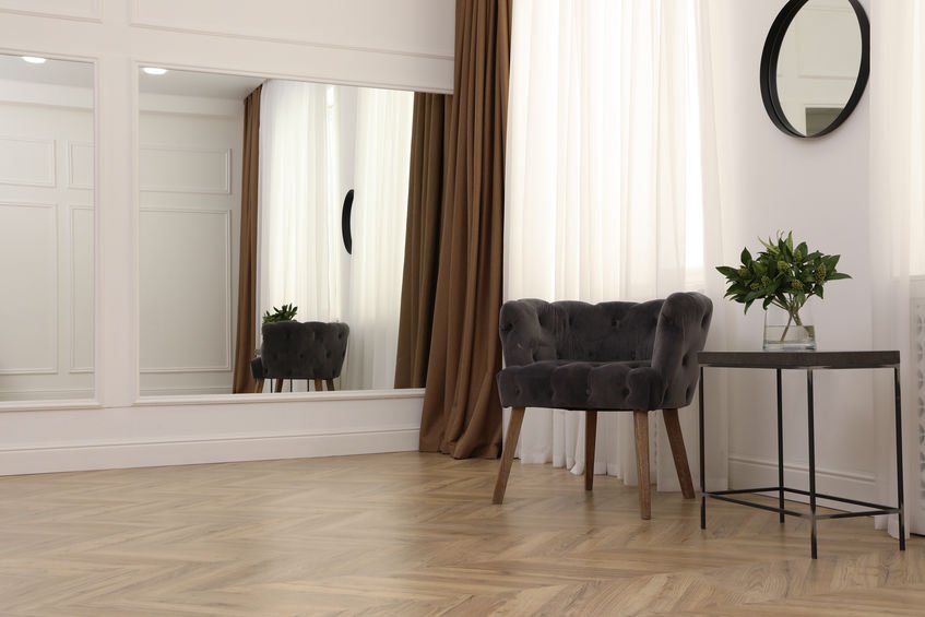
Earthy tones are another prominent direction for 2026. Sage greens, olive greens, terracotta-inspired reds, and sand-like browns offer organic grounding and bring a sense of nature indoors. These colors pair well with natural materials such as wood, linen, jute, and stone, enhancing a room’s tactile experience. The earthy family often appears in wall color choices that are not too saturated, allowing the room to breathe while still providing personality. These hues can be layered with lighter trim and brighter accents to avoid a cocoon-like effect.
Coolers with a soft edge also feature in contemporary living rooms. Muted blues and cooler grays, when balanced with warmer accents, create a modern, sophisticated mood without feeling clinical. This balance is achieved through strategic use of textiles, artwork, and decorative objects that introduce warmth through color echoes—think warm-metal lighting, wood furniture, or ochre-toned cushions.
Nostalgic and timeless shades are making a quiet comeback. Designers highlight colors that nod to mid-century modern, traditional, or vintage palettes while remaining fresh. The emphasis is on moderation rather than bold novelty. A modern take on classic hues—such as a soft olive, a dusty mauve, or a subdued navy—can deliver depth while maintaining broad appeal. This trend is particularly effective in spaces that require longevity beyond seasonal design fads.
Finishes and textures are important as color alone cannot convey depth. Matte and eggshell finishes reveal subtle shifts in tone as light moves across surfaces, while more satin or low-luster sheens can catch highlights to illuminate architectural details. Textural contrasts—plush textiles, wicker, or raw wood—help a paint color feel rich and dimensional. In some cases, homeowners are choosing accent walls with bolder tones or richer saturation to create visual interest without overwhelming the entire room.
Beyond aesthetics, the 2026 color conversation intersects with practical considerations. Light exposure, room orientation, and the presence of large windows all influence how a color reads in a space. A color that looks serene in a north-facing living room may read cooler or flatter in a sun-filled southern exposure. The recommended approach is to test colors in situ, using large swatches to assess how they transform from morning to evening and under different lamps.
Accessibility and sustainability are also shaping contemporary color thinking. Some brands emphasize low-VOC formulations and consider long-term color durability, recognizing that a well-chosen shade can reduce perceived maintenance and replacement needs. Homeowners may seek colors that hide minor imperfections or marks better, favoring tones with warmer bases that mask wear more effectively over time.
In terms of application, the trend guidance suggests starting with a flexible neutral foundation and incorporating color through soft furnishings, artwork, and decor accents. This strategy reduces commitment risk and allows you to adjust your palette as tastes or trends evolve. It also enables more experimentation with textures, such as layering nubby fabrics or incorporating natural finishes that catch light differently throughout the day.
Overall, the 2026 palette recommendations prioritize environments that feel curated yet relaxed, adaptable to various living patterns, and aligned with a sense of natural ease. The recommended color direction invites homeowners to think of paint as a backdrop that supports furniture, textiles, and personal style, rather than dominating the room or dictating the entire mood. By embracing warmth, earthiness, and nuanced contrasts, living rooms in 2026 are positioned to be comforting, versatile, and enduring spaces.

*圖片來源:Unsplash*
Perspectives and Impact
The color trends for 2026 hold implications for both designers and homeowners. For designers, the emphasis on adaptable neutrals and earthy accents encourages a more modular approach to space planning. Rooms are conceived as interconnected environments where color serves to unify disparate zones—such as a living area that flows into a dining or home office space. This requires thoughtful coordination of color across the entire home or open-plan layouts to maintain cohesion while allowing individual rooms to express personality.
For homeowners, adopting these trends offers a practical path to refresh without a full overhaul. By choosing a flexible neutral as the base and layering with sustainable materials and textures, households can update the ambiance without frequent repainting. The softer, warmer palettes are also more forgiving of wear and common household mishaps, which can be advantageous for families with children or pets. Additionally, the move toward earthy tones aligns with broader environmental values, encouraging a connection to nature through color and material choices.
Lighting remains a pivotal factor in how these trends are realized. As lighting types evolve with energy efficiency and smart controls, color perception may shift. Homeowners should consider supplementing natural daylight with layered lighting—ambient, task, and accent—to optimize how walls and surfaces transform throughout the day. Similarly, the integration of color with textiles and furnishings means purchases in these domains can significantly impact the room’s overall harmony. A well-chosen rug or upholstered piece can elevate a wall color, while a mismatched piece could disrupt the intended mood.
In terms of market impact, paint brands offering wider swatches with validated undertones and color-matching tools will help consumers implement these trends more confidently. The ability to preview color with digital tools, sample swatches at scale, and observe undertone behavior across lighting conditions is crucial for successful adoption. Retail environments that provide in-store lighting setups and instant color testing can further empower homeowners to make informed choices.
From a design education perspective, these trends illustrate a continuing shift toward sustainability, comfort, and timelessness. Students and professionals may see an increased emphasis on evaluating color in relation to fabric, furniture, and architectural features rather than as an isolated decision. This holistic approach supports more thoughtful, enduring design outcomes.
As homes become more multi-functional, color strategies that accommodate different activities within a single space will gain traction. A living room may simultaneously serve as a reading nook, a home office corner, and a space for family gatherings. The chosen palette needs to be versatile enough to support all these roles without constant reconfiguration of décor. The 2026 trends respond to this need by offering adaptable hues that cooperate with various uses and evolving preferences.
Looking ahead, the ongoing dialogue between color science, material technology, and human psychology suggests that future palettes will continue to favor warmth, approachability, and subtle sophistication. As paint technologies advance, there may be new finishes or coatings that further enhance color perception, durability, and maintenance. The central takeaway is clear: the most successful living room color schemes of 2026 are those that stay flexible, connect with nature, and embrace the comfort of home.
Key Takeaways
Main Points:
– Warm neutrals underpin versatile living room backdrops.
– Earthy greens and terracotta-inspired tones add natural grounding.
– Balanced cool hues with warm undertones create contemporary sophistication.
– Texture, finish, and lighting crucially influence color perception.
– Timeless, nostalgic shades can provide depth without feeling dated.
Areas of Concern:
– Undertone misreading can lead to mismatched walls and furnishings.
– Overreliance on one neutral can risk a bland space; layering is key.
– The same color may read differently under varying light conditions; thorough testing is essential.
Summary and Recommendations
For homeowners aiming to refresh a living room in 2026, the recommended approach is to start with a flexible, warm-neutral base. This foundation works across different furniture styles and ensures longevity beyond transient trends. Layer this base with earthy greens and browns to establish an organic connection with the space, complemented by subtle pops of color in textiles and artwork. When incorporating cool-toned accents, ensure they are tempered with warmer undertones and balanced by warm lighting and natural materials to maintain coziness.
An essential practical step is to test paint in situ. Apply large swatches on multiple walls and observe color behavior under natural daylight, as well as under your typical lighting setup at different times of day. Consider finishes that add depth without glare, such as matte or eggshell sheens, which tend to interact pleasantly with textures in fabrics and wood. Pair paints with textures—linen, wool, jute, and wood—so the color can interact with tactile experiences, enhancing the room’s overall mood.
For a cohesive look, extend the chosen palette beyond walls to furnishings, décor, and architectural details. If your space includes an open-plan layout or multiple zones, carry color relationships across areas to unify the environment without stifling individuality. Finally, prioritize sustainability and indoor air quality by selecting low-VOC paints and materials that align with a mindful, long-term furnishing strategy. By following these guidelines, homeowners can create living rooms in 2026 that feel inviting, adaptable, and enduring.
References
– Original: https://abeautifulspace.co.uk/10-most-popular-living-room-paint-colours-trends-in-2026/
– Additional references:
– https://www.bhg.com/home-improvement/paint/
– https://www.housebeautiful.com/room-decorating/colors/g3490/paint-color-trends-2026/

*圖片來源:Unsplash*