TLDR
• Core Points: In 2026, living rooms embrace warm neutrals, serene greens, rich earthy tones, and bold accent colors to create inviting, versatile spaces.
• Main Content: The year’s top paint trends focus on warmth, depth, and adaptability, with recommendations for palettes, finishes, and application contexts.
• Key Insights: Balanced color strategies pair timeless neutrals with statement hues, while textures and lighting shape the overall mood.
• Considerations: Lighting, room function, and architectural style influence color choices; sample testing is essential.
• Recommended Actions: Select a primary wall color, add complementary accent tones, and use finishes to control depth and reflectivity; test samples before full application.
Content Overview
The living room continues to be a central hub for comfort, work, and social connection. In 2026, color psychology and practical design converge to guide homeowners toward paint palettes that are flexible, durable, and aesthetically soothing. The trend landscape emphasizes warm neutrals that feel timeless yet contemporary, greens and earthy tones that evoke nature, and strategic use of bold accents to provide personality without overwhelming the space. These color directions are paired with finishes and application strategies designed to enhance lighting, texture, and architectural features. Whether you favor a minimalist backdrop or a richly layered room, the goal is to create a space that adapts to changing needs—from daily routines to entertaining guests—without requiring frequent color refreshes. This article outlines the 10 most popular living room paint color trends for 2026, offering practical guidance on where each hue shines, how to combine hues harmoniously, and what to consider before committing to a final palette.
In-Depth Analysis
1) Warm Neutrals: Foundation for Flexibility
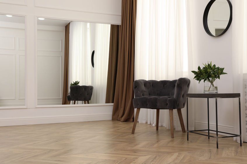
Neutral tones with warm undertones continue to lead, providing a dependable backdrop that accommodates a wide range of furniture, textiles, and artwork. Think soft beiges, creamy ivories, and warm taupes. These shades work well in open-plan living rooms and spaces with abundant natural light, where they lift the mood without overpowering other design elements. Finishes such as eggshell or satin offer a subtle sheen that catches light without reflecting too much glare. Strategy tip: build depth with slightly varying neutrals on different walls or pair a warm neutral with cooler accents to keep the space interesting.
2) Creamy Whites with Depth
Off-whites that lean toward cream or butter tones add warmth while preserving a bright, airy feel. These colors are particularly effective in rooms with ample natural daylight, as they avoid the sterile look of pure white while maintaining versatility. Complement creamy whites with natural materials—wood, stone, linen—to emphasize texture and tactility. Lighting is crucial here: consider layering ambient, task, and accent lighting to prevent flatness or excessive contrast.
3) Sage and Soft Greens: Nature-Inspired Calm
Soft greens, including sage and dusty olive, have gained traction for their soothing influence and versatile pairing options. These greens pair gracefully with wood finishes, earthy ceramics, and botanical textiles. They suit both contemporary and traditional spaces, from living rooms with clean lines to more classic, paneled interiors. Finishes should stay muted to preserve the tranquil effect; avoid overly saturated greens in small rooms where light reflects more strongly.
4) Forest and Olive Undertones: Depth with Drama
Deeper greens and olive tones add a sense of drama and sophistication, especially in larger rooms or spaces with strong architectural character. These hues work well on feature walls, libraries, or seating alcoves, creating a cozy, intimate atmosphere. Pair with warm metals (brass, aged copper) and rich textiles to enhance the sense of depth. In smaller spaces, use these tones as accents or on a single wall to avoid overpowering the room.
5) Earthy Clay and Terracotta: Grounded Warmth
Clay-inspired colors—terracotta, burnt sienna, and clay-based neutrals—bring warmth and a tactile, grounded feel. These hues are particularly effective in rooms that double as social hubs, where warmth and hospitality are desired. They pair beautifully with natural fiber rugs, woven textures, and terracotta pottery. Consider using these shades on accent walls or ceiling coffers to create an inviting focal point without saturating the entire room.
6) Charcoal and Deep Grays: Modern Contrast
Charcoal and deep gray tones offer a contemporary counterpoint to lighter neutrals. They provide sophistication, define architectural features, and emphasize furniture silhouettes. When using dark walls, balance with lighter furnishings, reflective surfaces, and adequate lighting to prevent the space from feeling closed in. A common approach is to apply a dark shade on a single wall or in seating nooks, while keeping the rest of the room lighter.
7) Navy and Indigo: Dramatic yet Versatile
Rich blues like navy and indigo create a bold, timeless look that works across styles—from coastal to modern minimalist. Navy walls can visually anchor a room, especially when paired with crisp whites, brass hardware, and natural wood tones. For smaller rooms, lighter accompaniments prevent heaviness; consider using navy on an accent wall or in trim details rather than the entire space.
8) Soft Charcoal Blues and Blues-Greens: Subtle Coolness
Subdued blue and blue-green hues offer a refined, tranquil mood suitable for living rooms that function as retreat spaces or home offices. These cool tones pair well with cool white or pale gray accents and driftwood-inspired textures. Use them to create a coastal or contemporary look, depending on complementary materials and furniture choices.
9) Muted Terracotta-Rose and Blush-Toned Pinks: Gentle Warmth
Soft pinks and rose-tinted neutrals bring a gentle warmth without overpowering the room. These hues work superbly in rooms that aim for softness and comfort, especially when paired with natural materials like linen, rattan, and light wood. They pair well with brass or copper accents to add a touch of elegance and warmth.
10) Matte Finishes and Subtle Sheen: Texture and Light
Beyond color, finishes play a crucial role in perception. Matte and low-sheen paints reduce glare and enhance color depth, while satin or eggshell finishes provide a balanced glow that highlights architectural details. In living rooms with ample daylight, flatter finishes can read as serene backdrops; in rooms with dramatic lighting or textured walls, slightly higher sheen can accentuate features. The trend is toward finishing choices that harmonize color with the room’s lighting and material palette.
Additional Context and Application Tips
– Environmental and health considerations: Many homeowners are seeking low-VOC, low-odor paints to minimize indoor air quality concerns. When selecting colors, consider the impact on indoor air quality and choose products that meet relevant certifications.
– Sample testing and scale: Always test paint samples on multiple wall areas under different lighting conditions (morning, afternoon, artificial light). Colors can shift dramatically depending on natural light and surrounding materials.
– Layering and texture: Use textiles, cabinetry, and wall treatments to layer color. A single hue can express different moods through finished surfaces, textures, and lighting, enabling a flexible design that evolves with time.
– Coordination with furniture and decor: The choice of wall color should harmonize with upholstery, rugs, and art. Neutral backdrops make colorful accents pop, while bold wall colors demand careful balancing with more muted furnishings.

*圖片來源:Unsplash*
Perspectives and Impact
Paint color trends for 2026 reflect a broad shift toward elements that promote calm, versatility, and a sense of connection to nature. The movement toward warm neutrals and nature-inspired greens suggests homeowners are prioritizing spaces that feel welcoming and timeless, even as furniture and decor evolve with trends. The inclusion of deeper chromatics like navy, charcoal blues, and forest greens reveals an interest in creating anchor points within open-concept living areas, enabling residents to designate zones for conversation, relaxation, and work without sacrificing cohesion.
The emphasis on finishes and textures underscores a growing understanding that color is only part of the design equation. The same hue can read very differently depending on finish, lighting, and surrounding materials. This holistic approach supports more durable interior environments, where rooms can adapt to seasonal changes, different occupancy patterns, and evolving stylist preferences without demanding a complete repaint.
Moreover, the trends indicate a balanced desire for modern sophistication while preserving warmth and comfort. By integrating soft neutrals with nature-inspired tones and selective bold accents, designers and homeowners can craft living spaces that feel both contemporary and enduring. This approach is particularly relevant for multi-use homes where the living room functions as a hub for family time, remote work, entertaining, and relaxation.
Looking forward, color experts anticipate continued evolution toward palettes that respond to sustainability, light management, and personal expression. As digital tools enable more precise color visualization, homeowners will experiment with layered palettes that align with architectural features, cabinetry, and textiles. The trends in 2026 position the living room as a flexible canvas—one that accommodates changing moods, seasons, and life stages while maintaining a grounded sense of style.
Practical considerations for implementation include assessing natural light patterns, room size, and existing furniture before selecting a palette. Lighter neutrals work well in small or poorly lit rooms, while deeper tones can add drama and warmth in larger, well-lit spaces. The strategic use of accent walls, trim, and ceiling colors can further refine the room’s balance, helping to avoid color overkill and ensuring a cohesive look.
Culminating guidance for homeowners is clear: choose colors that align with how you live in the space. Color can influence mood and energy—so select hues that support your daily activities, reflect your taste, and endure beyond fleeting fashion. With thoughtful planning, the 2026 palette trends offer ample opportunity to refresh a living room with personality, warmth, and enduring appeal.
Key Takeaways
Main Points:
– Warm neutrals and creamy whites provide flexible backdrops for varied styles.
– Nature-inspired greens and earthy tones contribute calm, grounding vibes.
– Deep blues and charcoal add structure and sophistication; use as accents to avoid heaviness.
Areas of Concern:
– Overusing dark colors can make small rooms feel cramped; balance with lighter elements.
– Color shifts with lighting require thorough testing across times of day.
– Finishes matter: texture and sheen significantly affect perceived color depth.
Summary and Recommendations
For 2026, the most successful living room color strategies blend warmth, natural inspiration, and purposeful contrast. Start with a versatile neutral foundation—warm beige, cream, or light taupe—that supports furniture and art while remaining adaptable to future changes. Introduce nature-inspired greens or earthy clay tones on accent walls or focal points to create inviting depth and a sense of connection to the outdoors. If you want a more dramatic atmosphere, reserve deep blues, charcoal grays, or forest greens for selected walls or architectural features, balancing them with lighter upholstery and reflective surfaces to maintain openness.
Beyond hue selection, emphasize finish and texture to maximize impact. Matte or eggshell paints minimize glare and reveal subtle color nuance, while satin finishes can highlight architectural details and textures. Layer lighting to enhance color perception and mood—consider warm ambient lighting to soften neutrals, or cool white light to accentuate blues and greens. Finally, test color samples in the room under different lighting conditions and with nearby materials to ensure the palette behaves as intended.
By following these guidelines, homeowners can achieve a refreshed living room that feels current yet timeless, with a palette that adapts to life’s normal changes and evolving decor preferences.
References
- Original: https://abeautifulspace.co.uk/10-most-popular-living-room-paint-colours-trends-in-2026/
- Additional reference 1: https://www.houseandhome.com/decorating-design/2026-paint-colors-trends/
- Additional reference 2: https://www.decoist.com/2025/12/painting-trends-2026-colors/

*圖片來源:Unsplash*