TLDR
• Core Points: Exterior colour choices in 2026 balance timeless neutrals with expressive accents, emphasizing curb appeal, sustainability, and architectural harmony.
• Main Content: A curated look at seven top exterior colour trends for 2026, with context on palettes, finishes, regional considerations, and maintenance.
• Key Insights: Neutrals remain foundational, bold accents are gaining traction, and climate-conscious finishes influence selection.
• Considerations: Inspect substrate, test colours in natural light, and coordinate with roofing, trim, and landscape.
• Recommended Actions: Choose a dominant neutral, add a character colour for architectural emphasis, and consult a professional for long-term durability.
Content Overview
The exterior colour of a home shapes first impressions, influences perceived size, and interacts with surrounding landscape and climate. For 2026, design guidance emphasizes a thoughtfully balanced approach: select a dependable base that reflects architectural style and regional lighting, then introduce accent tones to highlight features such as entryways, windows, and structural lines. Practical considerations—durability, fade resistance, and maintenance—work in concert with aesthetic aims to ensure longevity and curb appeal.
This article synthesizes current trends in exterior colours for 2026, drawing from design professionals, material recommendations, and consumer interests. It provides a framework for homeowners to navigate palette decisions across a spectrum of architectural styles—from modern minimalism and farmhouse-inspired homes to traditional brick and refined stucco façades. By examining seven distinct colour directions, readers can identify palettes that align with their home’s orientation, roof colour, siding material, and local climate while maintaining a cohesive relationship with the landscape and neighbourhood context.
In-Depth Analysis
The seven trending exterior colour directions for 2026 each offer a distinct way to refresh a home’s façade while aligning with practical considerations such as durability, maintenance, and energy efficiency. Below, we unpack these trends, including palette characteristics, recommended finishes, and scenarios where they tend to shine.
1) Timeless Neutrals with Subtle Warmth
Overview: Neutral bases—soft beiges, greiges, and off-whites—continue to anchor exteriors, offering versatility across architectural styles. The warmth level is slightly elevated to avoid a sterile look, creating inviting façades that pair well with natural landscapes.
Palette tips:
– Base: Warm ivory, light greige, or greige-taupe with low reflectance.
– Trim and accents: Classic white or a slightly darker neutral to define architectural details without high contrast.
– Finish: Low-sheen or satin to hide minor imperfections and reduce glare in sun exposure.
Best fits: Homes with stone, brick, wood siding, or mixed cladding; coastal or rural settings where soft light is prevalent.
Maintenance considerations: Neutrals can show dust and staining more readily, so consider semi-gloss coatings for higher durability in high-traffic areas or splashes near entryways.
2) Grounded Earth Tones for a Natural Look
Overview: Earth-inspired palettes draw from surrounding soil, foliage, and rock, creating harmonized exteriors that feel integrated with the landscape. These colours work well on timber, stucco, and brick elements and can soften modern profiles.
Palette tips:
– Base: Clay, sand, olive, or muted sage as primary tones.
– Accents: Deeper olive, charcoal, or slate for architectural lines, doors, and shutters.
– Finish: Flat to satin with good UV resistance to avoid excessive fading over time.
Best fits: Homes with strong landscape presence, terracotta roofing, or natural stone accents.
Maintenance considerations: Earth tones generally hide dirt better but may require sun-sensitive products to maintain colour consistency across seasons.
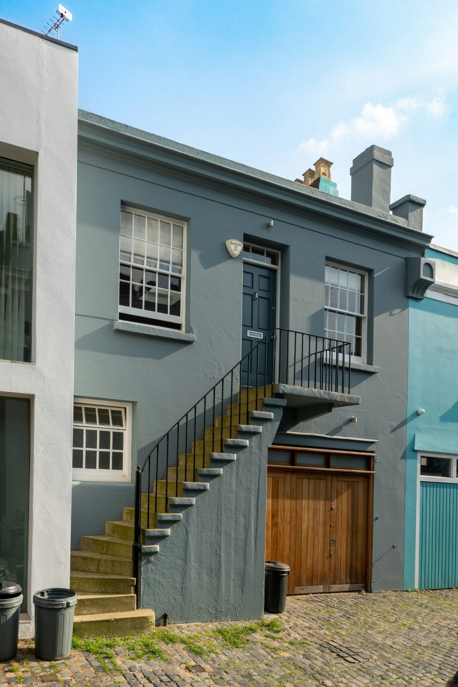
3) Bold Accents on Neutrals for Architectural Drama
Overview: A restrained neutral base paired with bold accents emphasizes entryways, trim, or architectural features without overwhelming the entire façade. This approach balances contemporary energy with classic sophistication.
Palette tips:
– Base: Light neutral (cream, warm white, or pale gray).
– Accent: A saturated hue on doors, shutters, or a single architectural feature (e.g., charcoal, navy, forest green, or deep blue-gray).
– Finish: Durable exterior enamel on accents to achieve clean lines and long-lasting colour.
Best fits: Modern homes, transitional styles, and houses with clean lines or mixed materials.
Maintenance considerations: Accent colours should be chosen with consideration for fading resistance; darker accents may require more frequent touch-ups in hot climates.
4) Monochromatic Depth for Modern Minimalism
Overview: A monochrome approach uses variations of a single colour family to sculpt depth and dimensionality. Subtle shade transitions across siding, trim, and doors create a sophisticated, cohesive look.
Palette tips:
– Base: A single colour family ranging from light to mid-tone.
– Variations: Deploy lighter shades on larger wall planes and deeper tones on recessed areas, entry frameworks, or mullions.
– Finish: Semi-gloss or satin on trim areas to reinforce structure without glare.
Best fits: Contemporary residences, flat-surfaced exteriors, and homes seeking a cohesive, quiet presence.
Maintenance considerations: Ensure sufficient contrast between planes to avoid a flat appearance, and test natural-light effects across different times of day.
5) Coastal Blues and Sea-Green Palettes
Overview: Cool blues and sea greens evoke oceanic light and airiness, especially on homes near water or with strong morning light. These tones can feel refreshing and modern when paired with white trim.
Palette tips:
– Base: Light to medium blues or greens on siding.
– Accents: White or near-white trims, with deeper blues on doors or shutters for focal points.
– Finish: UV-rated satin or eggshell for a fresh look with moderate sheen.

*圖片來源:Unsplash*
Best fits: Beachfront, lakeside, or houses facing open skies; complements white or light-toned roofs.
Maintenance considerations: Blues and greens tend to show mineral deposits and mildew if moisture control is inadequate; ensure proper drainage and ventilation.
6) Rich Charcoal and Slate for Bold Modernity
Overview: Deep, charcoal-rich exteriors deliver dramatic presence with a contemporary edge. This palette works particularly well with minimal window trim and high-contrast door colours, creating a strong architectural statement.
Palette tips:
– Base: Charcoal, near-black, or deep charcoal-gray.
– Accents: Crisp white or light neutrals for trim; door colours can range from bold red to moss green for a striking welcome.
– Finish: Low or no-gloss for a sophisticated, modern aesthetic; consider a protective topcoat for weather resistance.
Best fits: Modern houses, brick or stucco facades, and homes seeking a high-contrast, editorial look.
Maintenance considerations: Dark exteriors can fade unevenly if not protected; select high-quality, UV-stable coatings and address any colour shift promptly.
7) Warm Residential Blues with Neutral Grounding
Overview: A friendly, approachable palette that uses warm blues as the primary body colour, balanced by warm neutrals and timber accents. The result is a welcoming, traditional-to-transitional vibe.
Palette tips:
– Base: Warm blue with earthy undertones (slate blue, powder blue with warmth).
– Trim and accents: Creamy whites or sand tones; timber elements can be echoed in porch ceilings or railings.
– Finish: Satin or eggshell on siding; semi-gloss on doors for emphasis.
Best fits: Colonial, farmhouse, and bungalow styles; homes with front porches benefit from the inviting aesthetic.
Maintenance considerations: Blues can be forgiving on dirt but require protection from sun fading; layering UV-stable finishes helps maintain vibrancy.
Regional and material considerations
– Siding material: Wood clapboard, fiber cement, brick, stucco, or metal siding respond differently to colour choices. Lighter bases can make older wood grain pop, while darker bases highlight modern textures.
– Roof colour: The roof heavily influences exterior colour perception. Harmonize with roofing to avoid clashing palettes; contrast can be used deliberately to emphasize architectural features.
– Climate and sun exposure: In hot climates, lighter neutrals reflect heat and keep exteriors cooler; in cooler environments, deeper hues can absorb warmth but may require more maintenance.
– Landscaping: Plant palette and seasonal changes interact with exterior colours; consider plant foliage when selecting base and accent tones to avoid visual discord.
Application and testing guidance
– Paint samples: Always test swatches on multiple areas of the façade, including areas in shade and sun, over several days to observe color shifts.
– Finish and sheen: Choose finishes based on the siding material and maintenance expectations; higher sheen stands up to weather but can reveal surface flaws.
– Substrate preparation: Proper cleaning, priming, and sealing extend the life of paint and maintain colour integrity.
– Accessory coordination: Ensure window frames, doors, and trim colours coordinate with the main palette to create a cohesive look.
Durability and sustainability considerations
– UV resistance: Select coatings with built-in UV protection to minimize fading over time.
– Fade longevity: Lighter colours may show dust and grime more readily; consider finishes and maintenance routines that keep the palette looking fresh.
– Environmental impact: Some manufacturers offer low-VOC paints and dyes, contributing to indoor air quality and outdoor environmental stewardship.
Perspectives and Impact
Exterior colour trends for 2026 reflect a broader industry shift toward palettes that balance aesthetic appeal with durability, energy efficiency, and climate responsiveness. Homeowners increasingly seek palettes that:
– Create a sense of rootedness in the landscape while allowing architectural expression.
– Adapt to regional lighting, with neutrals delivering versatility and earth tones providing warmth.
– Offer flexibility for updating other elements (doors, shutters, landscaping) without a full façade overhaul.
– Align with sustainable practices by preferring high-quality, durable finishes that resist fading and weathering.
The emphasis on accent colours—whether on entry doors, window trim, or architectural nooks—suggests that homeowners view the exterior as an opportunity for architectural storytelling. Rather than a single flat colour, the modern exterior becomes a composition of tones that highlight form, texture, and rhythm. As materials evolve (e.g., weather-resistant sidings, advanced stucco textures, and pre-finished metals), colour strategies increasingly consider long-term maintenance and refurbishment cycles.
Industry professionals stress the importance of integrating colour decisions with other design elements: roofing, masonry, landscaping, and exterior lighting. A well-chosen palette can enhance curb appeal, improve perceived value, and contribute to a cohesive neighbourhood aesthetic. In coastal and high-exposure environments, the choice of finishes gains additional relevance, with fade resistance and moisture tolerance guiding product selection.
Future implications include the potential for regionally tailored palettes that respond to microclimates and daylight patterns. As standard lighting and smart-home exterior features become more common, colour choices may also be influenced by how lighting systems render colour at night. Homeowners may increasingly rely on design services to simulate sun and shade variations across the year, ensuring chosen palettes remain compelling year-round.
Key Takeaways
Main Points:
– Seven trends offer diverse paths: timeless neutrals, earth tones, bold accents, monochrome depth, coastal blues/greens, rich charcoals, and warm blues.
– Palette choices should harmonize with roof colour, materials, and landscaping while considering climate and maintenance.
– Accent colours can dramatically influence architectural emphasis without sacrificing harmony.
Areas of Concern:
– Potential fading of darker hues in hot climates; test colour stability under local sun exposure.
– Neutrals may show dust or staining; select finishes that balance appearance with durability.
– Inconsistent lighting can alter perceived colour; pre-visualization and lighting considerations are essential.
Summary and Recommendations
Choosing exterior colours in 2026 is less about chasing a single trend and more about crafting a durable, aesthetically balanced palette that resonates with the home’s architectural language and environment. Start with a timeless neutral base that complements the structure and surrounding landscape. Introduce a carefully selected accent to highlight architectural features and provide character without overpowering the design. Consider climate and material constraints, and select finishes that endure fading, weather, and exposure. Testing colours in real-world lighting conditions remains critical to ensuring the final choice remains appealing across seasons and over time. Collaborating with a design professional or paint specialist can help translate intentions into a practical, enduring exterior that enhances curb appeal and aligns with both personal taste and neighbourhood context.
References
- Original: https://abeautifulspace.co.uk/7-best-home-exterior-colours-in-2026-inspiring-trends/
- 1) Relevant reference: https://www.benjaminmoore.com/en-us/interior-exterior-stains-paints
- 2) Relevant reference: https://www.behr.com/consumer/common-t exterior-colour-trends
- 3) Relevant reference: https://www.paintqualitymagazine.com/exterior-paint-fade-resistance-guide

*圖片來源:Unsplash*