TLDR
• Core Points: The 2026 exterior palette blends timeless neutrals with bold accents, prioritizing mood, climate suitability, and curb appeal.
• Main Content: Trends highlight versatile neutrals, earthy hues, and strategic color-blocking to differentiate architectural features.
• Key Insights: The best exterior colours balance longevity, maintenance needs, and regional climate considerations.
• Considerations: Lighting, substrate material, and architectural style influence colour outcomes; sample testing is essential.
• Recommended Actions: Choose a main neutral, add two complementary accents, test in natural light, and coordinate with roof and trim.
Content Overview
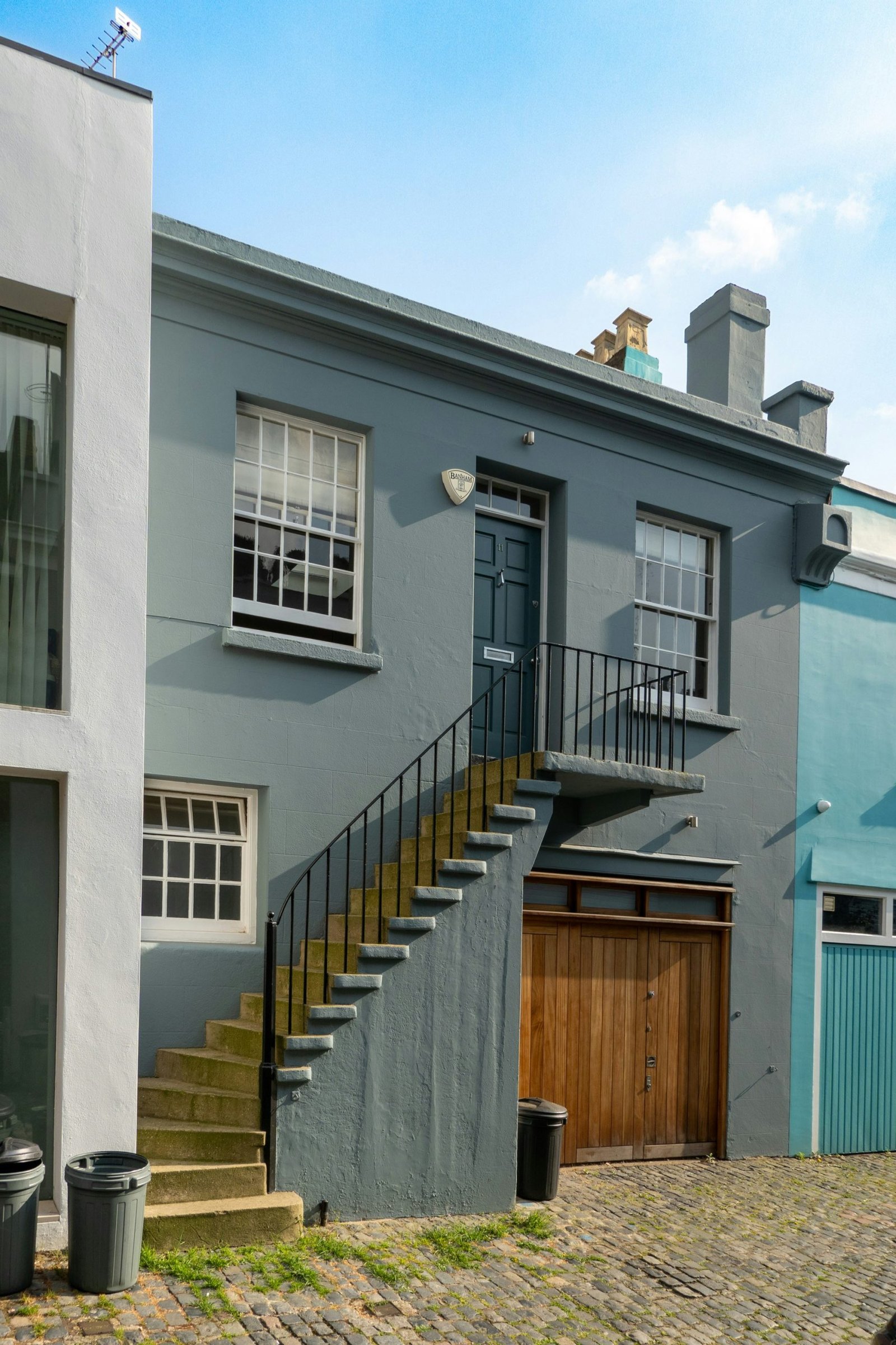
The exterior colour of a home creates the first impression, sets the mood, and interacts with surrounding landscape and climate. For 2026, designers and homeowners are gravitating toward palettes that combine classic neutrals with carefully chosen accents, allowing homes to feel modern without sacrificing timeless appeal. A Beautiful Space’s coverage of the best exterior colours for 2026 emphasizes versatility, maintenance practicality, and the way colour choices can highlight architectural details. The central idea is that the right exterior colour scheme should reflect the home’s character, respond to local weather conditions, and remain aesthetically appealing for years to come.
In 2026, the emphasis is on palettes that offer depth and warmth while maintaining clean lines and curb appeal. Neutrals—ranging from soft beiges and greys to greige tones—continue to dominate, but with refined undertones that harmonize with stone, brick, wood, or composite sidings. In addition to neutrals, earthy greens, rich blues, and warm charcoal or black accents are being used more strategically to draw attention to features such as entryways, shutters, or architectural recesses. The trend also encourages experimenting with colour-blocking to accentuate architectural proportions, balconies, or gables without overwhelming the overall look.
Importantly, the 2026 guidance underscores practical considerations: how the colour behaves in different lighting, the impact of regional climate on durability and fade resistance, and how maintenance routines influence long-term appearance. The article suggests that homeowners should test colour samples on small exterior areas and observe how the hue evolves at different times of day and across seasons. Roof colour, trim, and material finishes should be planned in coordination with the main body colour to ensure cohesion and a timeless finish.
This year’s recommendations also reflect a shift toward sustainable aesthetics. With more homes focusing on energy efficiency, lighter neutrals paired with reflective or energy-conscious coatings can help regulate interior temperatures. Conversely, deeper tones can convey gravitas and sophistication on traditional or modern facades. The key takeaway is balance: choose shades that enhance architectural features, complement natural surroundings, and remain resilient against weathering.
In-Depth Analysis
2026’s best exterior colour selections are not about chasing the latest hue at the expense of practicality. Instead, the most successful palettes hinge on deliberate contrasts and harmonious undertones that enhance the home’s lines and materials. The following themes capture the core directions for contemporary exteriors:
Neutral Foundations with Subtle Depth
Neutral colours remain the backbone of most exterior schemes. Soft whites, greiges, taupes, and light charcoals provide a reliable base that works across architectural styles—from contemporary minimalist to traditional colonial. What distinguishes top choices this year is the undertone stabilization: designers prefer hues with balanced warmth or coolness to prevent the base from looking flat. The goal is a canvas that accepts seasonal lighting shifts and coordinates gracefully with stone veneer, wood accents, or brickwork.Earthy and Nature-Inspired Tones
Earth-inspired greens, clay reds, and taupe-brown combinations help integrate homes with their landscapes. These colours tend to age gracefully and pair well with natural materials. They can be used as primary exterior colours or as accent shades on doors, shutters, cornices, or feature walls. The palette leans into botanical and landscape cues, offering a sense of grounded warmth.Dramatic Accents and Colour-Blocking
Statement accents are increasingly used to highlight entryways, architectural recesses, or upper gables. A lighter body with a deeper door or trim colour can provide focal points without overpowering the structure. Conversely, a dark main body with lighter trim or a bold front door can create striking contrast that remains refined.Depth through Contrast, Not Overload
The strongest exteriors use depth through controlled contrasts rather than an array of competing colours. This means selecting two to three complementary hues—one primary body colour, one secondary trim or accent colour, and a third hue used sparingly for doors or feature elements. The aim is a cohesive look that reads well from curb to gate, with a sense of architectural rhythm.Material and Roof Coordination
Roof colour and material influence exterior perception as much as wall colour. Coordinating the main colour with roof tiles or shingles ensures a unified silhouette. This often means choosing a body tone that either echoes the roof’s warmth or provides a deliberate contrast to emphasize eaves and cornices. The result is a polished, professional finish that withstands weathering and remains visually balanced as materials weather over time.
Practical recommendations for homeowners include sampling large paint chips or boards in natural light, observing how the hue interacts with shading patterns throughout the day, and testing in multiple seasons. Climate considerations—such as heat absorption for lighter colours and fade resistance for darker tones—play a significant role in long-term satisfaction. For coastal or high-humidity regions, finishes with moisture resistance and milder hues can prevent visible mildew or staining. In sunny inland areas, deeper hues may require superior UV protection to maintain vibrancy.
The article also highlights that trends can be adapted to suit different architectural styles. A modern home with flat planes benefits from crisp white or cool grey foundations accented by bold window frames or doors. A traditional house can embrace warmer neutrals with chocolate or charcoal trim and a vibrant door to inject personality while preserving elegance. The versatility of the palette allows homeowners to align exterior colour choices with interior design schemes and landscape plans.
To ensure accuracy and confidence in colour application, professionals advise evaluating the colour in digital renderings and in real-life swatches. Digital tools can help visualize the finished look in different lighting, while physical samples reveal true undertones and texture reflections on rough masonry or smooth siding. The overarching message is that deliberate selection, tested under real conditions, yields the most durable and satisfying exterior.

*圖片來源:Unsplash*
Perspectives and Impact
The 2026 exterior colour trends emphasize accessibility and adaptability. By prioritizing neutrals with thoughtfully chosen accents, homeowners can achieve a timeless appearance that resists becoming dated as trends shift. The impact extends beyond aesthetics:
Market appeal and resale value: Homes with well-coordinated colour schemes that enhance architectural features can attract attention in a competitive market. Curb appeal, bolstered by a strategic exterior palette, often translates into perceived value and faster initial interest.
Maintenance considerations: Lighter neutrals are forgiving for showing dust and dirt, but high-quality finishes and UV-resistant coatings help maintain colour integrity over time. Darker tones can mask dirt but may require more frequent maintenance to prevent fading, especially in sunny climates.
Environmental harmony: Natural-toned exteriors tend to blend with landscapes and can reduce perceived heat gain in some scenarios due to reflective coatings. Selecting environmentally rated paints aligned with energy efficiency goals can contribute to lower cooling costs and improved interior comfort.
Architectural adaptability: The palette supports a wide range of home styles, ensuring that older houses can update their appearance without structural changes, while new constructions can establish a strong, cohesive identity from the outset.
Future-proofing: By focusing on enduring undertones and high-quality finishes, homeowners can extend the life of their exterior colour choice. This reduces the need for frequent repainting and preserves curb appeal through changing fashion cycles.
Implications for designers and homeowners include adopting a modular approach to colour selection: set a neutral base, confirm the undertone compatibility with surrounding materials, and reserve two accent hues for doors, trim, or architectural statements. This strategy supports both aesthetic coherence and practical maintenance across diverse climates and environments.
Key Takeaways
Main Points:
– Neutral foundations with carefully balanced undertones remain central to 2026 exteriors.
– Earthy tones and nature-inspired colours help integrate homes with their surroundings.
– Strategic colour-blocking and accent use highlight architectural features without overwhelming the design.
Areas of Concern:
– Colour performance under varying light and weather conditions requires real-world testing.
– Overly bold combinations can risk dated appearances if not executed with restraint.
– Material and roof coordination are critical to achieving a harmonious exterior.
Summary and Recommendations
For homeowners planning an exterior refresh in 2026, the most reliable path combines a timeless neutral base with intentional accents that highlight architectural features. Start with a main body colour in a neutral family—soft white, greige, taupe, or light charcoal—selecting undertones that complement the home’s materials and the surrounding landscape. Choose one or two accent colours to apply selectively on doors, window trims, shutters, or architectural recesses. This restrained colour-blocking approach produces depth and visual interest without sacrificing cohesion.
Testing remains essential: obtain large paint swatches or sample boards and observe colour behavior under different daylight conditions and across seasons. Consider local climate factors, such as UV exposure and humidity, to choose coatings with appropriate fade resistance and moisture protection. Ensure roof colour and material harmonize with the wall colour to maintain a unified silhouette.
Finally, align exterior colours with any interior design plans and landscape schemes to create a seamless transition from interior to exterior spaces. By embracing the 2026 trends—balanced neutrals, earthy accents, and well-considered contrasts—homeowners can achieve a refined, durable, and aesthetically pleasing exterior that remains relevant for years to come.
References
- Original: https://abeautifulspace.co.uk/7-best-home-exterior-colours-in-2026-inspiring-trends/
- Additional references (relevant to exterior colour trends):
- https://www.decoist.com/exterior-paint-colour-trends-2026
- https://www.housebeautiful.com/room-decorating/outdoor-gardens/g4425/exterior-paint-colors-trends/
- https://www.dulux.co.uk/en/our-insights/articles/2026-paint-colour-trends-exterior

*圖片來源:Unsplash*