TLDR
• Core Points: Exterior color choices in 2026 emphasize timeless neutrals, warm earthy tones, and bold accents that highlight architecture and landscape.
• Main Content: The most popular exterior palettes blend durability with curb appeal, using high-quality finishes and sustainable pigments.
• Key Insights: Light-reflective neutrals, deep accent tones, and adaptable palettes suit diverse climates and architectural styles.
• Considerations: Climate, material compatibility, maintenance, and resale impact influence color decisions.
• Recommended Actions: Test colors in natural light, consult professionals for finishes, and create a cohesive triadic palette tied to surroundings.
Content Overview
Choosing the exterior color for a home is more than a visual decision; it sets the tone for curb appeal, architectural expression, and even energy efficiency. In 2026, designers and homeowners lean toward palettes that endure changing trends while enhancing the structure’s character. The trends emphasize neutral foundations that provide a harmonious backdrop for architectural details, with carefully selected accent colors that define entrances, trim, and focal features. Durability and sustainability play a key role, as painters and manufacturers increasingly favor low-VOC paints, fade-resistant pigments, and coatings designed to withstand regional weather patterns. The goal is to achieve a balanced, welcoming exterior that feels cohesive with surrounding landscapes and neighborhood aesthetics.
This article synthesizes current trends to help homeowners consider what color families and finish options best align with their house type, climate, and personal preferences. It components of 2026 thinking: neutral bases that offer timeless appeal; warm earthy tones that blend with nature; bold but strategic accents to highlight architectural elements; and material-aware choices that maximize longevity and performance. Additionally, the discussion covers practical factors such as exterior materials (brick, siding, stucco, wood), regional climate considerations, maintenance cycles, and the potential impact of color on resale value. By exploring these dimensions, readers can approach exterior color selection with confidence, ensuring the finished look is both stylish and durable.
In-Depth Analysis
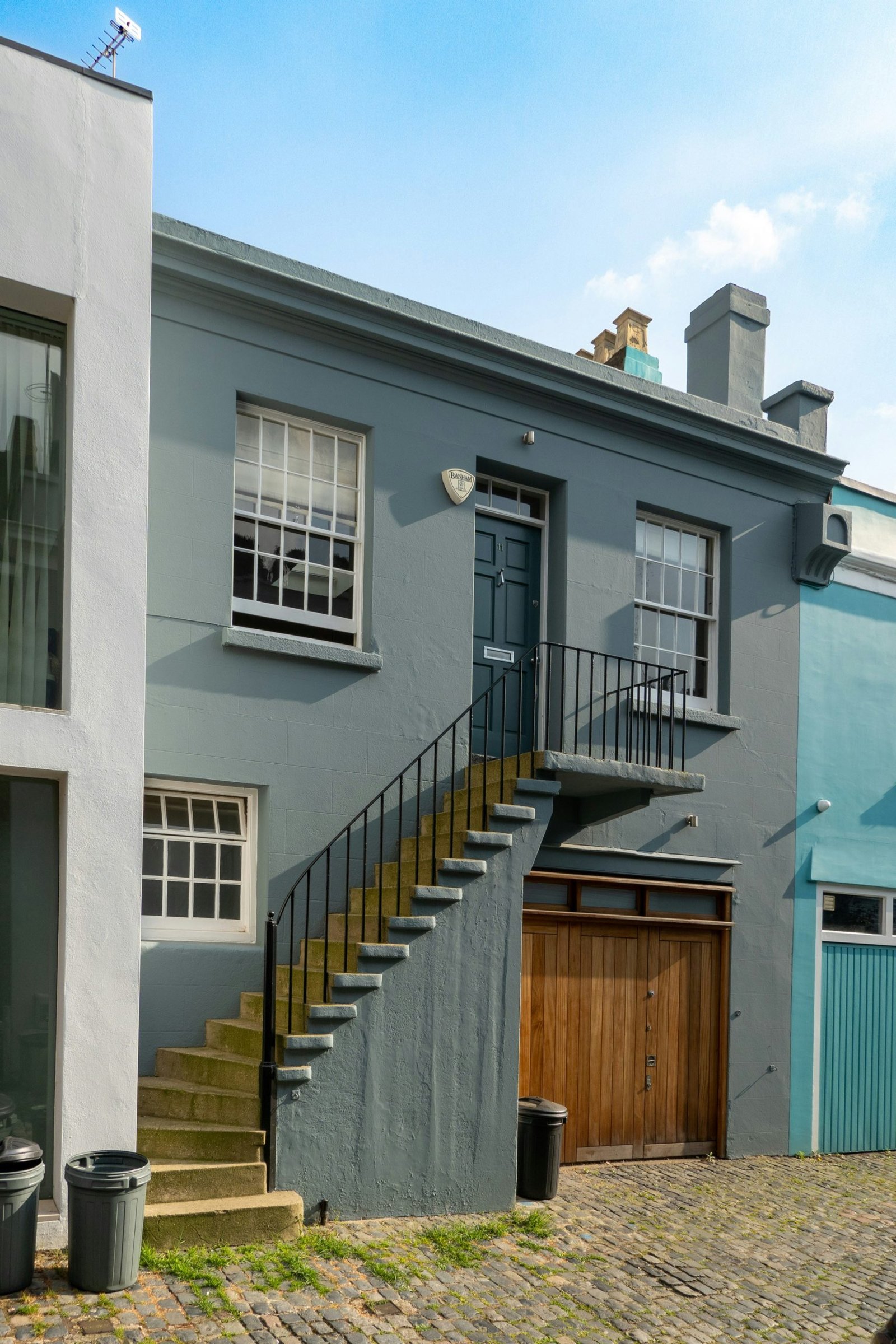
The 2026 palette landscape centers on creating homes that feel anchored yet expressive. A recurring theme is the use of light-reflective neutrals as the foundation. Off-whites, warm creams, and soft beiges act as versatile canvases that brighten facades without washing out details. These bases are particularly effective on homes with traditional or transitional architecture, where trim and architectural features can be highlighted through carefully chosen accents. When selecting a neutral, consider undertones—some whites skew warm with creamy yellows or pinkish hues, while others lean cooler with subtle gray-blue veils. The goal is to avoid stark, pure white in favor of hues that offer a gentle glow and depth under varying daylight conditions.
In parallel, warm earthy tones provide depth and connection to the landscape. Terra cotta, sandstone, olive, sage, and kiln-dried clay-inspired shades evoke a grounded, natural aesthetic. These colors work well on craftsman, ranch, or modern farmhouse styles, especially when paired with organic materials such as wood, stone, or brick. Earthy palettes are resilient in regions with strong sunlight, as they tend to resist showing imperfections and fading more gracefully than cooler palettes. The article emphasizes testing samples on external surfaces and observing color behavior from different angles and times of day before committing.
Bold accent colors are used judiciously to emphasize architectural features, doors, shutters, or porches. Rather than painting large areas with saturations, designers favor deep, saturated hues for small but strategic roles. For instance, a charcoal or ebony door against a neutral body can create a strong point of interest, while a dark accent on trim or window casings can delineate structural lines without overwhelming the facade. If a house already includes brick, stone, or wood accents, the accent color should harmonize with those materials rather than compete with them. The trend is to pair bold accents with calm bases, producing a refined, modern look that remains timeless rather than passing.
Finish and texture choices are also critical in 2026. Matte or satin finishes tend to soften color perception and minimize glare, which is especially helpful on large walls. Semi-gloss or gloss finishes are reserved for surfaces where moisture control and washability are priorities, such as doors, trim, and shutters. Some homeowners experiment with subtle texture or two-tone effects, using color to differentiate planes and emphasize architectural depth. The sustained popularity of durable, weather-resistant coatings—such as elastomeric or ceramic-based paints—reflects a practical shift toward longevity and maintenance reduction. In areas with humidity, rain, or intense sun, coatings with UV stability and mildew resistance can preserve color integrity longer, reducing repaint cycles.
Material considerations play a significant role in color performance. Brick masses carry inherent color cues that influence adjacent siding choices, and stucco surfaces often require lighter neutrals to avoid visual heaviness. Wood exteriors benefit from stains or semi-transparent finishes that allow wood grain to show while still providing protection. When mixing materials, the color scheme should read as a cohesive whole from the street, with transitions that feel deliberate rather than improvised. A common strategy is to choose a dominant neutral for large surfaces, a secondary complementary color for trim, and a high-contrast accent for front doors or focal architectural elements.
Climate responsiveness is another guiding factor. In hotter climates, lighter neutrals help reflect solar heat, potentially reducing cooling costs, while in cooler regions, deeper neutrals and rich accents can create a welcoming, grounded sense that counteracts winter gloom. For coastal homes, softer blues, greens, and sandy neutrals harmonize with the sea and sky, while inland properties might embrace terracotta and sage tones that blend with open landscapes. The best outcomes come from testing pigments under actual light exposure and considering long-term fading characteristics in the chosen environment.
The 2026 palette shift also reflects an emphasis on sustainability and responsible sourcing. Homeowners increasingly ask for low-VOC paints and environmentally friendly coatings that do not compromise durability or pigment stability. Reputable manufacturers offer extended warranty-backed products that maintain color integrity longer, a practical consideration for homeowners who wish to reduce repaint frequency and environmental impact. When possible, choosing paints with built-in UV protection and weather resistance provides additional assurance that the color remains faithful to its intended appearance across seasons and years.
Another dimension is the evolving relationship between color and architectural identity. Rather than chasing trends, many homeowners and designers pursue palettes that reinforce a property’s character. For example, a modern farmhouse might pair warm beige walls with black or charcoal trim and a bold red front door to celebrate a familiar rural dichotomy of simplicity and charm. A coastal contemporary could lean into soft, blue-gray neutrals with crisp white trim and a navy entry, evoking a maritime vibe while maintaining a clean silhouette. By aligning color choices with architectural language, homes gain an enduring sense of authenticity even as trends drift.
Practical execution is essential, too. Before finalizing any color, obtain large test samples and perform a thorough color study in multiple lighting conditions—morning sun, afternoon shade, overcast days, and evening twilight. Observe how the color interacts with adjacent landscaping, driveways, and neighboring houses. Lighting can dramatically alter perceived tone, warmth, and brightness, so a sample panel or a small test patch on the actual exterior surface provides the most accurate read. It is also wise to consider the repaint cycle and maintenance requirements associated with the chosen color. Lighter neutrals may show dirt more readily, while darker shades can fade unevenly or show watermarks. A maintenance plan that addresses cleaning, sealing, and periodic recoat can keep the exterior looking fresh for years.

*圖片來源:Unsplash*
Homeowners should work with reputable painters or contractors who understand exterior color application and surface preparation. Proper cleaning, priming, and weatherproofing are crucial for achieving durable color outcomes. Even the best color selection can fail to meet expectations if preparation and application are rushed or inadequate. Professionals can also provide color-matching services that ensure harmony with architectural features and landscape elements, further reducing the risk of a mismatched or unbalanced result.
In summary, the 2026 exterior color trends emphasize longevity, sophistication, and a thoughtful relationship with the home’s architecture and environment. Neutral foundations paired with well-chosen earthy or bold accents create a flexible framework that accommodates various styles—from traditional to modern—while staying sensitive to climate, materials, and maintenance realities. The overarching aim is to deliver a home exterior that feels welcoming, timeless, and resilient against the elements, with color decisions that enhance, rather than overpower, architectural storytelling.
Perspectives and Impact
The color decisions homeowners make around exterior appearances extend beyond aesthetics. They influence perceived value, energy efficiency, and the connection between a home and its surrounding landscape. A well-executed exterior color scheme can accentuate architectural features such as entryways, eaves, and cornices, drawing attention to craftsmanship and design intent. Conversely, poorly chosen colors can overwhelm the structure, mask architectural details, or clash with the environment, diminishing curb appeal and potential resale value.
From the design community’s perspective, 2026 trends underscore a pragmatic approach: prioritize palettes that endure and accommodate evolving tastes without frequent repainting. This aligns with sustainability goals and cost-conscious maintenance planning. The emphasis on finishes that resist fading and moisture aligns with the realities of climate variability, including more intense sun exposure, heavier rainfall in certain regions, and fluctuating temperatures. In areas prone to humidity or salt spray—such as coastal locales—specific pigments and sealants ensure color stability and surface protection, contributing to longer-lasting exteriors.
The retail and manufacturing sectors respond to these preferences by offering expanded color libraries with curated palettes that reflect regional compatibility. Consumers benefit from better guidance, extended warranties, and the ability to visualize colors via digital tools and physical swatches. Color consultants and design professionals play a pivotal role in translating personal taste into durable, climate-suitable choices, helping homeowners navigate undertones, finishes, and material interactions with confidence.
Looking forward, potential developments include enhanced pigment technology that improves color retention across diverse climates, as well as smarter coatings that respond to environmental stressors. The integration of sustainability with aesthetics could lead to more options for low-impact, high-performance paints that still deliver rich, enduring color. As homeowners increasingly prioritize both form and function, the dialogue around exterior color choices will likely grow more nuanced, with emphasis on how color complements landscape design, architectural heritage, and energy performance.
Key Takeaways
Main Points:
– Neutral bases provide a versatile canvas that supports varied architectural styles.
– Warm earthy tones create a natural, enduring connection to the environment.
– Bold accents, used sparingly, define architectural features and add character.
Areas of Concern:
– Undertone mismatches in neutrals can skew perceived warmth or coolness.
– Maintenance considerations vary by finish and color darkness, impacting upkeep.
– Climate-specific performance of pigments and coatings should guide selections.
Summary and Recommendations
Choosing exterior colors in 2026 is about balancing timeless bases with purposeful accents, while prioritizing durability and environmental compatibility. Start with a neutral base that harmonizes with the home’s material palette and landscape, then introduce earthy tones to ground the design. Use bold, carefully placed accents to highlight doors, trim, and focal points without overwhelming the facade. Always test color samples in natural light on the actual exterior and consult with professionals to ensure proper surface preparation, coating selection, and application technique. Consider climate, maintenance needs, and potential resale implications, and choose finishes with UV stability and weather resistance. By integrating architectural language, site context, and practical considerations, homeowners can achieve a cohesive, modern exterior that remains resilient and visually appealing for years to come.
References
- Original: https://abeautifulspace.co.uk/7-best-home-exterior-colours-in-2026-inspiring-trends/
- Additional references:
- Exterior Color Trends 2026: Neutral Foundations with Bold Accents (industry color forecasts)
- UV-Stable Exterior Paints: Performance and Longevity Guide
- Climate-Based Exterior Color Selection: Practical Guidelines for Homeowners
Forbidden:
– No thinking process or “Thinking…” markers
– Article starts with “## TLDR”

*圖片來源:Unsplash*