TLDR
• Core Points: 2026 exterior colours balance timeless neutrals with bold accents, using sustainable finishes and climate-aware palettes for curb appeal and longevity.
• Main Content: The trend guidance highlights versatile neutrals, earthy tones, moody hues, and durable finishes tailored for modern homes and varying climates.
• Key Insights: Color psychology, material compatibility, and environmental considerations shape durable, stylish exteriors.
• Considerations: Lighting, regional climate, and architectural style influence colour choice and coverage.
• Recommended Actions: Test swatches on-site, consult paint durability data, and plan color schemes that pair with landscaping and roofing.
Content Overview
Choosing an exterior paint colour is about more than aesthetics; it’s a blend of durability, climate resilience, and how a hue communicates a home’s personality. In 2026, designers and homeowners are favoring palettes that offer timeless appeal with modern depth. The curated selections emphasize versatility, enabling homeowners to create striking façades without frequent repainting. The approach merges traditional favourites—soft neutrals, warm whites, and charcoal grays—with contemporary accents and sustainable finishes. This summary draws on current trend reporting and industry guidance to outline the seven best exterior colour directions for 2026, along with practical considerations for application, lighting, and matching materials.
Exterior colour planning in 2026 prioritizes three core principles:
– Adaptability: Colours that perform well across different lighting conditions and architectural styles.
– Durability: Finishes and pigments with long-term fade resistance and weather tolerance.
– Environmental mindfulness: Low-VOC formulas and sustainable sourcing where possible, aligned with eco-friendly home upgrades.
The following sections present the seven standout exterior colour families, along with guidance on how to implement them thoughtfully.
In-Depth Analysis
1) Timeless Neutrals with Depth
Neutral palettes continue to dominate, but 2026 neutrals are richer and more nuanced. Subtle undertones of greige, greystone, and warm stone offer flexibility for brick, wood, or stucco exteriors. These hues create a cohesive backdrop that supports contrasting doors, window trim, and landscape features. The key is selecting a base neutral that complements the surroundings while accommodating roof materials and any stone veneers. Finishes with UV resistance and low sheen help maintain colour integrity in sunlit facades.
2) Soft Whites Reimagined
Soft whites remain a cornerstone for bright, clean exteriors, yet modern formulations address common issues such as yellowing and glare. In 2026, leaders emphasize whites with creamy or cool undertones to avoid washed-out appearances in shaded or urban environments. Pairing white exteriors with darker accents (for example, charcoal doors or black window frames) creates high-contrast focal points that feel timeless rather than stark.
3) Grounded Earth Tones
Earth-inspired colours—sage, sage-greens, terracotta, clay, and muted umber—offer warmth without overpowering a design. These shades harmonize with natural materials like timber cladding and stone, and they pair well with garden greenery. For homes in Mediterranean, cottage, or rustic modern styles, earth tones provide a grounded, welcoming presence. Durability in these families benefits from pigments designed for longer fade resistance in sun exposure and reflective heat.
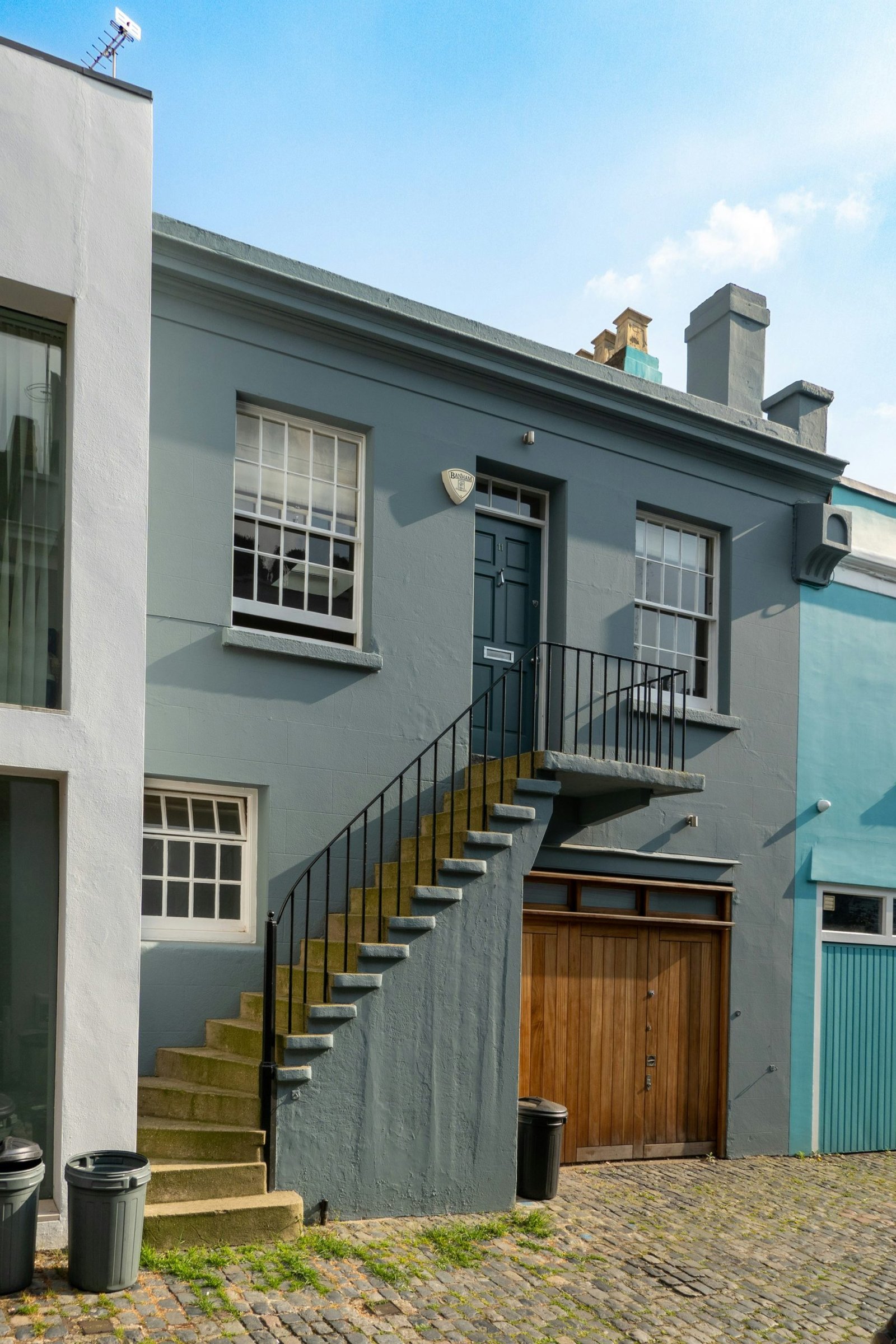
4) Moody, Character-Driven Hues
Deep, saturated colours such as slate blue, charcoal, navy, and charcoal-green hues bring drama and curb appeal. Moody tones work well on contemporary and traditional forms alike, especially when balanced with lighter trim and well-chosen landscaping. To avoid overwhelming a façade, use high-contrast accents sparingly and test colour samples on large wall sections under natural light.
5) Blues with Confidence
Blue exterior palettes—ranging from powder blue to navy—offer a refreshing alternative to classic neutrals. Lighter blues create a breezy coastal or airy feel, while deeper blues convey sophistication and modern elegance. The right blue requires attention to undertones to avoid purple or green shifts under different lighting conditions. Complementary trim in off-white or sand tones helps stabilise the look.
6) Green as a Modern Neutral
Green exteriors, especially olive, sage, and olive-gray blends, have grown in popularity for their connection to nature and low visual noise against landscaping. These tones can blend into mature suburban settings or stand out in contemporary urban homes. Green hues pair effectively with wood elements, natural stone, and black metal accents. For best results, consider colour-blocked strategies that limit large surface areas of a single green to prevent monotony.
7) Black and Charcoal for Modern Drama
Near-black and deep charcoal colours offer a crisp, modern aesthetic when applied thoughtfully. These shades are particularly striking on minimalist or industrial-inspired homes, where they highlight architectural details like geometry, lines, and texture. To prevent a home from feeling absorbent or unwelcoming, combine black exteriors with warm materials, wood textures, and luminous lighting at entry points.
Key factors to consider when selecting 2026 exterior colours
– Lighting: Assess how the hue shifts throughout the day and across seasons. North-facing facades may appear cooler, while south-facing walls can intensify warmth.
– Materials and textures: The interaction between paint colour and siding (vinyl, wood, stucco, brick) influences perceived tone. Test on each material type.
– Roof colour: Ensure chosen exterior colours harmonise with roofing material and shade.
– Contrast and balance: Use trim, doors, and architectural accents to bring depth and focus, avoiding an overly monochrome look.
– Durability and maintenance: Prioritize paints with UV protection, fade resistance, and mildew resistance; water-based acrylic paints often provide easier maintenance.
– Climate considerations: In hot climates, lighter neutrals can reflect heat, while cooler or darker hues may be more appropriate in milder or shaded regions.
– Sustainability: Seek low-VOC or zero-VOC formulations and sustainable pigment practices where available.
Implementation tips
– Start with a color strategy: Select a main shade, a secondary tone for trim or accents, and one or two accent colours for doors or features.
– Use swatches and large samples: Apply paints on sizeable wall sections to observe real-world colour behavior in your environment before committing.
– Consider future updates: If you anticipate changing the landscape or roof, choose adaptable neutrals that remain relevant as the surroundings evolve.
– Coordinate with landscaping: Plan plant materials and hardscaping to complement the chosen palette, creating a cohesive external environment.

*圖片來源:Unsplash*
Perspectives and Impact
Exterior colour trends for 2026 reflect a shift toward practical elegance and enduring design. Homeowners seek palettes that reduce maintenance burdens while amplifying architectural features. The emphasis on durable finishes and climate-aware choices aligns with broader sustainability goals, encouraging the use of low-VOC products and responsibly sourced pigments. The growing preference for earthy and moody tones signals a move away from overly bright exteriors towards more sophisticated, tactful colour storytelling.
Architects and designers highlight colour as a tool for enhancing curb appeal without compromising architectural integrity. The trends encourage a balanced approach: neutrals provide a reliable foundation, while well-chosen accent colours inject personality. In urban settings, softer whites and greys offer a refined, modern look that remains adaptable as neighborhoods evolve. In rural or coastal contexts, earthy greens and blues bring harmony with the natural surroundings, while deep hues offer a contemporary counterpoint to traditional forms.
Designer insights suggest testing multiple lighting scenarios and considering long-term maintenance when selecting colours. The right palette should not only reflect current tastes but also hold value by remaining visually appealing a decade from now. As climate resilience becomes a central consideration, exterior paints engineered to resist fading, mildew, and thermal expansion will gain prominence across regions.
Future implications involve expanding colour libraries tailored to different architectural styles, materials, and climate zones. Manufacturers may increase emphasis on energy-efficient finishes and sustainable pigment systems, making it easier for homeowners to achieve high-performance exteriors without sacrificing aesthetics. With accessible digital tools, homeowners can simulate colour combinations on 3D models of their homes, enabling more informed decisions before committing to large projects.
Key Takeaways
Main Points:
– 2026 exterior colours mix timeless neutrals, earthy tones, and bold accents for durable curb appeal.
– Finishes with UV resistance and low-VOC formulations support longevity and sustainability.
– Strategic use of contrast and materials enhances architectural features without overpowering the design.
Areas of Concern:
– Colour shifts under varying light conditions can distort intended tones.
– Large surfaces of dark colours may absorb heat; proper roof and landscaping coordination is essential.
– Availability of specific pigments and formulation quality may vary by region.
Summary and Recommendations
For 2026, exterior colour strategy centers on versatile, durable palettes that complement diverse architectural styles and climates. Homeowners should prioritize test-based decisions, taking color samples to different wall areas and lighting conditions before painting. Selecting base neutrals with depth allows for flexible accents that can evolve with landscaping and roofing changes over time. Incorporating moody hues and earthy tones can elevate a home’s curb appeal without sacrificing timelessness. When possible, choose low-VOC paint options and materials that resist fading and mildew to ensure the exterior remains vibrant and low-maintenance throughout the years.
A practical approach is to define a three-part palette: a dominant neutral (for walls), a secondary shade (for trim and fascia), and an accent colour (for doors or architectural highlights). This structure helps maintain balance and reduces the risk of a dated appearance as trends shift. Finally, coordinate with professionals—painters, contractors, and designers—who can advise on material compatibility, regional climate considerations, and long-term upkeep, delivering a refreshed exterior that stands up to time.
References
- Original: https://abeautifulspace.co.uk/7-best-home-exterior-colours-in-2026-inspiring-trends/
- Additional references:
- A Material- and Finish-Focused Guide to Exterior Paints (industry standards and durability considerations)
- Climate-Specific Exterior Colour Palettes for Residential Homes
- Color Psychology and Exterior Design: How Hue Influences Perception of Home Value
Forbidden:
– No thinking process or “Thinking…” markers
– Article must start with “## TLDR”
Ensure content is original and professional.

*圖片來源:Unsplash*