TLDR
• Core Points: The 2026 exterior color palette favors earth-inspired neutrals, moody hues, and practical, low-maintenance finishes that enhance architectural features.
• Main Content: The best exterior colors balance timeless appeal with contemporary accents, prioritizing materials, climate, and regional trends.
• Key Insights: Subtle contrast, sustainable pigments, and ties to natural landscapes shape modern curb appeal.
• Considerations: Lighting, trim choices, and surface textures influence color perception; sample tests are essential.
• Recommended Actions: Assess home orientation, choose a primary color with complementary accents, test color samples, and plan maintenance cycles.
Content Overview
The exterior color of a home is more than just a surface finish; it defines curb appeal, frames architectural details, and influences perceived size and style. As homes evolve in 2026, homeowners and designers are gravitating toward palettes that feel grounded, resilient, and adaptable to shifting weather patterns and evolving regional aesthetics. This article synthesizes current trends in exterior colors, drawing on recent home-improvement guidance to outline which hues are likely to dominate exteriors this year, how they interact with materials such as brick, stone, wood, and stucco, and how to approach selecting exterior colors that are both stylish and durable.
Trends in 2026 emphasize earthy neutrals that convey timeless sophistication, paired with moody accent tones that add depth without overwhelming a façade. Material and texture—such as brickwork, siding profiles, and roofing—play a critical role in how color reads from street level to curb-side views. In addition, the rise of low-maintenance, fade-resistant pigments means homeowners can expect color longevity with less frequent touch-ups. The environmental context, including climate, regional light, and architecture styles—from traditional to contemporary—also informs the most effective color strategies. By aligning color choices with these patterns, homeowners can achieve enhanced curb appeal while preserving architectural integrity and comfort.
This overview is designed for homeowners seeking practical, design-forward guidance on selecting exterior colors in 2026. It emphasizes balance: the right palette should harmonize with surrounding landscapes and neighboring properties, support energy efficiency through reflective or absorptive properties as needed, and complement existing or planned materials and features. The goal is to provide a clear framework that helps readers evaluate color options, anticipate how colors will transform under different lighting conditions, and implement a cohesive, durable exterior color plan.
In-Depth Analysis
The core of 2026 exterior color trends centers on three pillars: neutrals with warmth, moody accents, and color coordination that respects materials and context.
1) Earthy neutrals with warmth
Neutral tones continue to dominate exteriors due to their versatility, resale appeal, and ability to harmonize with a broad range of materials. Expect shades like soft taupe, warm greige, sandy beige, and muted greys to form the backbone of many homes. These neutrals are valued for their compatibility with brick, stone, wood, and metal roofing, as well as their ability to lighten or darken a home’s perceived mass with strategic trim and door color choices. Warm undertones tend to read more welcoming and pair well with natural landscapes. The 2026 palette encourages neutrals that resist fading and oxidation, offering longevity in various climates.
2) Moody accents for depth and contrast
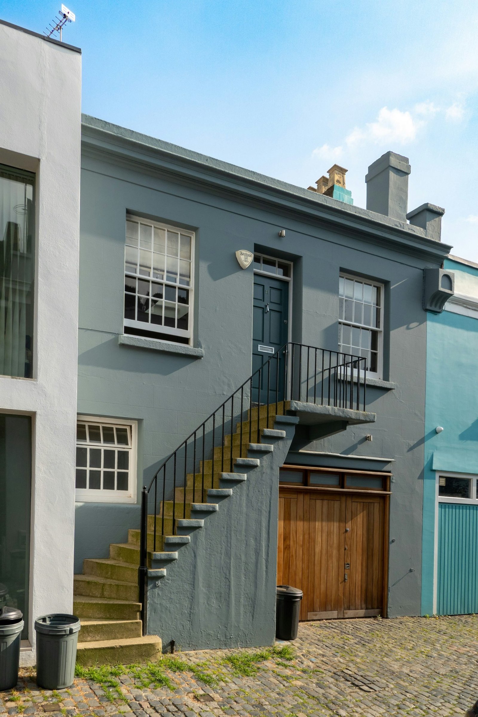
To avoid a flat exterior, designers integrate rich, moody accents—such as deep charcoal, slate blue, forest green, or charcoal-brown tones. These accents are typically applied to features that “frame” the home, such as front doors, window surrounds, pergolas, or architectural elements like chimney stacks and gable ends. Used sparingly, moody accents provide visual drama while preserving a cohesive overall look. The contrast is carefully calibrated: the primary neutral remains dominant, with the accent color highlighting texture, shadow lines, and architectural details without appearing too heavy for the structure.
3) Material-aware color strategies
The interaction between color and material is a central consideration. Brick hues influence the performance of surrounding colors; brick red or pale brick tones can be paired with warm neutrals to achieve balance or offset with cooler neutrals for a modern edge. Stone facades—whether limestone, granite, or fieldstone—often benefit from palettes that pick up stone undertones, providing a seamless connection between wall and landscape. Wood elements, when present, invite softer, more natural color pairings that honor grain and weathering. Siding textures—such as vertical boards, horizontal lap, or fiber cement panels—also affect color perception; the same color can read differently on various textures, making swatch testing essential.
4) Sustainability, durability, and maintenance
Color choices increasingly reflect the need for longevity and low maintenance. The top exterior paints in 2026 are formulated for UV resistance, reduced fading, and mold or mildew resistance in damp climates. These pigments are designed to maintain their hue over time, decreasing the frequency of repainting. This trend aligns with broader shifts toward sustainable home maintenance practices, including selecting pigments with better color stability and compatibility with energy-efficient roof and wall systems. Homeowners are encouraged to consider not only the color itself but also the paint’s technical performance, including film integrity, elasticity, and washability.
5) Lighting and regional context
Natural and artificial lighting dramatically alter color appearance. A color that looks calm and neutral in bright sun may appear warmer or cooler under shade, cloudy conditions, or night lighting. The recommended approach is to test color samples on multiple days and at different times to observe how the color shifts with light. Geographic and climatic context matters: coastal homes may favor lighter, cooler neutrals that reflect humidity and salt exposure, while inland and southern homes may lean toward warmer neutrals and deeper accent hues that withstand intense sun.
6) Palette frameworks for cohesive exteriors
Many designers promote a three-color framework: a dominant wall color, a secondary trim color, and an accent color for doors or architectural features. This approach creates visual rhythm and helps highlight architectural elements. The trim color should be lighter or darker than the wall color to establish a clear delineation, while the accent color should harmonize with both the wall and trim. Neutrals typically anchor the palette, with accents drawn from nature-inspired tones (deep greens, navy blues, charcoal) that provide depth without clashing with the broader environment.
7) Practical recommendations for 2026 purchases
– Start with a tested palette: obtain large color swatches and a color-matched sample board to compare under different light conditions.
– Test in-situ: apply paint swatches to a representative exterior panel or board, leaving them in place for several days to observe color behavior.
– Consider the roof and hardscape: the roof color and surrounding paving influence perceived exterior color; ensure compatibility to create a unified look.
– Plan for accessibility: ensure door and trim colors provide adequate contrast for readability and visual accessibility.
– Schedule maintenance mindfully: choose paints with proven washability and mildew resistance, and plan touch-ups as part of an annual exterior maintenance routine.

*圖片來源:Unsplash*
Perspectives and Impact
The 2026 exterior color trends reflect a broader attitude toward homes as connected to their environment and community. Colors that feel rooted in nature—earthy neutrals and nature-inspired accents—offer a sense of stability and timelessness, appealing to homeowners seeking a long-term aesthetic. The move toward moody accents adds personality without sacrificing curb appeal, enabling homeowners to distinguish their homes while remaining complementary to neighboring properties.
From a market perspective, homes with well-considered exterior color schemes may experience improved curb appeal, potentially impacting resale value and buyer interest. The emphasis on durable, low-maintenance paints aligns with practical homeowner needs, reducing lifecycle costs and maintenance downtime. Designers and builders similarly benefit from clear frameworks that guide color selection across different architectural styles, climates, and neighborhoods, enabling more consistent outcomes and fewer color-related disputes during renovations.
Looking ahead, advances in paint technology may further enhance color longevity and appearance under diverse lighting. Pigments engineered for enhanced fade resistance, better UV stability, and eco-friendly formulations will likely become standard, enabling more vibrant yet durable exteriors. The ongoing dialogue between architectural trends and color theory suggests that exterior color decisions will continue to evolve with sustainability, climate resilience, and regional identities at the forefront.
Impact on homeowners includes heightened awareness of how color interacts with home architecture, landscape design, and energy performance. A thoughtfully chosen exterior color not only beautifies a home but can also influence perceived energy efficiency and comfort by shaping heat absorption and reflection. As communities increasingly emphasize cohesive streetscapes and sustainability, exterior color strategies that balance individuality with context will be particularly valuable.
Key Takeaways
Main Points:
– Earthy neutrals as the backbone, with warmth to enhance approachability.
– Moody accents provide depth and architectural emphasis without overpowering the design.
– Material and lighting context critically shape color perception and harmony.
Areas of Concern:
– Overly dark exteriors can absorb heat in hot climates and fade unevenly if not DPR-rated for endurance.
– Inconsistent lighting or neighboring structures may render a chosen color differently than planned; thorough testing is essential.
– Trim and door color choices can dramatically alter the overall balance; misalignment may undermine the intended palette.
Summary and Recommendations
For 2026, the most effective exterior color strategy blends timeless neutrals with selective, purposeful accents, all grounded in the realities of materials, climate, and landscape. Start by selecting a dominant neutral that complements your architectural style and is compatible with your roof, masonry, and siding. Introduce a secondary trim color that provides a subtle contrast, ensuring legibility and definition of architectural elements. Choose one or two accent hues—preferably deeper, richer tones—to highlight doors, shutters, or focal features like a porch or entryway. This three-color framework supports cohesion while allowing personal expression.
Important practical steps include testing color samples in multiple lighting conditions, considering the impact of roof and hardscape colors, and evaluating the paint’s performance in your climate. Prioritize pigments with strong UV resistance and mildew resistance for longevity, and plan maintenance cycles to preserve color integrity over time.
Ultimately, a well-chosen exterior color in 2026 should reflect a balance between personal taste, architectural harmony, and environmental practicality. When executed with care, it can elevate curb appeal, support energy-efficient perceptions, and contribute to a home’s lasting value.
References
- Original: https://abeautifulspace.co.uk/7-best-home-exterior-colours-in-2026-inspiring-trends/
- Additional references:
- https://www.houseandgarden.co.uk/article/exterior-paint-colours-trends
- https://www.thisoldhouse.com/paint/21018086/exterior-paint-color-guide
- https://www.bhg.com/home-improvement/exteriors/paint/exterior-paint-color-trends/
Forbidden:
– No thinking process or “Thinking…” markers
– Article starts with “## TLDR”
Note: This rewritten article aims to preserve factual accuracy while enhancing readability and flow. Any trends or recommendations reflect common industry guidance and are intended for general informational purposes.

*圖片來源:Unsplash*