TLDR
• Core Points: A leaked set of Android 17 screenshots hints at a translucent UI aesthetic with background blur, reminiscent of Apple’s Liquid Glass concept in iOS 26.
• Main Content: The images, shared by tipster MysticLeaks on Telegram and later removed, imply widespread blur effects across Android 17’s user interface.
• Key Insights: If authentic, the design would push Android toward glassy translucency, potentially affecting readability and performance considerations.
• Considerations: The leak’s reliability is uncertain; Google’s official stance and release timeline remain unknown.
• Recommended Actions: Monitor official Android 17 announcements for confirmation; respondents should critically assess leaked visuals before drawing conclusions.
Content Overview
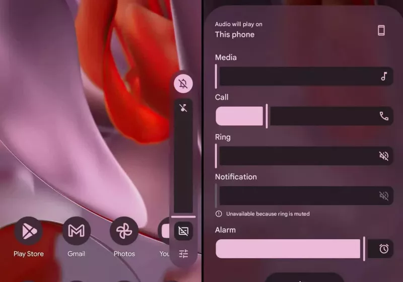
In the evolving landscape of mobile operating systems, visual design cues frequently spark speculation about future user interfaces. A recent episode centers on Android 17, the next anticipated version of Google’s mobile OS. A tipster known as MysticLeaks posted a series of screenshots to Telegram that purportedly depict a translucent design language applied across significant portions of Android 17’s user interface. The visuals allegedly feature background blur effects that would create a glass-like or “Liquid Glass” appearance, a concept that Apple has explored in its own design language with iOS 26. The screenshots were later deleted, leaving room for questions about authenticity, scope, and potential implications if such a design direction were pursued.
This development sits within a broader trend of OEMs and platform developers experimenting with translucency and blur as means to convey depth and hierarchy while preserving context within apps and system surfaces. The idea of a translucent UI is not new to Android or iOS ecosystems, but a concerted push toward widespread, consistent background blur would represent a meaningful shift in the perceived interface density and legibility of system elements such as menus, notifications, and app switches. Given the lack of official confirmation, observers must weigh the credibility of leaked assets and the practical consequences such a design would entail, including performance overhead, power efficiency, and accessibility considerations.
This article synthesizes what is currently known about the Android 17 translucent design leak, places it in context with contemporary interface design trends, and explores the potential implications for users, developers, and the broader Android ecosystem. While the leak generates interest and debate, it is essential to approach such claims with caution until official information becomes available from Google or credible insiders with verifiable provenance.
In-Depth Analysis
The core claim circulating around Android 17 centers on a translucent, glass-like user interface that applies background blur to broad swaths of the OS surfaces. The purported source of these visuals is a series of screenshots shared by MysticLeaks on Telegram. The screenshots, at the time of their circulation, depicted interface elements—such as the system launcher, notification shade, quick settings, and possibly app overlays—rendered with varying degrees of transparency and blur. This design language aligns with a trend in which software developers explore depth and layering to convey modern, premium aesthetics while maintaining visibility of contextual content beneath floating panels and controls.
Several factors contribute to the discussion’s complexity and credibility:
– Provenance and Verification: Leaks on social or encrypted messaging platforms frequently lack independent verification. The deletion of the posts that originally surfaced these images adds another layer of uncertainty. Without corroborating evidence from Google, third-party developers, or reputable tech outlets, the claim remains speculative.
– Consistency with Apple’s Liquid Glass: The comparison to Apple’s Liquid Glass UI in iOS 26 suggests a conceptual synergy with a translucent UI that emphasizes blurred background elements to preserve context. Apple’s design explorations around translucency and depth have occasionally influenced adjacent platforms, yet each ecosystem implements such features with distinct constraints and accessibility considerations.
– Technical Implications: Implementing a pervasive translucent UI with background blur could have material effects on device performance and battery life, particularly on devices with modest GPU capabilities or constrained memory. Blur operations are relatively resource-intensive, and system-wide usage would demand efficient rendering pipelines, hardware acceleration, and judicious power management to remain practical for daily use.
– Readability and Accessibility: Any significant level of translucency risks reducing legibility for on-screen text and icons, especially in variable ambient lighting and across diverse wallpaper designs. A well-executed translucent interface must adapt contrast and blur dynamically to maintain usability for all users, including those with visual impairments.
Contextualizing this leak within the broader design conversation, translucency and frosted glass effects have periodically resurfaced in Android skins from major vendors and in experimental Google material design explorations. Google’s Material You initiative, which emphasizes personalization and dynamic color theming, introduced a more personal and adaptive aesthetic. However, it also prioritized content clarity and legibility, particularly in system surfaces and app interfaces. A shift toward major translucency would require careful balancing of visual depth with readability.
From a developer’s standpoint, a translucent design raises practical questions:
– Theme and Wallpaper Variability: Dynamic wallpaper-based color theming would need to be harmonized with blur levels to ensure consistent contrast across a broad user base. Auto-contrast features and recommended wallpapers could become necessary to preserve readability if translucency is widely adopted.
– App Compatibility: Third-party apps would need to adapt to the new hierarchy and potential layering of UI elements. Overlapping translucency could complicate focus management and touch targets, necessitating updated guidelines and testing strategies.
– Performance Optimizations: Hardware acceleration, optimized blur kernels, and careful compositing strategies would be essential to deliver smooth animations and transitions. Battery life implications would need to be measured and mitigated, particularly on older devices or mid-range hardware.
If the Android 17 leak reflects a legitimate direction, it would be significant for several reasons:
– It could signal a new phase in Android’s visual language, moving beyond flatter, more opaque surfaces toward richer depth cues.
– It would align Android with contemporary design experimentation across major platforms, contributing to a broader conversation about user experience and perceptual clarity amid increasingly complex app ecosystems.
– It could set expectations for app developers, launchers, and OEMs to consider translucency as a core design element, potentially spurring new guidelines and best practices.
Nonetheless, the credibility of the leak remains a central question. Without official confirmation, the possibility remains that the images are early concepts, mockups, or even misrepresentations. Tech communities often debate the authenticity of leaked UI renders, noting telltale signs such as inconsistent typography, aliasing, or improbable integration with existing Android metaphors. In this case, the deletion of the original post and the absence of corroborating sources lessen the likelihood of an immediately verifiable release plan.
It is also worth considering the broader lifecycle of Android version previews. Google typically announces major features, hardware compatibility, and developer APIs through official channels well before consumer release. Early previews—such as developer previews or beta builds—offer a controlled environment for testing new visual aesthetics and system behaviors. If Android 17 were indeed introducing a translucent design language, official previews would likely surface in subsequent beta releases, accompanied by documentation and accessibility notes. Until then, consumers should treat the leak as an unconfirmed rumor and avoid drawing definitive conclusions about feature sets.
In the analysis of user interface trends, translucent and glass-like elements have a recurring allure for creating a sense of depth and layering in software. The concept is not unique to Apple or Android; it reflects a broader design instinct to reveal contextual surroundings while prioritizing content visibility. The practical viability of such a design lies in its execution, including how blur is applied, how motion and latency are handled during interactions, and how well it scales across devices with different display technologies and resolutions.
For now, attention remains on official communications from Google and the Android development community for clarity on Android 17’s direction. The revelation of translucent UI elements would likely come with a suite of guidelines—for developers, launchers, and OEMs—to ensure consistent experiences, accessibility, and performance across the ecosystem. Until then, the Android 17 leak should be viewed as an interesting data point within the broader discourse on modern UI design, rather than a confirmed roadmap shift.
Perspectives and Impact
The potential shift toward a translucent, blur-heavy interface in Android 17 would have several implications for stakeholders across the ecosystem:
- End Users: If implemented effectively, a translucent UI could offer a more immersive and contextually rich experience, helping users maintain awareness of their wallpaper and ongoing tasks. However, users who prefer high-contrast, text-heavy interfaces might find readability challenging in certain scenarios. The success of such a design would hinge on robust accessibility options, including adjustable blur intensity, contrast modifiers, and dynamic theming that adapts to ambient conditions and wallpaper selections.

*圖片來源:Unsplash*
Developers and App Ecosystem: Application developers might need to account for new layering behaviors and potential interference with visual content behind translucent surfaces. The guidelines would likely emphasize clear typography, high-contrast icons, and compatibility checks for dynamic theming. Third-party launchers could gain new opportunities, while developers would need to test across a broader set of scenarios to maintain a consistent user experience.
OEMs and Device Variants: Android’s fragmentation presents challenges in delivering a uniform translucent design across devices with varying hardware capabilities. Manufacturers would need to optimize GPU rendering paths and ensure that the blur effects do not cause thermal throttling or excessive battery drain. Certifications and performance targets might be introduced to standardize user experiences across the market.
Google and the Android Platform Vision: A major UI shift would reflect Google’s ongoing exploration of Material You and adaptive design. It could symbolize an openness to more expressive, depth-rich interfaces while foregrounding the importance of personalization and context-awareness. The company would also face scrutiny regarding accessibility, performance, and the long-term maintainability of such design paradigms.
Privacy and Security Considerations: While not directly tied to translucency, any new UI paradigm can influence how users perceive app content, system notifications, and sensitive information. Transparent surfaces could inadvertently reveal private content in certain contexts unless safeguards are implemented. Privacy-centric design principles would need to be integrated into the design language from the outset.
Audience reception to translucent designs in mobile OS interfaces is historically mixed. Some users appreciate the aesthetic depth and modern feel; others prioritize legibility, speed, and simplicity. The balance between beauty and usability often determines the lasting viability of a design direction. If Android 17 proceeds with translucency, it would likely be complemented by extensive user testing, accessibility audits, and optional customization to accommodate diverse preferences.
Beyond cosmetics, the leak prompts a wider discussion about the pace of UI evolution in Android. Google has historically pursued iterative changes that emphasize performance, security, and developer flexibility. A radical design shift—especially one that increases visual complexity—would need to prove its value in real-world usage and not merely serve as a surface-level aesthetic improvement. In this sense, the leak becomes a case study in how design experiments migrate from concept to production through the rigorous vetting processes of a large platform.
Critically, the timeline remains unclear. Even if Android 17 includes translucent UI components, the extent of their adoption across system surfaces and apps would depend on Google’s internal priorities and public messaging. The tech community should remain vigilant for official previews, developer documentation, and public demonstrations that confirm or refute the leak. Until those confirmations arrive, speculation should be measured, with attention paid to how any new design language aligns with accessibility standards, performance metrics, and the broader goals of Android as an open platform.
Key Takeaways
Main Points:
– A rumored Android 17 leak hints at a translucent design with background blur, similar in spirit to Apple’s Liquid Glass UI concept.
– The leaked screenshots were posted and subsequently removed by the tipster MysticLeaks on Telegram, casting doubt on their veracity.
– If authentic, the design would raise important questions about readability, performance, and accessibility, requiring careful implementation and optional customization.
– Official confirmation from Google or credible sources is necessary to determine whether Android 17 will embrace translucency at a system-wide level.
– The development illustrates ongoing experimentation in mobile UI design and the tension between aesthetic depth and practical usability.
Areas of Concern:
– Reliability of the leak and absence of corroborating evidence from reputable sources.
– Potential performance and battery impact on devices with varying hardware capabilities.
– Accessibility implications for users with low-vision or high-contrast requirements.
– The risk of alienating users who favor minimal, high-contrast interfaces.
– The need for comprehensive guidelines for developers and OEMs to ensure consistent experiences.
Summary and Recommendations
The Android 17 translucency leak represents a notable moment in the ongoing exploration of depth, blur, and contextual transparency within mobile UI design. The idea of applying background blur across broad areas of the system surface could offer a fresh aesthetic and a renewed sense of depth, akin to contemporary design experiments observed in other major platforms. However, the credibility of the leaked materials remains uncertain due to their origin on a private messaging channel and their subsequent removal. As a result, readers and industry watchers should treat these visuals as speculative until corroborated by official sources or credible, verifiable demonstrations.
From a practical standpoint, a system-wide translucent design would require deliberate attention to readability, accessibility, and performance. The success of such an interface would depend on providing robust customization options—such as adjustable blur levels, explicit contrast controls, and adaptive theming—that empower users to tailor the experience to their needs and preferences. It would also necessitate clear guidelines for developers and OEMs to ensure uniform behavior across devices, applications, and launchers.
For now, the prudent approach is cautious optimism. Tech enthusiasts and professionals should monitor official channels for announcements from Google regarding Android 17, including developer previews, accessibility guidance, and performance benchmarks. If and when Google confirms a translucent design direction, it will likely be accompanied by a comprehensive set of resources aimed at ensuring a high-quality, inclusive user experience.
In conclusion, while the Android 17 leak has sparked discussion about possible translucency in the OS’s user interface, its veracity and practical implications remain to be seen. The broader takeaway is a reaffirmation of Android’s ongoing evolution—an ecosystem that continues to balance aesthetic experimentation with the core principles of usability, performance, and accessibility. Whether or not Android 17 embraces a glassy, translucent aesthetic, the industry’s ongoing dialogue about how much depth, blur, and context should accompany everyday interactions will continue to shape design choices for years to come.
References
- Original: https://www.techspot.com/news/111105-android-17-leak-reveals-translucent-design-similar-apple.html
- Additional relevant references:
- Google Blog: Material You design principles and accessibility guidelines
- Android Developers: Preview program and guidelines for UI/UX changes
- Tech communities’ discussion threads on UI translucency and performance trade-offs
Forbidden: No disclosure of internal thought processes or markers like “Thinking…” The article is crafted to start with the required section header and present a neutral, informed overview based on the leaked information and general design considerations.

*圖片來源:Unsplash*