TLDR
• Core Points: Curated gallery walls add personality to any space; plan with balance, mix frames, measure grid, and use mounting tricks for a polished result.
• Main Content: Practical steps to design, assemble, and maintain a gallery wall that feels intentional and professional without expert help.
• Key Insights: Start with a cohesive theme, curate a varied mix of art and photography, and use templates or faux layouts to guide placement.
• Considerations: Space, frame styles, wall type, mounting hardware, and weight distribution are critical for safety and aesthetics.
• Recommended Actions: Define theme, collect diverse sizes, draft a template, and test-layout with paper cutouts before mounting.
Content Overview
Gallery walls remain one of the most timeless and stylish ways to infuse character and personality into a home. A well-executed gallery wall can transform blank walls into a focal point, tell a story, and reflect personal style without overwhelming a space. The challenge lies in achieving a curated look that appears deliberate rather than haphazard. This guide provides practical, actionable steps to design and install a gallery wall that looks polished—without the need for a professional designer.
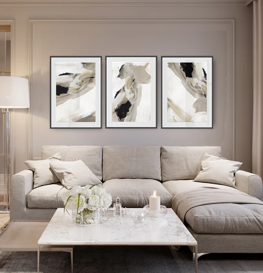
To begin, understand that there are two core approaches to a gallery wall: a tightly arranged grid and a more organic, salon-style layout. A grid offers clean lines and symmetry, suitable for modern interiors or spaces with strict architectural geometry. An organic arrangement, on the other hand, feels more eclectic and can complement traditional or bohemian aesthetics. The right choice depends on the room’s function, existing furniture, wall dimensions, and the mood you want to create.
The first essential step is planning. Rather than impulsively hanging frames, map out your design on paper or with painter’s tape on the wall. Gather a mix of artwork, photos, prints, mirrors, and other wall elements. Variety in scale, orientation, and subject matter adds visual interest, but it should still feel cohesive. Consistency in frame finish, matting, or color palette helps tie disparate pieces together, creating a unified collection.
Choosing a theme or narrative for the wall is another powerful strategy. A theme could be color-based (monochrome blues, earthy tones), era-focused (vintage travel posters, mid-century photography), or subject-driven (nature, cityscapes, family moments). The theme serves as an organizing principle and guides retrieval and selection of future additions.
Frames and matting play a significant role in the wall’s overall perception. While mixing frame styles can be visually engaging, it’s often wise to select a common thread—such as a shared frame color, similar matting width, or a unifying shape—to maintain harmony. Frames should be proportional to the wall space and the artwork they contain. Bulky frames can overwhelm small pieces, while ultra-thin frames may feel sparse for larger works.
The layout process is where precision matters. Create a template of each piece by cutting out paper representations and arranging them on the floor or against the wall. Use painter’s tape to reproduce the wall layout and adjust spacing before committing to nails. Common spacing guidelines suggest 2 to 4 inches between pieces for a tight grid, and 3 to 6 inches for a more relaxed arrangement. A standard rule is to center the gallery at eye level, around 57 to 60 inches from the floor, though this can vary with ceiling height and furniture placement.
When selecting artworks, curate a mix that includes a dominant large piece, several medium-sized works, and multiple smaller items. This hierarchy provides a focal point while allowing the eye to travel across the wall. Consider mixing media—framed photographs, prints, art reproductions, and mirrors—to add texture and reflect light. Personal photographs can be incorporated, but it helps to edit for quality and tonal balance so the wall remains cohesive.
Mounting and hardware choices depend on wall type and weight. For drywall and standard frames, picture-hanging hooks or nails often suffice. For heavier frames or plaster walls, use proper wall anchors or screws and consider a mounting system that distributes weight evenly. Because a gallery wall involves several pieces, use a level during installation to ensure alignment. If renting or preferring not to drill, consider freestanding display options or adhesive hanging systems designed for art.
Lighting is another crucial factor. Proper illumination enhances color, contrast, and texture. Natural light is ideal but can cause fading over time. If possible, position the wall away from harsh direct sunlight. Consider installing track lighting, picture lights, or small LED sconces that won’t generate heat near sensitive artworks. A well-lit wall feels more intentional and helps every piece feel equally important.
Maintenance and adaptability matter as well. A gallery wall isn’t a static display; it should evolve as you acquire new works or as your space changes with furniture repositioning. Start with a layout that allows easy swapping of pieces or re-framing without incurring excessive cost. Keep a small inventory of the artworks and their measurements to simplify future rearrangements.
Finally, embrace a curated approach rather than a perfect one. A gallery wall gains its charm from a thoughtful curation process, not from flawless symmetry alone. Imperfections—slight misalignments, varied frame wear, or a touched-up napkin sketch in a portfolio—can add character when done with intention. The underlying principle is to create a cohesive narrative that resonates with you and complements the room’s architecture and decor.
In-Depth Analysis
A gallery wall is more than a decorative feature; it is a narrative device that communicates taste, history, and emotion. The effectiveness of a gallery wall hinges on deliberate curation, precise execution, and ongoing stewardship. Several practical strategies help translate the concept into a tangible result that looks curated rather than accidental.
Start with an intentional framework. Decide what the wall should convey before you select any pieces. This may involve selecting a theme—such as travel memories, black-and-white photography, or botanical illustrations—or choosing a color story that binds disparate works together. The objective is coherence, even if the pieces themselves are diverse. Without a central idea, the wall risks appearing cluttered or chaotically eclectic.
Artistic variety within a cohesive system is key. A compelling gallery wall often features a spectrum of sizes and a mix of media. A large central piece anchors the arrangement, while a cluster of mid-sized pieces and several smaller items radiate outward. Mirrors, decorative panels, or sculptural elements can punctuate the layout and reflect light, making the space feel brighter and more dynamic. The aim is to guide the viewer’s eye across the wall with deliberate pauses at each focal point.
Size and scale should be carefully considered. Pieces that are too small relative to the wall can disappear; framed works that are too large can crowd the space and overwhelm nearby furniture. A practical approach is to measure the wall area and group artworks into sizes that fit within a grid-like plan. A common method is to create a “gallery grid” with even spacing, but an asymmetrical layout can be equally engaging if proportion and rhythm are maintained. The key is to avoid awkward gaps and to ensure that the overall massing reads as a single installation.
The frames themselves are more than just protective casings; they are design elements that influence harmony. A set of frames with a shared color or material creates a visual thread that ties the wall together. If you prefer mixed styles for a more eclectic feel, keep at least one unifying factor—such as a unifying color (e.g., black or white), matting width (like 1/2 inch), or a consistent level of wear across frames. The matting can also unify the wall—white mats provide crisp separation, while darker mats can soften contrasts and add depth.
Hanging and alignment require careful attention. Use a level and a measured spacer to ensure that each piece sits at the correct height and distance from its neighbors. When working with multiple pieces, a practical approach is to create a paper layout of the entire wall. Cut out templates the size of each frame and tape them on the wall in the intended arrangement. This technique lets you visualize spacing and flow without making multiple holes in the wall. It also allows for quick adjustments before you commit to nails or screws.

*圖片來源:Unsplash*
Mounting hardware should align with wall structure and piece weight. Light frames on drywall can be secured withCommand strips or small nails. For heavier frames, anchors, screws, or a mounted rail system are safer options. If the wall is plaster, find studs for robust support or use masonry anchors if no studs are available. A mid-weight gallery typically satisfies most living room or hallway installations, but always err on the side of sturdiness when dealing with valuable or irreplaceable pieces.
Lighting considerations can transform a gallery wall from good to exceptional. A well-lit wall reveals color, texture, and detail while enhancing the perceived depth of the arrangement. The simplest approach is to install track lighting or adjustable sconces that direct light toward key pieces. If natural light is abundant, choose UV-protective glass or acrylic frames to reduce fading risk. For readers or visitors, consider lighting that minimizes glare on glossy surfaces.
Position relative to space and furniture matters. The center of the gallery should typically align with eye level, around 57 to 60 inches from the floor for most rooms. However, this standard can be adjusted based on ceiling height, sofa height, or standing furniture. The goal is to achieve a visually balanced result where the wall composition feels integrated with the room rather than floating in isolation.
Flexibility and future changes are practical benefits of a well-executed gallery wall. One of the strengths of a curated wall is the ease with which it can be refreshed. You can rotate in seasonal pieces, swap out prints with heirloom photographs, or update frames to reflect new tastes without altering the core structure. Maintaining a small library of frame sizes and mount types simplifies future updates and minimizes damage to the wall from repeated nail holes.
Ethical and practical considerations also come into play. When selecting family photos or personal memorabilia, consider privacy and sentiment. For public or rental spaces, choose images and prints that respect the space’s context and tenants’ preferences. If a home is rented, using removable mounting solutions can preserve walls while allowing later changes without penalties or extra costs.
Ultimately, a gallery wall is a dynamic design element that reflects your evolving taste. The curated appearance emerges from a disciplined process of planning, testing layouts, and thoughtful selection. The result should be a wall that feels intentional and personal, rather than a random assortment of frames. With patience and attention to detail, you can achieve a gallery wall that conveys a sophisticated, researched look without needing professional design services.
Perspectives and Impact
The appeal of gallery walls extends beyond aesthetics. They offer a versatile platform for storytelling, memory preservation, and the expression of individuality. A well-executed display can anchor a room, support interior design themes, and even influence how occupants interact with the space. By revealing personality through curated collections, homeowners can create a sense of continuity between furnishings, architectural features, and daily routines.
In contemporary homes, gallery walls can function as narrative devices that reflect current events, travels, or seasons. The ability to rearrange and replace pieces makes them highly adaptable, a valuable trait in spaces that see frequent changes in usage or decoration. For example, a gallery wall in a dining room might shift to emphasize family milestones during holidays, while a living room arrangement could evolve with new art acquisitions or sentimental photographs. The modularity of a gallery wall aligns well with modern furniture layouts, open-plan living spaces, and the desire for configurable, personalized environments.
Economically, a curated wall can be built on varying budgets. Start with affordable prints, thrifted frames, or DIY art projects and gradually layer in higher-value pieces as resources permit. The adaptability of this approach makes it accessible to a broad audience, from first-time homeowners to seasoned design enthusiasts. The key is a thoughtful selection process, not immediate perfection.
Cultural implications also arise in how gallery walls reflect heritage and memory. Display choices often honor family history, travels, or cultural motifs, transforming walls into storytelling canvases. This can enhance a sense of belonging and continuity within a home, reinforcing values and memories for residents and visitors alike.
Looking to the future, gallery walls may become even more digitally integrated. We can anticipate smarter framing options, modular systems that adapt to wall contours, and embedded lighting that responds to ambient changes. As design tools become more accessible, homeowners will have greater opportunities to experiment with layouts, color schemes, and thematic narratives, further democratizing interior design.
Despite the evolving tools and trends, the core principle remains constant: a gallery wall should feel curated, not cluttered. Achieving this balance requires a thoughtful process that respects the space, artworks, and occupants. When done correctly, a gallery wall can elevate a room, celebrate personal history, and serve as a daily source of inspiration.
Key Takeaways
Main Points:
– Start with a clear theme or narrative to guide piece selection.
– Use a dominant large piece with supporting medium and small pieces for balance.
– Create a paper-based layout or a tape mock-up to plan spacing and alignment before drilling.
Areas of Concern:
– Weight and mounting safety on different wall types.
– Maintaining cohesion with multiple frame styles.
– Avoiding overcrowding or dead spaces that disrupt rhythm.
Summary and Recommendations
To create a gallery wall that feels curated without professional help, begin with a clear design concept. Decide on a theme, color palette, or narrative that will unify the works you select. Assemble a mix of artwork in varying sizes, ensuring a logical hierarchy with one dominant piece and several supporting pieces. Plan the layout meticulously using paper templates or painter’s tape, and test spacing to prevent misalignment or overcrowding. Choose frames and mats that tie the collection together, while allowing some flexibility for eclectic elements if desired. Mount the pieces with appropriate hardware for the wall type and weight, and consider lighting options that highlight each piece without glare or fading. Finally, treat the gallery wall as an evolving installation: be prepared to swap pieces, reframe, or reconfigure as your tastes change or as you acquire new art. This approach yields a polished, curated look that reflects your personality and harmonizes with the room’s architecture and furniture.
References
- Original: https://abeautifulspace.co.uk/how-to-build-a-gallery-wall-that-looks-curated-without-hiring-a-designer/
- Additional references:
- https://www.apartmenttherapy.com/how-to-maintain-a-gallery-wall-ideas-367108
- https://www.housebeautiful.com/room-decorate/decorate-by-room/a19911019/curate-gallery-wall/
- https://www.elledecor.com/design-decorate/color-photos/galleries/ideal-gallery-wall-layouts/

*圖片來源:Unsplash*