TLDR
• Core Points: Curated gallery walls blend cohesion and personality through thoughtful planning, layout, framing, and presentation without professional design fees.
• Main Content: Use a unifying concept, precise layout planning, varied frame styles, and strategic spacing to achieve a polished, personal display.
• Key Insights: Start with a cohesive color palette, mix media thoughtfully, and balance asymmetry with symmetry for visual appeal.
• Considerations: Measure walls accurately, curate pieces with meaningful connections, and avoid overfilling the space.
• Recommended Actions: Draft a layout grid, gather frames and mats, pre-mount or mock layout on the floor, and proceed with careful hanging.
Content Overview
Gallery walls offer a timeless and stylish way to inject character into any room. Rather than a random assortment of frames and art, a curated gallery wall achieves a cohesive look through deliberate planning and attention to detail. The process combines understanding your space, selecting complementary artwork, and organizing the pieces in a way that feels intentional rather than haphazard. This guide provides practical steps to craft a gallery wall that reads as professionally composed, even if you’re not a trained designer.
First, define the purpose and mood you want the wall to convey. A gallery wall can celebrate travel memories, showcase family portraits, highlight favorite artworks, or mix in meaningful objects such as textiles or three-dimensional pieces. Clarifying the theme helps guide choices around color palette, frame styles, and matting, ensuring every element contributes to a unified story.
Next, assess the wall itself. Note its size, lighting, and architectural features. A small bathroom or narrow hallway benefits from a tight, compact arrangement; a large living room wall can support a more expansive gallery with generous negative space. Consider the viewing distance and how the wall will be experienced from different parts of the room. Adequate lighting, whether natural or artificial, is essential to highlight the contents and prevent a flat appearance.
With space defined, move to selecting art and objects. Start with anchor pieces—signature artworks or photos that will form the core of the display. Then curate supporting pieces that echo or complement those anchors in terms of color, style, or subject matter. A balanced mix of media, such as framed prints, canvases, and textured textiles or decorative items, can add richness, but it’s important not to overcrowd the wall. Each item should have a clear role within the overall composition.
Framing and matting choices are a critical driver of cohesion. Consider a consistent frame color family (for example, black, white, wood tones) and uniform matting where appropriate. If you prefer variety, limit the number of distinct frame styles to a small, intentional subset. Matting can create breathing room around artwork and help unify pieces with different dimensions.
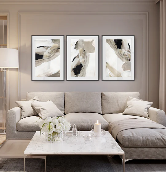
Planning the layout is where many people feel they save money by improvising, but this phase is essential for a polished result. It’s best to work the way designers do: lay out the pieces on the floor or a large tabletop to test arrangements before committing to nails and hooks. A grid-based layout provides order, while a salon-style arrangement offers a more dynamic, asymmetrical feel. A common starting point is to establish an anchor line—an imagined horizontal band at a consistent height across the wall—and position other pieces relative to it. For mix-and-match displays, create a mental or physical boundary around clusters to maintain visual unity.
Size, scale, and spacing must be considered together. Avoid placing objects that are too close or too far apart; a typical recommended spacing between frames is 2 to 4 inches, depending on the wall size and the frame dimensions. In a dense gallery, slightly smaller gaps prevent the composition from looking crowded. In a more open space, slightly larger gaps can enhance breathing room. Ensure scale relationships among pieces feel intentional—larger works can anchor the center or focal point, with smaller pieces radiating outward.
Hanging techniques matter for safety and appearance. Use appropriate hardware based on wall type—studs for heavy frames, picture-hanging hooks for lighter pieces, or adhesive options for rental spaces where drilling is restricted. Use a level to ensure straight edges and consider laser or string guides to transfer layout positions to the wall accurately. Protect walls with felt pads or protectors to avoid scuffs during installation.
Color harmony is another lever for a curated look. A cohesive color palette—whether anchored in neutrals with pops of color or a more monochromatic scheme—helps unify disparate artworks. You can pull off a bold, eclectic display by ensuring at least one shared color or tonal thread runs through all pieces. If you want to emphasize a room’s existing palette, choose frames and mats that echo those hues.
Texture and material variety also contribute to depth. Combine flat prints with textured textiles, metal, or dimensional objects to add tactile interest. When integrating three-dimensional items, ensure they don’t protrude excessively and are securely mounted to avoid shifting or damage.
Lighting can dramatically affect the final effect. Consider the wall’s natural light and add adjustable lighting if needed. Picture lights, track lighting, or picture-led illumination can highlight key pieces and help create a gallery-like atmosphere. Avoid glare on glass by angling lights appropriately and selecting non-reflective mats for framed works.
Maintenance and rotation are part of the long-term plan. A gallery wall isn’t static; you can refresh it by rotating pieces as your collection evolves or as your living space changes. Keep the framework flexible: using modular layouts or frames with simple swapping mechanisms makes updating easier without sacrificing cohesion. Take photos of the layout before changing it so you can reproduce a similar setup later if desired.
Accessibility and personal meaning also matter. A curated wall should reflect your taste and experiences, not merely follow trendy aesthetics. Include pieces that tell stories about your travels, favorite artists, or family moments. Balancing accessibility—where guests can comfortably view and read captions or dates—with aesthetics improves engagement and appreciation of the collection.
Finally, consider budget and practicality. You don’t need the most expensive frames or rare artworks to achieve a curated look. Thoughtful choices, consistent framing, measured layout, and intentional curation deliver a professional appearance at a reasonable cost. You can repurpose existing frames, buy affordable prints, or create DIY art to fill gaps without compromising the overall integrity of the display.
In summary, building a gallery wall that looks curated without hiring a designer hinges on clear intent, precise planning, and disciplined execution. By defining a theme, evaluating the space, selecting anchor pieces and supporting works, and carefully planning the layout, you can achieve a sophisticated and personalized display that elevates your interiors without professional help.
In-Depth Analysis
A successful gallery wall begins with a deliberate concept rather than a collection of unrelated pieces. The idea is to translate a room’s personality or a specific narrative into a visual arrangement. This approach provides a roadmap for selecting art, choosing frames, and organizing pieces. The planning phase is where many DIY enthusiasts stumble, but investing time here prevents post-hanging regrets and ensures longevity of the display.
Understanding space and viewing behavior is essential. The wall’s dimensions, traffic patterns, and seating positions influence how people perceive the arrangement. For example, a gallery wall in a living room should feel balanced from multiple seating viewpoints, not just when standing directly in front of it. In a kitchen or hallway, height and reach become practical constraints, and a compact grid may be preferable to a sprawling constellation of frames.
The role of anchors in layout design cannot be overstated. An anchor is a primary piece that grounds the arrangement. It might be the largest work or the most thematically central image. From there, other pieces relate to the anchor through color, subject matter, or style. This technique helps maintain coherence, especially when including a variety of media or frame designs.
Mixing media requires a strategic approach. Combining prints, canvases, photography, and three-dimensional objects can add depth and interest, but it’s important to create a unifying thread. This thread could be a recurring color, a shared motif, or a common period or style. Without such a thread, the display risks feeling chaotic rather than curated.
Frame consistency plays a pivotal role in cohesion. While mixing frame styles can be visually dynamic, it’s easy to overdo it. Limiting the palette to two or three frame finishes with compatible mats creates a harmonious look. If you want a more eclectic vibe, keep the frames uniform in size or maintain a consistent inner mat width to preserve rhythm across the wall.
Spacing and scale require careful judgment. The gap between pieces should be deliberate and proportional to the wall’s size and the frames’ dimensions. A one-size-fits-all rule rarely works; instead, adapt spacing to the wall’s proportions. Some designers favor a tight, salon-style approach with close placement, while others prefer a more breathing room in a grid configuration. Regardless of the chosen method, aim for visual balance where focal points attract attention without overwhelming neighboring pieces.

*圖片來源:Unsplash*
Layout testing—whether on the floor or with removable tape on the wall—is a critical step. A mock-up helps you refine alignment, spacing, and overall flow before committing to nails. This process also makes it easier to adjust the composition as you collect more items or decide to swap in different works.
Hanging technique and hardware choices affect durability and presentation. Heavier items demand solid mounting hardware, ideally anchored to studs. Lighter pieces can use picture hangers or adhesive options suitable for the wall type (drywall, plaster, brick, or concrete). Using a level throughout ensures straight lines, and a consistent hanging height keeps the display cohesive. It’s wise to label each piece with its planned position during the planning phase to simplify installation.
Lighting considerations can transform a gallery wall from flat to immersive. Proper lighting highlights textures, colors, and details that might otherwise fade in ambient light. Adjustable fixtures allow you to emphasize different pieces over time, which is useful as you rotate works or adjust the theme seasonally. Avoid glare by angling lights away from reflective glass and selecting non-glare mats if possible.
Color strategy reinforces unity. A cohesive color story helps disparate pieces feel related. This can be achieved by selecting artwork with complementary hues, choosing frames that echo those colors, or using mats to introduce subtle color cues. However, you can also use a restrained neutral palette and allow a handful of accent colors to pop, which often makes the wall feel more sophisticated.
Maintenance and rotation considerations help preserve interest in the wall over years. Over time, you might want to rotate in new pieces or repurpose old ones. Keeping a digital catalog of your wall, including frame sizes, mat dimensions, and hanging heights, makes it easier to re-create or revise layouts later. Seasonal refreshes can keep the wall feeling alive without a complete overhaul.
Aesthetics versus sentiment is an ongoing tension for many homeowners. It’s tempting to chase current trends, but gallery walls succeed when they reflect personal taste and memories. Intentionally chosen photographs, prints, and objects add meaning that transcends fashion. The most admired walls are those that tell a story and invite conversation, rather than simply showcasing what’s current.
Practical budgeting tips can make the project accessible. You don’t need to invest in a full art collection or premium frames to achieve a curated look. Start with a few strong anchors and gradually expand your wall as resources allow. Consider repurposing existing frames, printing affordable reproductions, or crafting DIY art to fill gaps. Consistency in presentation—mat sizes, frame thickness, and mounting heights—often yields a higher-end appearance than a random assortment of pieces bought separately.
In conclusion, the art of a curated gallery wall lies in discipline as much as creativity. Clear intent, careful planning, and thoughtful execution yield a display that feels intentional and polished. By aligning your space, artwork, and hardware with a cohesive concept, you can achieve a gallery wall that looks professionally curated, yet remains deeply personal.
Perspectives and Impact
The movement toward accessible home styling, including gallery walls, reflects a broader desire for personalization and meaningful interior design without the barrier of professional services. As homeowners increasingly invest time in curating personal spaces, galleries become narrative devices that communicate identity, travel history, and aesthetic sensibilities. This DIY design ethos democratizes interior styling, enabling individuals to translate memories and preferences into tangible, displayable form.
Technological and consumer trends influence how gallery walls are assembled. High-quality prints, affordable framing options, and online resources for layout planning have lowered the barrier to entry. Digital catalogs, printable grids, and floor planning apps help users experiment with layouts before committing to hardware or alter configurations after installation with minimal effort.
Cultural and psychological impacts also emerge from gallery walls. A well-considered display can enhance a room’s atmosphere, improve mood, and foster a sense of stewardship over one’s living environment. Conversely, a poorly executed wall can feel chaotic or sterile, potentially diminishing a room’s perceived value. The balance lies in creating a space that is emotionally resonant while remaining visually cohesive.
Looking ahead, gallery walls may evolve with new materials and display technologies. Lightweight modular frames, magnetic systems, and flexible display options for renters could redefine how people approach permanence and change. The core principles—cohesion, intent, and thoughtful arrangement—will likely endure as constants in successful gallery-wall design, even as tools and materials innovate.
Future implications for interior design practice include broader adoption of client-led storytelling through wall displays. Designers may increasingly guide clients through structured processes that emphasize narrative-building, color theory, and spatial psychology, empowering homeowners to achieve refined results without commissioning bespoke design services. For the DIY enthusiast, the takeaway is that a curated gallery wall is less about expensive assets and more about disciplined curation, precise measurement, and deliberate presentation.
Key Takeaways
Main Points:
– Begin with a clear concept or story to guide artwork and frame choices.
– Plan layout meticulously, testing on the floor or with tape before hanging.
– Use a cohesive framing strategy and mindful spacing to achieve a polished look.
– Mix media with restraint, ensuring a unifying color thread or motif.
– Consider lighting, wall type, and hardware to ensure durability and impact.
Areas of Concern:
– Rushing the planning phase can lead to an incoherent wall.
– Overfilling or using too many contrasting frames can disrupt cohesion.
– Poor hanging methods may result in shifting displays or wall damage.
Summary and Recommendations
To craft a gallery wall that feels curated without hiring a designer, approach the project as a narrative exercise as much as a decorative one. Start by defining the wall’s purpose: what story do you want the space to tell, and which pieces best convey that story? Assess the wall’s dimensions, lighting, and architectural context to determine the most effective layout form—grid, salon-style, or a hybrid. Select anchor pieces that will anchor the arrangement and choose supporting items that echo the anchors’ color, subject, or mood.
Prioritize cohesive framing and matting to unify varied works, and plan a precise layout before mounting. Use testing methods such as floor mockups or removable tape outlines to refine spacing and alignment. When it comes to hanging, select hardware appropriate to the wall material and weight, and invest in tools that help you maintain level and precise positioning. Lighting can dramatically elevate the display; consider adjustable options that highlight key pieces and reduce glare.
Color strategy should balance unity with personality. A restrained palette can feel sophisticated, while a few well-chosen accents prevent the wall from appearing monotonous. Rotation and maintenance are essential for long-term appeal—document layouts so you can recreate designs later and refresh the wall as your collection grows or your preferences change.
Ultimately, a curated gallery wall is less about expensive acquisitions and more about deliberate selection, disciplined layout, and thoughtful presentation. By combining a clear concept with precise execution, you can achieve a gallery wall that reads as professionally curated yet remains a highly personal expression of your space.
References
- Original: https://abeautifulspace.co.uk/how-to-build-a-gallery-wall-that-looks-curated-without-hiring-a-designer/
- Additional references:
- https://www.apartmenttherapy.com/how-to-create-a-gallery-wall-ideas-367377
- https://www.houseandgarden.co.uk/article/how-to-create-a-gallery-wall
- https://www.elledecor.com/design-decorate/how-to/a3208/how-to-create-a-gallery-wall-guide

*圖片來源:Unsplash*