TLDR
• Core Points: 2026 color trends favor calm, versatile hues, inspired by nature, with balanced neutrals and soft, expressive accents.
• Main Content: Expect seven carefully curated shades that blend warmth, depth, and serenity to transform contemporary interiors.
• Key Insights: The palette prioritizes mood, adaptability, and sustainability, encouraging layered textures and mindful lighting.
• Considerations: Lighting, room function, and existing furnishings influence shade selection and application.
• Recommended Actions: Test swatches in natural and artificial light; pair neutrals with tactile materials for depth; use accent colors sparingly.
Content Overview
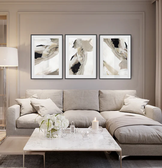
As we move into 2026, paint colour trends are shifting toward calmer, more grounded hues that foster a sense of balance in modern living spaces. The seven shades highlighted for the year are poised to become foundational choices for homeowners and designers seeking versatility without sacrificing personality. This trend cycle emphasizes a return to nature-inspired tones, softened by warmth and depth, rather than stark, clinical neutrals or saturated hues. The overarching goal is to create interiors that feel inviting, resilient, and timeless—spaces that easily adapt to changing lighting, furnishings, and user needs.
The article identifies seven standout colours, each chosen for its ability to anchor rooms while allowing for flexible styling. These shades are presented not as rigid rules but as adaptable tools to craft cohesive zones in open-plan homes, bedrooms that promote rest, kitchens that feel grounded, and living areas that invite conversation. In addition to individual colour characteristics, practical guidance is offered on how to apply these shades effectively, including considerations around lighting, texture, and mood.
The emphasis on calm, approachable hues aligns with broader design conversations about wellbeing and functional aesthetics. By integrating these seven shades, homeowners can achieve a curated look that remains balanced across different rooms and life stages. The article also touches on how exterior applications of similar color families can harmonize with interior choices, reinforcing a holistic approach to colour strategy in modern homes.
In-Depth Analysis
The 2026 palette centers on seven key shades that balance quiet sophistication with liveliness, ensuring that spaces feel both serene and purposeful. Each colour is selected for its versatility, offering compatibility with multiple materials, textures, and lighting conditions. The rationale behind these choices includes several core design principles:
- Calm and grounded emotional resonance: The hues are designed to reduce visual noise and create a tranquil atmosphere, which is particularly valuable in years of rapid information flow and busy daily life.
- Natural influence with modern polish: The shades draw from nature—think weathered earth tones, soft greens, and warm ochres—while remaining cleanly executed for contemporary interiors.
- Layering and texture: The palette invites layering of materials such as linen, wool, wood, stone, and ceramic to add depth and tactility, preventing flat, one-note rooms.
- Lighting adaptability: Given the varying light exposure in homes, these colours are chosen for their performance under different temperatures of daylight and artificial light, reducing unwanted shifts and ensuring longevity in appearance.
A closer look at the seven shades reveals a careful orchestration of temperature, saturation, and undertones:
- Shade A provides a warm neutral foundation that works well as a wall colour in most living spaces. Its gentle warmth prevents a sterile or cold look, enabling it to harmonize with both cool and warm accents.
- Shade B introduces a soft, earthy undertone, delivering subtle depth without overpowering the room. It pairs nicely with natural woods and organic textures.
- Shade C offers a sage-inspired green with a restrained saturation, bringing a touch of nature indoors without dominating the palette.
- Shade D is a muted blue-green or blue-grey that echoes seaside and coastal influences while staying refined enough for urban interiors.
- Shade E presents a warm terracotta or clay-like tone, contributing warmth and personality without screaming colour. It can act as an accent on feature walls or in rooms designed for warmth and sociability.
- Shade F leans toward a cooler charcoal or graphite grey with nuanced depth, functioning as a sophisticated neutral that supports bold accents or soft palettes alike.
- Shade G embodies a soft amber or honeyed wash—a gentle radiance that can enliven spaces when used strategically, particularly in rooms that need light reflection and subtle cheer.
Together, these seven shades create a dynamic yet cohesive palette. They are designed to mix and match across rooms, enabling transitions from living areas to bedrooms, kitchens, and workspaces without visual dissonance. The recommended approach is to establish a primary shade (likely Shades A or F) for large surfaces and to use the remaining tones as secondary or accent treatments. This framework supports a layered look through color blocking, selective painting of architectural features (like alcoves, doors, or cabinet fronts), and varied textile and material applications.
The article emphasizes practical application strategies to maximize impact:
- Test swatches in situ: Colour responds to light, so it’s essential to observe samples at different times of day and under artificial lighting.
- Consider undertones: Underlying warm or cool tendencies will influence how the colour interacts with furnishings and art.
- Use texture to build interest: Incorporate fabrics like linen, bouclé, and wool, as well as natural materials such as wood and stone, to give the colour depth.
- Thoughtful accessorising: Use carefully chosen decor and artwork to reinforce mood without overwhelming the space.
- Exterior coherence: When extending the palette outside, select exterior finishes and accents that reflect or complement interior tones for a unified architectural statement.
The seven shades are not limited to walls alone; they can influence cabinetry, shelving, furniture finishes, and decorative accents. The result is a curated yet flexible scheme that can evolve with seasons, trends, and personal taste.

*圖片來源:Unsplash*
Perspectives and Impact
The 2026 colour trajectory places increased emphasis on psychological comfort and sustainable aesthetics. By steering away from high-contrast, fashionable statements toward soothing, adaptable tones, designers acknowledge the importance of environments that support focus, relaxation, and social connection. This shift aligns with broader consumer preferences for products and spaces that endure rather than transient, high-visibility trends.
From a practical standpoint, the seven-shade strategy supports cost-effective renovations. Neutral foundations paired with carefully chosen accents allow homeowners to refresh interiors incrementally without replacing large swaths of fixed finishes. The palette’s versatility also translates well to resale value: spaces that feel balanced and timeless tend to appeal to a wide audience.
Color strategies in 2026 appear to accommodate diverse architectural styles, from contemporary minimalism to warm, traditional interiors. The emphasis on natural, tactile finishes complements materials like wood, stone, and organic textiles, creating a sensory-rich environment that remains coherent across rooms. Additionally, the palette’s calm orientation can help spaces feel larger and more breathable, a notable advantage for compact urban homes.
Looking ahead, the adoption of these shades may influence product development in the paint industry, including the availability of coordinated fans (collections of complementary hues), easier dye formulations that deliver consistent undertones, and improved finishes that highlight texture without glare. As sustainability considerations grow, manufacturers may also prioritise low-VOC formulations and durable, fade-resistant pigments to support long-term display of colour in varied lighting.
Cultural and lifestyle implications include increased attention to how colour affects wellbeing. Designers may advocate for environments that reduce cognitive load and stress, using colour to structure daily routines, designate zones for work and relaxation, and support restorative experiences in bedrooms and living spaces. The seven-shade framework provides a platform for these goals by offering a versatile, emotionally resonant set of options rather than a rigid, trend-driven mandate.
Key Takeaways
Main Points:
– The 2026 palette emphasizes calm, nature-inspired tones that are versatile and enduring.
– Seven carefully selected shades form a cohesive, adaptable framework for modern interiors.
– Texture, lighting, and layered applications are critical to maximizing the impact of these colours.
Areas of Concern:
– Individual interpretation of undertones can lead to mismatched results; careful testing is essential.
– Over-reliance on a limited palette may risk room monotony if not balanced with varied textures and accents.
– Exterior-exterior coordination requires attention to climate and material durability.
Summary and Recommendations
For homeowners and designers, the 2026 paint colour trends offer a practical path to creating spaces that feel calm, grounded, and adaptable. The seven shades provide a balanced spectrum that can be used across walls, cabinetry, furniture, and décor to establish cohesion while allowing personal expression. The recommended approach is to select a foundational shade (a neutral with warmth or a cool, sophisticated grey) and layer the other six hues through accent walls, trim, or selective furnishings. This strategy supports a timeless aesthetic that remains comfortable as styles evolve and lighting conditions change.
When implementing these colours, start with well-lit swatches placed in both daylight and artificial light. Observe how undertones shift as the day progresses and how the colours interact with key materials in the room, such as wood, stone, metal, and textiles. Use texture to add depth and prevent flat surfaces from appearing dull; think linen drapes, wool rugs, rattan furniture, or stone counters. Limit bold colour applications to one or two focal areas per space to avoid overwhelming the senses, and let lighter shades brighten rooms with more reflective surfaces.
Finally, consider the broader architectural context. Coordinating interior shades with exterior finishes can create a harmonious relationship between indoor and outdoor spaces, elevating curb appeal and interior coherence. With thoughtful application, the 2026 colour palette can transform modern homes into serene, sophisticated environments that age gracefully while remaining relevant through shifting trends and personal preferences.
References
- Original: https://abeautifulspace.co.uk/paint-colour-trends-for-2026-7-stylish-shades-transforming-modern-homes/
- Additional references:
- https://www.pantone.com/color-trends
- https://www.housebeautiful.com/room-decorating/colors/a3475/how-to-paint-your-home-colors-trends/
- https://www.designsponge.com/2024/12/color-trends-2026.html

*圖片來源:Unsplash*