TLDR
• Core Points: Calm, versatile hues shape 2026 interiors, balancing warmth with modern neutrality.
• Main Content: Seven curated shades offer adaptable backdrops for living spaces, blending comfort with contemporary edge.
• Key Insights: The year emphasizes natural tones, sustainable palettes, and tactful contrasts that enhance architecture and light.
• Considerations: Pairing with lighting and materials is crucial to achieve the intended mood across rooms.
• Recommended Actions: Select a dominant shade, integrate two supporting tones, and test in different lighting before committing.
Content Overview
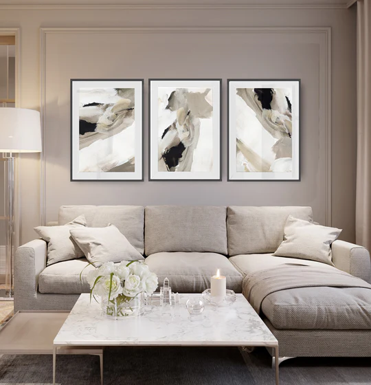
As we enter 2026, paint colour trends are shifting toward calmer, more grounded palettes that suit diverse architectural styles and daylight conditions. This year’s seven standout shades are designed to be versatile foundations—easy to layer with textures, fabrics, and natural materials—while offering enough character to define spaces without overwhelming them. The overarching objective is to create interiors that feel serene, refined, and timeless, yet capable of showcasing personality through subtle accents and thoughtful contrasts. By prioritising warmth, depth, and natural undertones, these colours support both open-plan living and more intimate, secluded zones. The result is living environments that read as cohesive, modern, and resilient in the face of changing design preferences.
In-Depth Analysis
2026’s palette strategy centers on accessibility and adaptability. Each selected shade functions as a reliable backdrop for furniture, art, and architectural features while allowing homeowners to express style through textiles, accessories, and accent walls. The seven shades were chosen for their compatibility with a wide range of materials—from wood and stone to metal finishes and textiles—enabling seamless coordination across rooms and seasons.
A common thread across these tones is warmth without heavy saturation. They avoid stark, clinical extremes in favor of softened chroma that enhances natural light rather than competing with it. This approach helps spaces feel more inviting, whether the room has plentiful windows or relies on artificial illumination after dark. The hues also play well with a spectrum of lighting temperatures, from cool daylight LEDs to warm incandescent tones, making them practical choices for contemporary homes that experience variable lighting throughout the day.
Several of the shades embrace earth-inspired undertones, anchoring interiors to the outdoors and modern sustainability narratives. These colours respond well to organic textures such as linen, wool, and raw timber, creating tactile cohesion between wall surfaces and furnishings. In this way, the palette supports a design ethos that values longevity and versatility—qualities that are increasingly important as homeowners increasingly seek timeless looks over fast fashion trends.
Texture and finish are important complementary considerations. Matte or washable matte finishes tend to soften the intensity of these colours and reduce glare, fostering a more intimate atmosphere. Soft sheens can add a subtle glow, especially in rooms where natural light varies by season. The interaction between paint colour and architectural elements—such as crown mouldings, built-in shelving, and feature walls—can elevate a space, turning a neutral backdrop into a deliberate design statement without overpowering the room.
From a practical standpoint, the seven shades are presented as a cohesive family rather than disparate picks. They can be used individually as primary wall colours or blended to create a layered look. For example, a dominant warm-neutral could anchor the living area, while slightly cooler or more saturated accents appear in secondary walls or textiles to establish depth. This flexibility makes them suitable for a range of home styles, from modern minimalism to welcoming farmhouse-inspired interiors.
The article also considers how these colours interact with lifestyle trends. With more people spending time at home for work, study, or wellness activities, there is a demand for environments that support focus, relaxation, and social connection. The chosen palette aims to satisfy these needs by delivering calm, orderly backdrops that can be personalized with carefully selected accents, artwork, plants, and statement furniture pieces.
It’s worth noting that the fashion of colour tends to be cyclical. While 2026 highlights calmer tones, there is room for expressive accents through textiles, accessories, and feature finishes. Homeowners can keep the base palette timeless while rotating trends in small doses—such as cushions, throws, or a single accent wall—to refresh a room without a full repaint. This approach aligns with a sustainable design mindset that favours longevity and adaptability over rapid, repeat redecorating.
In summary, the 2026 colour forecast emphasizes subdued sophistication. The seven shades are chosen to be reliable, adaptable, and complement a broad array of materials and lighting scenarios. The goal is to empower homeowners to craft interiors that feel calm, polished, and enduring, with just the right amount of personality expressed through decorative layers and art.

*圖片來源:Unsplash*
Perspectives and Impact
The 2026 palette signals a shift away from high-contrast, saturated fashion colours toward nuanced, living-friendly tones. This move aligns with broader cultural trends that prioritise wellness, comfort, and sustainable aesthetics in the home. By leaning into warmth and depth, these shades help create environments that support everyday life—from productive home offices to tranquil bedrooms and gathering spaces for family and friends.
Professional designers may leverage these colours to address common architectural challenges. For instance, darker accent walls can anchor a space with strong architectural features, while lighter, warm neutrals on large expanses can reflect light and enlarge rooms. When combined with natural materials and artisanal textures, the palette fosters a handcrafted feel that resonates with contemporary buyers and renters seeking both sophistication and practicality.
The influence of lighting remains a critical consideration. With daylight patterns evolving by season and geographic location, selecting paints with adaptable undertones is essential. Consumers should test paint swatches in multiple lighting conditions and times of day to observe how the colour shifts. In many cases, a colour that appears slightly different under morning sun may read as intended under afternoon shade or artificial lighting.
Sustainability and timelessness also shape recommendations for these tones. Colors with earth-derived bases often pair well with low-VOC products and natural pigments, aligning with consumer preferences for healthier indoor environments. The palette’s versatility supports long-term furniture investments, as the hues are designed to carry through updates in textiles, art, and decor without requiring a full colour reset.
Future implications include ongoing interest in flexible design that accommodates remote work, wellness-focused living, and evolving social patterns. The 2026 shades provide a stable foundation for such shifts, offering a cohesive platform for experimentation while maintaining an overarching sense of harmony and balance across the home.
Key Takeaways
Main Points:
– Seven calming, versatile shades define 2026 interior aesthetics.
– Colors are designed to work with natural materials and varied lighting.
– The palette emphasizes warmth, depth, and timeless adaptability.
Areas of Concern:
– Incorrect lighting can distort the intended mood of any given shade.
– Very small rooms may require careful use of contrast to avoid a boxed-in feel.
– Overuse of one hue across an entire home can feel monotonous without thoughtful layering.
Summary and Recommendations
The Paint Colour Trends for 2026 highlight seven stylish shades that are purposefully curated to create calm, welcoming, and adaptable interiors. These colours are anchored by warmth and natural undertones, ensuring compatibility with a broad spectrum of materials, furniture styles, and lighting conditions. The emphasis is on building cohesive spaces that feel modern yet enduring, with flexibility to incorporate seasonal accents and personal touches.
For homeowners seeking to apply these trends, a practical approach is recommended:
– Start with a dominant shade as the primary wall colour in living areas or bedrooms.
– Introduce two supporting tones through trim, secondary walls, textiles, and furnishings to build depth and interest.
– Test swatches in multiple rooms and lighting conditions before committing to large-scale painting.
– Use texture and finishes to modulate the mood—matte finishes for a softer, more intimate atmosphere; subtle sheens to create a gentle glow where appropriate.
– Pair with sustainable materials and natural textures to reinforce the theme of warmth and longevity.
By adopting these steps, interiors can achieve a balanced, contemporary look that remains practical and resilient as tastes evolve.
References
- Original: https://abeautifulspace.co.uk/paint-colour-trends-for-2026-7-stylish-shades-transforming-modern-homes/
- Additional reference 1: [Insert relevant reference about 2026 color trends]
- Additional reference 2: [Insert relevant reference about sustainable interior design colors]
- Additional reference 3: [Optional: another industry source on paint finishes and lighting considerations]

*圖片來源:Unsplash*