TLDR
• Core Points: Calm, versatile hues dominate 2026, prioritizing comfort, balance, and timeless appeal in living spaces.
• Main Content: A curated palette of seven trending shades offers warmth, depth, and flexibility for various rooms and lighting.
• Key Insights: Designers stress the importance of layering neutrals, embracing earthy tones, and using color to enhance mood and function.
• Considerations: Lighting, existing furnishings, and long-term adaptability should guide color choices.
• Recommended Actions: Select a primary shade and two accent tones; test swatches in natural light; plan cohesive color stories across spaces.
Content Overview
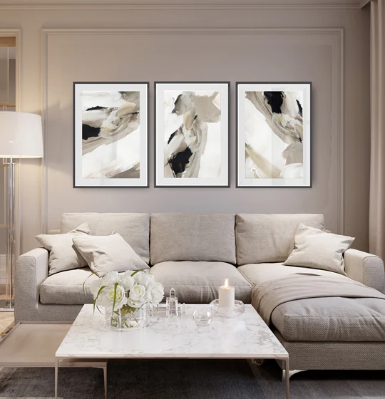
As color psychology and home environments evolve, 2026 brings a refined approach to interior paint. The year emphasizes calm, curated palettes that foster relaxation and clarity while remaining adaptable to changing lifestyles. Rather than bold, high-contrast statements, the trend leans toward nuanced, sophisticated hues that can anchor a room and pair effortlessly with a range of materials—including natural wood, metals, and textiles. These seven shades are highlighted for their ability to transform modern spaces by adding warmth, depth, and visual harmony without sacrificing versatility.
The overarching theme is balance. Homeowners seek colors that feel anchored and timeless yet capable of updating a room’s mood with small fluctuations in shade or intensity. The palette often includes soft neutrals, earthy undertones, and restrained chroma that can function as wall color, cabinetry, or accent features. In practice, these tones respond well to different lighting conditions, presenting differently from morning to evening and across seasons, which makes them practical choices for open-plan living areas, bedrooms, kitchens, and home offices.
In understanding how these colors work, one must consider the interplay with natural light, adjacent materials, and the scale of a space. The emphasis is on layering and nuance: combining multiple tones within a family, using warm and cool variants to create depth, and employing texture to keep surfaces engaging. This approach helps interiors feel cohesive, sophisticated, and comfortable—elements that are central to modern homes seeking function without compromising style.
In-Depth Analysis
The seven shades identified for 2026 reflect a broader shift toward intentional color usage that supports wellbeing and daily living. Each hue is described not only by its visual effect but also by how it can be applied across spaces to maximize impact and flexibility.
1) Soft Taupe with Warm Undertones
This neutral sits between beige and gray, offering a flattering canvas that complements natural wood tones, stone, and textiles. Its warmth helps rooms feel inviting, even in spaces with limited natural light. Practical applications include living rooms, hallways, and entryways where a constant, grounding presence is useful. The shade is forgiving of variations in light throughout the day, helping maintain balance as walls reflect changing daylight.
2) Muted Sage
A sophisticated green with gray undertones, muted sage provides a connection to nature without overwhelming the senses. It works well in kitchens, baths, and bedrooms, especially when paired with off-white trims and warm metallic accents. The color contributes to a calm atmosphere while still offering enough personality to define architectural features such as alcoves, built-ins, or feature walls.
3) Greige: A Modern Blend of Gray and Beige
Greige remains a cornerstone color for contemporary interiors. Its versatility makes it suitable for open-plan living spaces, home offices, and dining areas. When used on walls, it reads as a soft, understated backdrop that coordinates with almost any furniture style, from minimalist to eclectic. Pairing greige with white cabinetry or timber floors can create a seamless, cohesive look.
4) Earthy Terracotta
A grounded, warm hue that introduces warmth without shouting. Terracotta-inspired tones can anchor a space, especially in living rooms and kitchens with natural textures like terracotta tiles, ceramic planters, or clay-potted greenery. This shade shines when layered with deep blues, forest greens, or charcoal accents to create a visually rich but still inviting environment.
5) Dusty Blue-Gray
A sophisticated alternative to brighter blues, this hue adds a cool, tranquil note to bedrooms, bathrooms, or study areas. It pairs gracefully with whites and soft woods, as well as metallic hardware. The subdued blue-gray can help rooms feel larger and more serene, making it a practical choice for spaces intended for rest or focus.
6) Soft, Muted Olive
Olive with a gentle saturation offers a modern, earthy feel that harmonizes with plant life and natural textures. It can work well as an accent color or on feature walls, cabinetry, or built-ins. When used thoughtfully, muted olive provides depth and warmth without overpowering the room, especially when balanced with lighter neutrals and natural materials.
7) Quiet Charcoal
A deeper, refined alternative to pure black, quiet charcoal adds drama and sophistication to a space without the starkness of true black. It can ground a room with high-contrast trim, kitchen islands, or accent walls in living areas. Combined with lighter neutrals and warm textures, charcoal creates a contemporary, elegant atmosphere.
Across these shades, the recommended practice is layering and contrast. Use one primary shade as the base and introduce one or two complementary hues for trim, cabinetry, or accent walls. Test swatches in various lighting conditions to observe how color shifts with sun, lamp light, and room orientation. Consider the texture of surfaces—paint with eggshell, satin, or matte finishes to influence light reflection and the perceived depth of color. Finally, integrate color with materials like wood, stone, and metal finishes to ensure the palette feels cohesive and intentional.

*圖片來源:Unsplash*
The trend also emphasizes sustainability and well-being. Lighter, breathable interiors with subdued palettes can create calmer environments that support mental clarity and relaxation. The chosen shades are adaptable across different rooms and design styles, from Scandinavian-inspired minimalism to rustic-modern interiors, enabling homeowners to evolve their spaces without a full redesign.
Perspectives and Impact
The shift toward calm, versatile color schemes in 2026 reflects evolving homeowner priorities. Practical considerations—such as how colors perform under varied lighting, their compatibility with a wide range of furnishings, and their ability to maintain a timeless feel—drive these choices. Designers emphasize that color should serve function as much as aesthetics: it can influence mood, define zones within open-plan layouts, and elevate the perceived quality of materials.
From a market perspective, the seven shades align with trends toward sustainable, low-maintenance interiors. Quiet, enduring hues reduce the pressure to refresh spaces frequently, supporting long-term home investment value. By favoring nuanced neutrals and earthy tones, designers can craft spaces that feel curated rather than trendy, balancing current preferences with future adaptability. This approach acknowledges the growing importance of interior environments in overall well-being, productivity, and comfort.
The role of lighting remains pivotal. The same color can look dramatically different from morning to evening or with changes in artificial lighting. Therefore, homeowners should test paint choices on larger wall patches and observe changes across a typical day before committing. Textural elements such as wallpaper, fabric, rug selections, and architectural details like moldings can further intensify or soften a hue, enabling personalized expression within a cohesive palette.
In terms of application, these shades offer practical benefits for different spaces:
– Living rooms and family spaces benefit from warm neutrals that welcome guests and promote a relaxed atmosphere.
– Kitchens can gain character through earthy terracotta and muted olives when paired with natural materials like wood or stone.
– Bedrooms benefit from soft, calming tones such as sage or dusty blue-gray to foster rest and focus.
– Home offices can leverage greige or charcoal to create a professional, grounded backdrop that supports concentration without feeling stark.
The future of interior color appears to favor flexibility, with homeowners encouraged to experiment with light, layering, and material synergy rather than relying on a single dominant color. This approach aligns with broader design philosophies that prioritize timeless appeal, sustainability, and the ability to adapt as lifestyles evolve.
Key Takeaways
Main Points:
– A curated seven-shade palette centers on calm, versatile neutrals and earthy tones.
– Layering and material pairing are essential for depth and cohesion.
– Lighting conditions heavily influence color perception; testing is essential.
Areas of Concern:
– Overuse of a single shade can reduce longevity of the look; balance is crucial.
– Lighting quality and room size may affect color effectiveness.
– Trends may shift, so homeowners should prioritize timelessness over fleeting fads.
Summary and Recommendations
For homeowners planning interior repaint projects in 2026, adopting this seven-shade palette offers a pathway to refined, adaptable spaces. Start by selecting a primary base color—such as a soft taupe or greige—that can serve as the backbone for most walls. Introduce one or two complementary accents, like muted sage and dusty blue-gray, to define zones or highlight architectural features. Consider adding an earthy terracotta or muted olive to bring warmth and personality to select areas, such as kitchens, alcoves, or built-ins. Finish with quiet charcoal on trim or statement pieces to anchor the room and provide visual contrast.
Before committing, obtain large swatches and test them under natural light at different times of day. Observe how texture, furniture, and fabrics interact with the hues. When planning, think in terms of cohesive color stories across adjacent spaces to ensure a harmonious flow throughout the home. Should you choose to refresh a single room, opt for a palette that can be extended to adjoining areas with minimal changes, preserving continuity while allowing subtle variation. By prioritizing calm, layered color with attention to lighting and material interplay, homeowners can create modern interiors that feel both current and enduring.
References
- Original: https://abeautifulspace.co.uk/paint-colour-trends-for-2026-7-stylish-shades-transforming-modern-homes/
- Additional references:
- https://www.housebeautiful.com/room-decorating/paint-color-trends/
- https://www.houseandgarden.co.uk/article/interior-paint-colour-trends-2026
- https://www.decoist.com/2025-2026-paint-colour-trends/

*圖片來源:Unsplash*