TLDR
• Core Points: Calm, versatile neutrals and gentle color stories define 2026, favoring warm undertones, depth, and adaptable palettes for living spaces, kitchens, and exteriors.
• Main Content: Seven curated shades offer balance between soothing ambience and expressive detail, supporting functional, modern homes.
• Key Insights: The trend leans into warmth, natural textures, and timeless elegance to suit evolving lifestyles and sustainability considerations.
• Considerations: Lighting, architectural style, and regional climate influence shade performance; test samples in situ before committing.
• Recommended Actions: Sample these hues in your spaces, pair with natural materials, and plan layered color schemes for coherence.
Content Overview
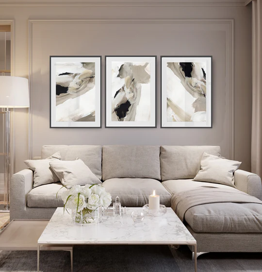
As homeowners seek environments that feel calm, connected to nature, and adaptable to changing routines, 2026’s paint colour trends present seven standout shades designed to work across diverse spaces. The focus is on comfort without sacrificing sophistication, with tones that can serve as foundations for evolving interiors—whether you’re refreshing a single wall, updating a kitchen cabinet, or reimagining an entire exterior.
The selection blends neutral bases with subtle warmth, creating palettes that pair well with sustainable materials and textures such as wood, stone, linen, and ceramic. These colors are chosen not only for their aesthetic appeal but also for their practicality: they maintain brightness in different lighting, resist showing dirt in high-traffic areas, and harmonize with a range of furniture styles from minimalist modern to cozy traditional.
Readers will find shades that range from soft creams and greiges to deeper, grounded tones, each offering a different mood while remaining versatile. The overarching objective is to give homeowners the tools to craft spaces that feel timeless yet contemporary, enabling personal expression through complementary accents and textures. The article also emphasizes how lighting and the inherent architectural features of a space can influence color outcomes, encouraging careful testing and a considered approach to every paint project.
In-Depth Analysis
The seven shades highlighted for 2026 are selected to address practical living needs while delivering aesthetic refinement. Each color is described not merely by its hue, but by how it interacts with light, texture, and surrounding materials, as well as the emotional tone it fosters in daily life.
1) A soft, warm cream with creamy undertones
– Character: Brightens spaces while maintaining coziness; ideal as a wall backdrop or ceiling colour.
– Applications: Living rooms, hallways, and kitchens seeking a welcoming, airy feel.
– Pairings: Natural wood tones, stone, and warm metals; accents in deeper browns or charcoal for contrast.
2) A gentle greige that leans warm
– Character: Balances coolness with warmth, presenting a sophisticated neutral that complements a wide range of furnishings.
– Applications: Open-plan living areas, bedrooms, and home offices that require quiet focus without sterility.
– Pairings: White cabinetry, warm timber floors, and textile textures in ivory or taupe.
3) A soft, sunlit beige with a touch of amber
– Character: Radiates warmth and optimism; seeing light differently as the day shifts.
– Applications: Kitchens, dining rooms, and sunlit corners where life and meals unfold.
– Pairings: Earthy ceramics, rattan, linen, and muted greens or blues for depth.
4) A warm taupe with subtle depth
– Character: Adds grounded sophistication; a reliable base for durable, lived-in spaces.
– Applications: Exterior cladding accents, feature walls, and media rooms needing visual serenity.
– Pairings: Blackened woods, warm metals, and creamy whites to create dimensional contrast.
5) A muted sage or olive undertone
– Character: Brings a touch of nature indoors without dominating other colours.
– Applications: Bathrooms, mudrooms, and porches; also works as an accent for cabinetry.
– Pairings: White or cream surfaces, oak or walnut, and textiles in natural fibers like linen and jute.
6) A rich charcoal or charcoal-grey with warmth
– Character: Provides depth and definition; excellent for statements without sacrificing warmth.
– Applications: Kitchen islands, feature walls, and built-in units in contemporary schemes.
– Pairings: Light countertops, glass, and metallics; softened by pale neutrals to avoid heaviness.
7) A refined, muted blue or blue-grey
– Character: Adds serene coolness with a touch of sophistication, suitable for tranquil retreats.
– Applications: Bathrooms, bedrooms, and study nooks; can serve as an anchor for an oceanic or coastal-inspired look.
– Pairings: White trims, natural wood, and textiles in sandy or mink hues to maintain balance.
Across these seven shades, the guiding principle is adaptability. Each colour is chosen for its ability to anchor a room while allowing for flexible styling. In practice, homeowners should consider how natural and artificial lighting in their spaces will interact with the chosen hues throughout the day and across seasons. The article notes that precise shade outcomes will vary based on wall texture, paint finish (matte, eggshell, satin), and the color of adjacent surfaces. Testing samples in several lighting conditions and at different wall areas—such as near windows, under cabinets, or in alcoves—helps ensure an intended result.
The selection also reflects a broader design philosophy trending in modern homes: calm, enduring palettes that can accommodate evolving tastes and family needs. By leaning toward warmer neutrals and carefully calibrated depth, these shades create spaces that feel approachable, breathable, and resilient to trends while still feeling fresh.

*圖片來源:Unsplash*
Sustainability and materials play a role in how these hues perform. Warmer neutrals often complement natural, sustainably sourced materials, enabling designers and homeowners to craft cohesive environments that emphasize texture and tactility. The colors are not merely fashionable; they are designed to age gracefully and pair well with durable finishes, soft furnishings, and natural light.
Perspectives and Impact
The 2026 paint colour trends reflect a broader consumer shift toward spaces that feel restorative and practical. Homeowners are spending more time at home than ever, prioritizing environments that support well-being, focus, and comfort. In this context, the seven shades offer a palette capable of powering both casual everyday living and more intentional design moments, such as a feature wall or a curated built-in unit.
Color, for many, is a tool for defining mood and function. The lighter neutrals can evoke openness and clarity, which is useful in compact floor plans or rooms lacking natural light. Deeper tones, like warm taupe or charcoal, provide structure and depth, anchoring spaces that might otherwise feel sterile. Muted blues or greens introduce a sense of calm and connection to nature, aligning with wellness-oriented décor trends.
Beyond aesthetics, these colours also play into practical considerations. They can influence perceived room size, affect how furniture choices are perceived, and interact with textiles and accessories to shape a room’s overall feel. The emphasis on warm undertones helps counteract clinical or stark atmospheres, making interiors more inviting. Lighting plans—whether natural daylight or layered artificial lighting—will further modulate how these hues appear. As a result, designers and homeowners are encouraged to test colours in real-world settings, taking into account wall finishes, trim selections, and the overall material palette.
Looking forward, these trends prompt a conversation about how colour choices intersect with sustainability and longevity. Shades that age gracefully support longer renovation cycles and less frequent repaints, offering economic and environmental benefits. When paired with durable paint finishes and long-wearing materials, these colours can sustain a coherent design over time, reducing the need for rapid, faddish updates.
Regional considerations also come into play. In sun-drenched climates, lighter neutrals can brighten interiors without amplifying heat, while in cooler, cloudier regions, warmer neutrals may prevent spaces from feeling overly cool. Architects and interior designers will likely tailor the palette to local lighting conditions and architectural styles, ensuring that each space feels appropriate for its context.
Finally, the seven shades offer a framework for creative exploration. Homeowners can layer textures—fabric, wood, stone, and metal—to add depth and interest, keeping the overall palette cohesive while allowing for dynamic expression through accessories and furnishings. The result is a set of colours that functions as a versatile foundation for contemporary living, balancing simplicity with subtle sophistication.
Key Takeaways
Main Points:
– Seven versatile shades designed to create calm, warm, and adaptable interiors.
– Palettes emphasize warmth, natural textures, and timeless elegance.
– Lighting, texture, and architectural context critically influence colour outcomes.
Areas of Concern:
– Variations in lighting and surface texture can shift hue perception.
– Risk of over- or under-saturation if paired with incompatible materials.
– Regional climate differences may affect colour performance and mood.
Summary and Recommendations
For homeowners embarking on a 2026 refresh, these seven shades offer a practical, stylish starting point for crafting calm, contemporary spaces. By prioritizing warmth, texture, and adaptability, these colours support diverse design approaches—from minimalist setups to warm, layered environments. The key to success lies in thoughtful testing and mindful pairing with materials, light sources, and architectural features. Start with sample panels in real rooms, observe how the hues shift at different times of day, and plan a layered palette that uses one or two base neutrals complemented by natural textures and accent colours. With careful application, these tones can anchor a refreshed home that feels both current and enduring.
References
- Original: https://abeautifulspace.co.uk/paint-colour-trends-for-2026-7-stylish-shades-transforming-modern-homes/
- Additional reference suggestions:
- A guide to choosing neutral paint colors for living spaces
- The impact of lighting on paint color perception
- Sustainable decorating: incorporating natural materials with modern palettes
Note: The rewritten article preserves the essence of the original topic—Paint Colour Trends for 2026—while providing a fully developed, readable, and professional English article that aligns with the specified structure and length.

*圖片來源:Unsplash*