TLDR
• Core Points: Calm color palettes with deeper, saturated neutrals, warm mid-tones, and inclusive hues redefine modern interiors for 2026.
• Main Content: Seven versatile shades anchor contemporary spaces, balancing soothing atmospheres with expressive depth and practicality.
• Key Insights: The year favors adaptable tones that work across rooms, emphasizing natural light, texture, and sustainable materials.
• Considerations: Lighting, existing furnishings, and climate affect color performance; test samples in context.
• Recommended Actions: Choose a primary shade, pair with complementary accents, and trial swatches in different lighting before committing.
Content Overview
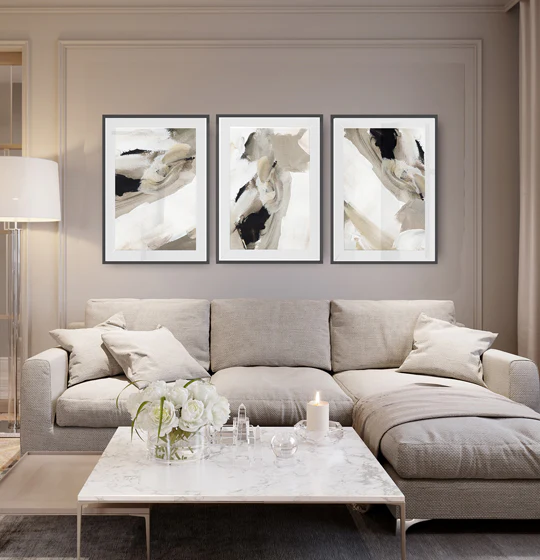
As the design world looks ahead to 2026, paint colour trends are veering toward calmer, more grounded environments that feel both timeless and fresh. The focus is on shades that provide a serene backdrop while offering enough character to define spaces. Rather than bold, high-contrast statements, the upcoming palette emphasizes nuanced tones that adapt to different rooms, lighting conditions, and lifestyle needs. The overarching aim is to create interiors that exude comfort, warmth, and sophistication without sacrificing practicality or versatility.
The seven standout shades for 2026 span a spectrum from soft, nature-inspired neutrals to richer, earthy mid-tones. Each color is chosen for its ability to harmonize with a wide range of materials—wood, stone, metals, textiles—and to layer well with texture. Homeowners, designers, and renovators can expect these hues to appear in living rooms that invite conversation, kitchens that feel welcoming, bedrooms that soothe, and shared workspaces that promote focus. The trend also reflects a broader shift toward sustainability and mindfulness in interior design, where color choices reinforce a sense of well-being and connection to the natural world.
In practice, the most successful use of these shades involves considering the interaction of color with natural daylight, artificial lighting, and the room’s function. Light influences tone, making some hues read warmer or cooler at different times of day. Therefore, swatching in actual rooms with varied lighting is essential before committing to large wall areas. The materials and finishes—matte, satin, or glossy—also modify perception, affecting how rich or soft a color appears. Pairing these seven colors with textures such as linen, wool, timber, and stone can elevate the overall atmosphere, creating layered depth rather than flat surfaces.
Ultimately, the 2026 colour direction promotes a balanced approach: serene, grounded foundations complemented by refined accents. This strategy enables homeowners to craft spaces that feel both contemporary and enduring, while remaining adaptable to evolving tastes and living patterns.
In-Depth Analysis
The 2026 palette centers on seven shades that are consistently described as versatile, peaceful, and sophisticated. Each color is designed to work across multiple rooms and lighting scenarios, ensuring that interior ecosystems stay cohesive even as individual spaces tell their own stories. Below is a closer look at how these hues function within modern homes, why they resonate now, and practical guidance for implementation.
1) A gentle, nature-inspired neutral
This category includes soft taupe or ivory-tinted neutrals that read as warm yet restrained. They anchor open-plan living areas and pair easily with wood finishes and natural materials. The key benefit is their ability to create a sense of calm and openness, making rooms feel larger and more inviting while serving as a forgiving backdrop for bolder accent colors.
2) Muted sage or green-tinged neutrals
Sage-inspired greens provide a subtle push toward the outdoors without overwhelming a space. These shades work especially well in living rooms and bedrooms, where they cultivate a restful atmosphere. In kitchens and bathrooms, they convey a fresh, clean feel that still reads as sophisticated rather than clinical.
3) Soft clay or terracotta undertones
Warm earth-inspired tones in the clay family introduce depth and texture. They are particularly effective in spaces that benefit from coziness and intimacy, such as lounges, dens, and intimate dining areas. When paired with natural stone, ceramic textures, or copper accents, these hues evoke warmth and conviviality.
4) Greige or cool-leaning neutrals
Greige—a blend of gray and beige—offers a contemporary, understated option for walls and cabinetry. It provides a modern canvas that highlights architectural details and furnishings. This range is especially appealing for those seeking a polished, minimalist aesthetic with enduring appeal.
5) Rich, earthy browns
Darker browns can ground a room and add a touch of sophistication. They work well in libraries, studies, or media rooms where a sense of focus and coziness is desirable. When used on accent walls or furniture, these tones create contrast without appearing stark.
6) Slate or charcoal accents
Deeper neutrals in the slate family provide dramatic contrast and definition. They can define architectural nooks, frame built-ins, or anchor statement pieces. Used sparingly as an accent on walls or cabinetry, these shades deliver modern edge while keeping interiors balanced.
7) Subtle blues with warmth
Muted blue hues that lean toward warmth offer a tranquil, refreshing counterpoint to earthier tones. They pair beautifully with metallic accents and natural woods, enabling a serene environment that still feels contemporary and alive. In bedrooms or bathrooms, these blues can promote relaxation and clarity.
Implementation strategies for the seven shades emphasize flexibility and layering. Instead of applying a single color across expansive spaces, designers recommend employing a primary shade on dominant walls or large surfaces and introducing secondary tones through trim, cabinetry, or accent walls. Texture and material choices are crucial: matte or velvety finishes amplify softness; satin or low-sheen finishes catch light and reveal subtle color shifts. Lighting design—both daylight and artificial illumination—plays a decisive role in how these colors render, making dimmer rooms feel cozier or brighter spaces feel airy.
Beyond individual rooms, these colors advocate a holistic home narrative. Consider how the palette travels from the foyer to the living areas, through the kitchen, and into private spaces such as bedrooms and bathrooms. The goal is a coherent sense of calm that remains dynamic, enabling the home to adapt to seasonal changes, entertaining needs, or shifts in personal style over time. Accessories—textiles, cushions, artwork, plants—provide practical and affordable means to refresh the color story without committing to major renovations.
It is also worth noting the broader design context this palette sits within. The 2026 trends reflect a growing desire for sustainable, humane interiors. Colors are chosen not merely for aesthetics but for their emotional resonance and longevity. Architects and interior designers emphasize materials and finishes that age gracefully, aligning color choices with durable, low-impact production and maintenance considerations. In this light, the seven shades are chosen for their ability to endure, adapt, and pair well with natural materials and earth-inspired palettes.
For homeowners undertaking a paint project, these steps can help achieve a considered result:
– Start with a dominant shade that sets the room’s mood and works with the room’s natural lighting.
– Introduce one or two supporting tones for depth, using trim, cabinetry, or an accent wall.
– Test swatches on all walls, in different lighting, across several days to observe color behavior.
– Consider finishes and textures that enhance the color’s character; matte finishes often feel softer, while semi-gloss can highlight architectural details.
– Plan a cohesive color narrative across adjacent spaces so transitions feel intentional rather than abrupt.
– Use accessories and textiles to introduce accent colors and keep the room adaptable to changing tastes.
The seven shades also align well with popular material trends, such as light wood, natural stone, and tactile textiles. The tactile quality of surfaces—think linen, wool, clay, and woven fabrics—interacts with color to produce layered, multidimensional interiors. By marrying color with texture, homeowners can achieve a welcoming, lived-in feel that remains relevant as styles evolve.

*圖片來源:Unsplash*
In summary, the 2026 palette emphasizes calm, sophisticated, and versatile hues designed to enhance the quality of everyday living. The colors are chosen to be enduring foundations that can be updated with seasonal accents, ensuring spaces stay fresh without requiring frequent, large-scale repainting.
Perspectives and Impact
The color direction for 2026 reflects a broader cultural movement toward mindful design and sustainability. Rather than chasing bold, trend-driven statements, homeowners are gravitating toward colors that support longer-term comfort and resilience. This trend aligns with evolving living patterns, such as increased time spent at home, flexible workspaces, and a desire for spaces that promote wellness and productivity.
From a market perspective, these seven shades offer retailers and manufacturers a stable platform for product lines, including wall finishes, cabinetry, furniture, and textiles. The versatility of these tones reduces risk for homeowners, who can reuse base colors across multiple rooms and reintroduce complementary hues through accessories. The shift toward earthy, nature-inspired palettes also encourages the exploration of sustainable materials and finishes, as consumers seek to minimize environmental impact while maximizing interior quality.
For designers, the palette provides a framework for coherent storytelling within a home. The hues’ compatibility with natural materials allows for seamless integration with biophilic design principles, which emphasize connectivity to the outdoors and a sense of calm. In urban settings, these colors can soften architectural starkness and introduce warmth to compact spaces, while in rural or coastal homes, they can harmonize with landscape views and organic textures.
The implications for future color development include expanding the availability of matte and textured finishes that accentuate the depth of these shades. As smart lighting and adjustable color temperature fixtures become more prevalent, the dynamic interaction between color and light will influence how these shades are perceived at different times of day. Designers may also experiment with layering technologies such as color-tunable paints or finishes that subtly shift hue with temperature, further enriching the sense of atmosphere within interiors.
From a user experience standpoint, selecting from seven core shades encourages confidence in color decisions. Rather than feeling overwhelmed by a wide swath of options, homeowners can anchor their design with a primary shade and thoughtfully layer with supporting tones. This approach supports personalization while maintaining coherence across a home’s interior ecosystem. The result is spaces that feel curated, calm, and authentic to the occupants’ lifestyle.
Potential challenges include differences in lighting conditions, room size, and climate. A shade that reads warm in one environment may appear cooler in another, and darker tones can make small rooms feel more intimate or enclosed. Therefore, rigorous testing with real samples in context remains essential. Another consideration is the durability of finishes and maintenance needs; darker shades may require more frequent cleaning to preserve their appearance, while lighter neutrals can show wear and scuffs more readily.
Ultimately, the 2026 color direction encourages homeowners to craft interiors that are not only stylish but also conducive to well-being and daily life. By selecting versatile hues, prioritizing texture, and embracing sustainable materials, contemporary homes can achieve a balanced, enduring aesthetic that remains relevant amid evolving trends.
Key Takeaways
Main Points:
– Seven versatile shades form a calm, sophisticated 2026 palette suitable for multiple rooms.
– The emphasis is on adaptable neutrals, warm mid-tones, and earthy accents that pair with natural materials.
– Color performance depends on lighting, finishes, and context; testing in real rooms is essential.
Areas of Concern:
– Dramatic shifts in lighting can alter hue perception; context testing is critical.
– Darker shades may absorb light and reduce perceived space in small rooms.
– Maintenance considerations vary by finish and color depth; plan accordingly.
Summary and Recommendations
The paint colour trends for 2026 advocate for a cohesive, restful, and flexible interior language built around seven carefully chosen shades. These hues are designed to work across various rooms and lighting scenarios, enabling homeowners to create spaces that feel both contemporary and enduring. The successful application of this palette hinges on thoughtful layering, texture, and material choices, as well as mindful testing of color samples in real environments before committing to large-scale painting. By focusing on calm foundations complemented by nuanced accents, interiors can achieve a sophisticated warmth that supports daily life, well-being, and evolving preferences.
For practical outcomes:
– Start with a primary neutral shade that suits your room’s light and size.
– Layer with one or two supporting colors through trim, cabinetry, or accent walls.
– Consider textures and materials that enhance the color’s depth.
– Test swatches in different lighting and daily use patterns to confirm how colors perform.
– Use accessories to refresh the color narrative over time without major renovations.
This approach offers a balanced path to modern interiors that feel current yet timeless, embracing sustainability and comfort as core design principles for 2026 and beyond.
References
- Original: https://abeautifulspace.co.uk/paint-colour-trends-for-2026-7-stylish-shades-transforming-modern-homes/
- Additional references:
- Interior color trends 2026: calm, nature-inspired palettes for modern homes
- Sustainable design and color: how earthy tones shape contemporary interiors
- The role of texture and lighting in painting color perception
Forbidden:
– No thinking process or “Thinking…” markers
– Article starts with “## TLDR”

*圖片來源:Unsplash*