TLDR
• Core Points: Data is messy; Power BI enables cleaning, modeling, and visualization with DAX-driven insights for action.
• Main Content: The article explains how analysts transform imperfect data into reliable models and interactive dashboards that support decision-making.
• Key Insights: Clean data foundations, robust modeling, and actionable dashboards are essential for impactful analytics.
• Considerations: Data quality gaps, governance, and stakeholder alignment influence outcomes.
• Recommended Actions: Implement structured data cleaning, define clear metrics, and build dashboards focused on decision-driving insights.
Content Overview
In today’s data-driven environments, analysts frequently encounter data that is incomplete, inconsistent, or scattered across disparate sources. Such messy data can hinder accurate analysis and slow down decision-making. Power BI emerges as a comprehensive platform that helps analysts bridge the gap between raw data and actionable intelligence. By facilitating data cleaning, modeling with DAX (Data Analysis Expressions), and the creation of interactive dashboards, Power BI enables organizations to transform messy inputs into reliable insights that decision-makers can act upon.
The journey from chaos to clarity typically begins with data gathering and assessment. Analysts inventory available data sources, identify gaps, and recognize inconsistencies in formats, codes, or time periods. They consider user needs, business questions, and the strategic objectives of the organization. With these fundamentals in mind, they proceed to the data preparation stage, where cleaning, normalization, and integration occur. Power BI offers a suite of tools and techniques to support this work, including Power Query for data shaping, connection management to diverse data sources (databases, cloud services, flat files, and APIs), and modeling features that establish relationships between datasets.
A core component of Power BI is its capability to create robust data models. Analysts define tables, relationships, and hierarchies that reflect the real-world structure of the business. They apply data transformations to standardize values, handle missing data, and create calculated columns and measures. DAX, the formula language used within Power BI, enables complex calculations, time intelligence, aggregations, and conditional logic. Through DAX, analysts can implement business rules, define key performance indicators (KPIs), and produce consistent results across reports and dashboards.
Once data is prepared and modeled, the emphasis shifts to visualization. Interactive dashboards and reports in Power BI provide decision-makers with a concise, contextual view of performance. Designers choose visuals that best communicate the underlying story—tables for granular data, charts for trends, maps for geographic patterns, and cards for at-a-glance metrics. Interactivity, such as slicers, filters, drill-through, and bookmarks, allows users to explore the data from different angles and to investigate specific questions in depth. The resulting dashboards should balance clarity with depth, ensuring that insights are both easy to grasp and sufficiently informative to guide action.
Throughout this process, governance, data quality, and stakeholder alignment play pivotal roles. Analysts must ensure that data sources are trusted, calculations are transparent, and the resulting insights are reproducible. Documentation, versioning, and change management help maintain accountability as data and business requirements evolve. Regular validation against source data and stakeholder feedback loops help sustain confidence in the analytics.
The article emphasizes that the value of Power BI lies not merely in the technology but in disciplined practice: understanding business questions, preparing reliable data, constructing meaningful models, and presenting insights in a way that prompts informed decisions. By combining clean data foundations, expressive DAX calculations, and well-designed dashboards, analysts can translate messy inputs into actionable intelligence that drives organizational outcomes.
In-Depth Analysis
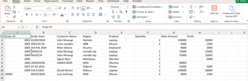
Messiness in data is a common barrier to effective analysis. Spreadsheets may contain duplicate records, inconsistent column headers, or varying date formats. Databases can hold incomplete fields, orphaned records, or disconnected tables. Such conditions undermine the accuracy of calculations and erode trust in analytics. Power BI addresses these challenges by providing end-to-end capabilities—from data ingestion to polished visualization—in a single platform. The workflow typically unfolds as follows:
1) Data Discovery and Assessment
– Analysts begin by cataloging data sources, assessing data quality, and identifying critical gaps. They ask business questions that the analytics effort must answer, such as where performance is lagging, which products drive revenue, or which regions require closer attention.
– The assessment includes understanding data lineage, data ownership, and update frequency. This context informs decisions about which sources to trust, how often to refresh data, and which transformations are permissible.
2) Data Preparation and Cleaning
– Clean data is foundational. Analysts use Power Query to remove errors, standardize formats, and resolve inconsistencies. Common tasks include trimming whitespace, unpivoting and re-pivoting tables, handling nulls, and normalizing categorical values.
– Data integration is another critical step. Analysts join data from multiple sources to create a unified dataset. This involves matching keys, resolving many-to-one or many-to-many relationships, and dealing with slowly changing dimensions where appropriate.
3) Data Modeling and DAX Calculations
– A robust data model captures the real-world structure of the business. This means establishing appropriate relationships, defining fact and dimension tables, and enabling intuitive hierarchies (e.g., Year > Quarter > Month or Country > State > City).
– DAX enables powerful calculations that go beyond simple aggregations. Calculations can include:
– Measures that aggregate data at the desired granularity (sums, averages, counts, ratios).
– Time intelligence to compare performance across periods (year-over-year, moving averages, period-to-date calculations).
– Conditional logic to implement business rules (e.g., discount eligibility, flagging exceptions).
– The goal is to create reusable, auditable logic. Well-named measures and calculated columns help ensure consistency across reports and dashboards.
4) Visualization and Dashboard Design
– Visuals translate data into an accessible narrative. Effective dashboards combine multiple visuals to illustrate trends, outliers, and drivers of performance.
– Interactivity enhances discovery. Slicers and filters enable stakeholders to isolate segments, while drill-through and bookmarks support deeper investigations and scenario analysis.
– Designers should avoid cognitive overload by focusing on a core story per page, using consistent color schemes, and providing clear labels and legends. The best dashboards answer business questions quickly and guide users toward the actions they should take.
5) Governance, Quality Assurance, and Stakeholder Alignment
– Transparency is paramount. Analysts document data sources, assumptions, and the logic behind calculations. This fosters trust and makes it easier for others to reproduce results.
– Data governance ensures that critical datasets are only modified through controlled processes. Versioning and change management help track updates and prevent unexpected shifts in reported metrics.
– Regular validation against source systems and continuous feedback from stakeholders help maintain accuracy and relevance. When business rules change, the analytics model should be updated consistently across reports.

*圖片來源:Unsplash*
6) Real-World Considerations
– Data timeliness matters. Stakeholders may require real-time or near-real-time insights; otherwise, dashboards should clearly indicate refresh schedules and latency.
– Scalability is essential as data volumes grow. Efficient data modeling and optimized queries reduce performance bottlenecks.
– Security and privacy considerations must be integrated from the start. Access controls, data masking, and compliance with regulations protect sensitive information.
The overarching message is that Power BI is a versatile instrument for data-driven decision-making, but its effectiveness depends on disciplined practice. Clean data, thoughtful modeling, and clear storytelling through dashboards enable analysts to turn ambiguity into actionable recommendations. By adhering to best practices in data preparation, modeling, and visualization, organizations can harness Power BI to produce reliable insights that inform strategic and operational decisions.
Perspectives and Impact
As organizations increasingly rely on data to steer operations, the role of the analyst evolves from simply generating numbers to delivering strategic narratives grounded in trustworthy data. Power BI’s features support this evolution by enabling analysts to:
– Build scalable data ecosystems: With multiple data sources harmonized into a single model, organizations can support more users, faster refresh cycles, and broader analytics use cases.
– Standardize calculations: DAX promotes consistency across dashboards, reducing conflicting interpretations of metrics and improving governance.
– Accelerate decision cycles: Interactive dashboards allow leadership to explore hypotheses, validate assumptions, and respond to changing conditions in near real time.
– Democratize analytics: By making data accessible to non-technical stakeholders through intuitive visuals, organizations foster data literacy and empower more teams to participate in data-driven decision-making.
However, this potential comes with responsibilities. Analysts must guard against data fatigue—presenting too many metrics or overly complex models that obscure the core story. Clarity should trump quantity; dashboards should be designed around the specific decisions they aim to inform. Additionally, organizations must invest in data governance, data quality initiatives, and ongoing training so that analysts, managers, and frontline staff speak a common data language and share a common understanding of what metrics mean.
The future of analytics with Power BI is likely to involve deeper integration with other tools, enhanced AI-assisted insights, and greater emphasis on data storytelling. Features such as natural language queries, pattern detection, and automated anomaly alerts can augment human judgment, helping analysts spot issues and opportunities more quickly. As organizations collect more data, the ability to clean, model, and visualize efficiently will become even more critical to maintaining accurate, timely, and actionable insights.
Ultimately, the impact rests on how well teams balance technical capability with practical business judgment. Power BI provides the toolkit; disciplined practice and clear communication determine how effectively that toolkit translates messy data into decisions that move the business forward.
Key Takeaways
Main Points:
– Messy data is a common starting point; cleaning, modeling, and visualization are essential steps to derive actionable insights.
– DAX enables robust calculations, time intelligence, and consistent business rules across reports.
– Well-designed dashboards with interactivity support quick understanding and informed decision-making.
Areas of Concern:
– Data quality gaps and governance can undermine trust if not managed.
– Overly complex models or dashboards can obscure the core message.
– Changes in data sources or business rules require coordinated updates across reports.
Summary and Recommendations
To translate messy data into actionable insights using Power BI, organizations should adopt a structured workflow that starts with data discovery and quality assessment, followed by rigorous data cleaning and normalization. Building a solid data model with clear relationships and well-documented DAX calculations ensures consistency and reliability across dashboards. Visualization should tell a focused story, leveraging interactivity to support exploration while avoiding cognitive overload. Governance practices, including data lineage, versioning, and stakeholder validation, are essential to maintain trust as data and requirements evolve.
Future success depends on balancing technical sophistication with practical business judgment. Embrace governance, invest in data quality initiatives, and cultivate data literacy across the organization so Power BI can truly convert messy inputs into decisive action.
References
- Original: https://dev.to/nicholas_kimani_e0fc0306b/how-analysts-translate-messy-data-dax-and-dashboards-into-action-using-power-bi-1hld
- 2-3 relevant reference links based on article content (to be added by user)

*圖片來源:Unsplash*