TLDR
• Core Points: A cautious approach to the yellow paint trend is advised due to design fatigue, practicality concerns, and durability considerations.
• Main Content: While yellow paint has surged in popularity on social platforms, its long-term appeal, visibility, and maintenance challenges warrant careful evaluation before committing.
• Key Insights: Trend longevity, lighting effects, and room function influence yellow’s suitability; misjudged hues can overwhelm spaces.
• Considerations: Lighting, space size, and existing furnishings; cost of upkeep and refreshing color choices.
• Recommended Actions: Test large swatches, consider muted or golden tones, and balance with neutral accents; avoid high-commitment wall choices without testing.
Content Overview
The rise of bold color in interior design has brought yellow paint to the forefront, aided by social media demonstrations and trend reports. Proponents highlight sunny, uplifting atmospheres and the ability to brighten dim rooms. However, there is a growing caution about embracing yellow as a dominant wall color in 2026. This piece examines why the trend might be overhyped, offering a balanced view based on design practicality, psychological effects, and long-term maintenance. Readers should consider how yellow interacts with natural and artificial lighting, the size and function of a space, and how durable and timeless the color is likely to be. The goal is to provide actionable guidance for homeowners, designers, and renovators who want to avoid regretful color choices while still enjoying current opportunities for expression through color.
In-Depth Analysis
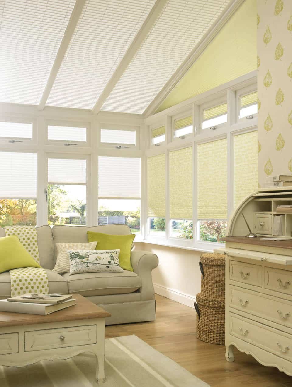
Yellow has the strongest associations with energy, warmth, and optimism among interior palettes. In recent months, social media reels and design influencers have showcased vibrant wall shades—from lemon bright to mustard and ochre—asserting that yellow can instantly uplift a room and create a focal point. These demonstrations often rely on high-saturation pigments and carefully curated lighting to achieve dramatic effects. As a result, many readers may feel compelled to adopt yellow to stay on trend.
Yet the analysis of interior design data suggests that trend-driven colors can be short-lived when exposed to real-world constraints. Several factors influence whether yellow walls remain appealing over time:
Lighting dynamics: Yellow hues respond differently under varied lighting conditions. In spaces with ample natural light, certain yellows can feel lively and approachable. Conversely, in rooms with cool or limited light, yellow can appear flat, muddy, or overly intense, depending on the undertones and saturation. This variability means homeowners must test colors under different times of day and seasons before committing.
Space scale and function: The psychology of color shows that lighter, cooler tones often provide a sense of openness, while warmer yellows can increase perceived energy. In small rooms or spaces without windows, an aggressive yellow might exacerbate a sense of confinement or visual fatigue. Conversely, larger rooms can sometimes handle richer yellows, provided the hue is balanced with neutrals and complementary textures.
Undertones and hue selection: Not all yellows are alike. Subtle shifts toward peach, amber, or gold can dramatically alter mood and compatibility with trim, cabinetry, and textiles. A misselected undertone may clash with existing wood tones or stone finishes, leading to a look that feels inconsistent rather than cohesive.
Maintenance and durability: Yellow paints, especially high-saturation varieties, can be more prone to showing wear, dust, and touch-ups. White or light neutrals may require less frequent maintenance, whereas bold yellows can demand more upkeep to keep the color looking fresh. Additionally, certain finishes may highlight imperfections in walls, requiring more preparation work before painting.
Longevity and timelessness: Seasonal mood boards and design articles can create a sense of urgency to adopt trending colors. However, many homeowners prefer colors that can evolve with personal taste and resale considerations. While yellow can be paired with a wide range of accents, its boldness may make it harder to refresh without repainting.
Cost considerations: The initial cost of painting a room in a vivid yellow is comparable to other color choices, but the long-term cost of maintenance and potential repainting to accommodate changing tastes should be considered. If a home is planned to be on the market, buyers’ color preferences may vary, affecting resale scenarios.
A cautious approach is to treat yellow as a design accent rather than a dominant wall color. For example, yellow can work effectively as an isolated feature, such as an accent wall, kitchen cabinetry, or small decorative elements, where it can inject energy without saturating the entire space. When used thoughtfully, yellow can complement a neutral base and highlight architectural features or textiles with warm undertones.
Practical strategies for integrating yellow without overcommitting include:
Start with testing: Use large swatches or sample boards in different lighting conditions over multiple days. Apply the color to a sizable patch to observe how it interacts with furniture and surrounding materials.
Pair with neutrals: Combine yellow with balanced neutrals such as warm whites, grays, or taupes to temper intensity. Wood tones, leather, and natural materials can anchor the look and prevent visual overstimulation.
Consider muted or golden yellows: Softer, golden-tinged yellows can offer warmth without the brightness of primary yellows. These shades tend to have broader appeal and greater versatility over time.
Use partial applications: Consider yellow in cabinetry, textiles, or accent pieces rather than full-wall coverage. This approach preserves flexibility if tastes shift.
Plan for lighting: Ensure artificial lighting complements the hue. Warm LED lighting can enhance golden yellows, while cool lighting can make certain yellows appear harsher.
Evaluate resale considerations: If resale is a factor, assess local market norms and potential buyer responses to bold color choices. Neutral palettes often offer broader appeal.

*圖片來源:Unsplash*
- Maintain flexibility: Design with replaceable elements such as textiles, artwork, and furniture to allow yellow accents to be updated or removed without a full repaint.
The broader takeaway is that while yellow paint trendiness is undeniable in media channels, its practical fit for a home depends on context. A measured approach—using yellow as an accent, selecting undertones carefully, and ensuring compatibility with lighting and furnishings—can yield a vibrant yet balanced result. For many households, this means resisting the impulse to cover large wall surfaces in saturated yellow and instead exploring more versatile applications that preserve flexibility for future design shifts.
Perspectives and Impact
Trends in color are influenced by fashion, branding, and cultural associations, and interior design is no exception. The yellow movement reflects broader desires for optimism and brightness amid challenging times or transitional seasons. However, several perspectives merit attention:
Design professionals’ stance: Interior designers often emphasize the importance of context. A color that feels energetic in a sunlit loft may feel overwhelming in a compact apartment with limited natural light. Professionals advocate testing, balance, and gradual adoption rather than wholesale shifting to a single bold color.
Psychological considerations: Yellow is linked to optimism, creativity, and sociability. Yet very saturated yellows can be exhausting in spaces intended for rest or focus. When adopted thoughtfully, yellow can stimulate conversation and wake up a space; when overused, it can contribute to visual fatigue.
Functional implications: In kitchens and workspaces, yellow accents can evoke warmth and alertness. In bedrooms or serene zones, buyers may prefer more muted tones that promote relaxation. The impact of yellow on mood and behavior is nuanced and design-dependent.
Durability and practicality: The maintenance realities of yellow paint should not be overlooked. Some finishes show wear, scuffs, or imperfections more readily than muted hues. A practical homeowner may prioritize color choices that maintain appearance with less upkeep.
Market and cultural variability: Regional preferences and housing stock influence how bold color trends are received. In resale scenarios, kitchens and living spaces with restrained, adaptable color palettes often appeal to a wider audience than rooms painted in bold hues.
Future implications point toward a more nuanced approach to color that blends trend awareness with personal taste and long-term feasibility. The most resilient color choices will be those that offer flexibility through complementary tones, tasteful texture, and scalable saturation. Rather than adopting yellow as a global theme, many households might benefit from using it as an auxiliary accent—small moments of brightness that can be updated or removed as tastes evolve.
Another trend worth noting is the shift toward psychologically informed color palettes. Designers increasingly analyze how color combinations affect performance in workspaces, comfort in living areas, and the perception of space. In this context, yellow remains a candidate for specific roles rather than a universal solution.
As we look to 2026, the best practice for homeowners is to approach yellow with intention. Use it to highlight features, create warmth, and reflect personal style, but avoid wholesale commitments that limit future design options. The key is balance: a neutral foundation with measured pops of color that can be adjusted over time.
Key Takeaways
Main Points:
– Yellow can inject energy and warmth, but its practicality depends on lighting, space, and undertones.
– Bold wall favors require careful testing and balanced pairing with neutrals and textures.
– Use yellow strategically as accents rather than a dominant, all-wall color to preserve flexibility.
Areas of Concern:
– Visual fatigue in poorly lit or small spaces.
– Undertone mismatches leading to clashes with existing finishes.
– Higher maintenance and repaint costs tied to bold hues.
Summary and Recommendations
The yellow paint trend for 2026 offers exciting opportunities to brighten spaces and create focal moments. However, the trend carries considerations that warrant a measured approach. For most homes, yellow works best as an accent or feature rather than a comprehensive wall color. Prospective adopters should test color samples extensively across different lighting and times of day, focusing on muted or golden yellows that harmonize with existing furniture and finishes. Neutral bases—whether warm whites, grays, or beiges—often provide a stable backdrop that supports yellow accents without overpowering the room. Additionally, planning with future flexibility in mind—through replaceable textiles, artwork, and decor—reduces the risk of color fatigue and costly repainting.
Ultimately, the decision to embrace yellow should be guided by personal preference, practical constraints, and a careful evaluation of how the color interacts with the room’s function and lighting. By balancing bold expression with durable design choices, homeowners can enjoy the vitality of yellow while maintaining a timeless sense of space and comfort.
References
- Original: https://abeautifulspace.co.uk/why-you-should-not-embrace-the-yellow-paint-trend-in-2026/
- 1) Color psychology and interior design considerations in modern homes (general reference)
- 2) Lighting effects on paint color perception and room mood (general reference)
- 3) Trends vs. timeless design: strategies for durable color plans (general reference)
Forbidden:
– No thinking process or “Thinking…” markers
– Article starts with “## TLDR”

*圖片來源:Unsplash*