TLDR
• Core Points: The yellow paint trend rising in 2026 is flawed for versatility, practicality, and long-term home appeal.
• Main Content: Bright color choices can hinder resale value, clash with lighting, and demand high maintenance; alternative neutrals or scheduled color accents offer safer, scalable decor.
• Key Insights: Trend cycles favor adaptable palettes; persistent color psychology and lighting conditions shape how yellows perform in real spaces.
• Considerations: Sized rooms, natural light, furniture finishes, and personal taste should guide color decisions beyond fleeting trends.
• Recommended Actions: Prioritize flexible color schemes, test samples in different lighting, and reserve bold yellows for accents rather than large walls.
Content Overview
In recent years, interior design trends have repeatedly spotlighted bold color palettes as a catalyst for mood and personality. The year 2026 has brought a heightened focus on yellow paint, with many platforms highlighting it as a must-try trend. However, this article examines why embracing yellow as a dominant feature in interior spaces may not be the best long-term strategy for most homeowners and renters. We review practical considerations, such as lighting interactions, room size, maintenance demands, and the impact on resale value, while offering balanced guidance on how to incorporate yellow thoughtfully.
The conversation around color in interiors is not simply about aesthetics; it’s about how color interacts with architecture, natural light, and everyday living. Yellow, in particular, is a color with strong associations and varying effects depending on hue, saturation, and context. While it can be uplifting and energizing in certain environments, it can also feel overstimulating or dated if misapplied. This analysis aims to present a grounded perspective that respects individual taste while acknowledging broader design principles and real-world constraints.
In-Depth Analysis
Yellow is a notoriously complex color to work with in interior design. Its brightness and warmth can enhance spaces with ample natural light, creating a cheerful atmosphere that some homeowners may desire. Yet, the same characteristics can lead to unintended consequences in other scenarios. The following factors are critical when evaluating the viability of yellow paint as a central design choice in 2026.
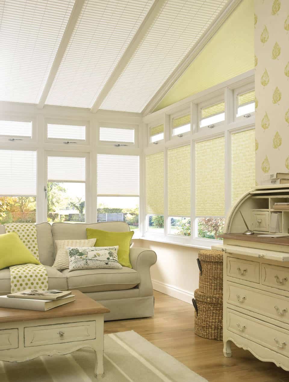
Lighting and room orientation: Yellow reflects more light and can appear different under varying daylight conditions. In rooms with cooler light or limited natural light, certain yellows may read as muddy, sickly, or overly aggressive. Conversely, warm midday sun can intensify yellows, potentially causing glare on walls or overpowering furnishings. The success of a yellow palette depends on precise hue selection, controlled brightness, and tested swatches over multiple times of day.
Hue selection and saturation: Not all yellows are created equal. Pale or muted yellows tend to feel sunshine-like and can work well in small spaces when balanced with cooler neutrals and textures. Bright, saturated yellows can energize a room but risk becoming distracting or wearing out quickly. Designers emphasize the importance of testing multiple tones—especially when considering large wall areas—to ensure the color remains harmonious with furniture, artwork, and architectural details.
Scale and proportion: In large rooms or open-plan living areas, a bold yellow can create a focal point or cohesive flow when thoughtfully integrated. However, overpowering a space with yellow can reduce perceived depth and complicate the coordination of other colors. For smaller rooms, a limited application—such as accent walls, cabinetry, or accent pieces—tends to yield a more versatile, timeless result.
Maintenance and wear: Yellow can show dirt, fingerprints, and dust more readily than subtler tones, particularly in high-traffic zones or homes with children and pets. This reality translates into more frequent cleaning and touch-ups. Additionally, yellow-painted surfaces may require more careful maintenance when paired with bright lighting or glossy finishes, where imperfections become more conspicuous.
Coordination with materials: The effectiveness of yellow depends on its connections with flooring, cabinetry, countertops, and textiles. Neutral cores—creams, beiges, or cool grays—often provide balance, while wooden tones and metallic accents can either harmonize or clash with the warmth of yellow. The risk of a mismatched palette increases when yellow is used as a dominant feature without providing anchor points in the room.
Resale value and timelessness: Trend cycles influence how potential buyers perceive color choices. A bold yellow trend could be polarizing, potentially limiting the buyer pool if the space feels too specific to a moment in time. Neutral or timeless color foundations tend to offer broader broad appeal, allowing future occupants to adapt rooms with ease via accessories or minor changes.
Practical alternatives: Rather than committing to bright yellow across major surfaces, many designers recommend testing yellow in more controllable forms—such as accent walls, cabinetry, textiles, or décor items. Layering yellows through textiles like cushions, throws, or lamps can deliver the mood-boost of yellow without permanently committing to a dominant wall color.
Psychological impact: Colors influence perception of space and mood. Yellow is associated with optimism and energy, but it can also provoke overstimulation in workspaces or bedrooms where calmness is desired. Understanding the intended function of a room helps determine whether yellow will support or hinder the desired atmosphere.
Cultural and architectural context: In certain architectural styles or neighborhoods, yellow may harmonize with exterior colors or local design traditions. In others, it may clash with historical features or the prevailing interior aesthetic. This contextual awareness is essential when deciding to adopt yellow on a wide scale within a home.
Personal preferences and lifestyle: Ultimately, color choices reflect personal taste. Some homeowners relish the vitality of yellow and plan to refresh their spaces frequently, while others prefer a more understated palette that remains flexible over time. The best approach considers both taste and practicality, with a plan for future updates.
In light of these factors, the argument against embracing yellow as a primary interior color in 2026 centers on practicality, adaptability, and long-term appeal. While yellow can be a powerful accent and mood enhancer when used selectively, relying on it as a dominant wall color demands careful planning, testing, and ongoing maintenance. For many households, a more conservative approach—using yellow as an accent or in feature pieces—offers a safer route to a bright, contemporary look without compromising functionality or resale value.
Perspectives and Impact
The broader implications of adopting or resisting the yellow paint trend extend beyond individual rooms. Color trends often reflect cultural dynamics, economic considerations, and evolving attitudes toward home environments. A few perspectives help illuminate why a measured approach to yellow may be prudent in 2026.
- Design resilience vs. trendiness: Fashionable colors rise and fall quickly, but interior design benefits from resilience. Neutral foundations provide enduring value because they accommodate changes in furniture, artwork, and personal taste. A bold yellow strategy may deliver immediate impact but risks feeling dated as trends shift.

*圖片來源:Unsplash*
Lighting equity and accessibility: Not all homes experience the same lighting conditions. A hue that sings in a sun-drenched living room can look space-warping in a dark corridor. Designing with lighting in mind—considering artificial lighting plans, window treatments, and reflective surfaces—helps ensure color choices remain harmonious.
Environmental and maintenance considerations: Lighter yellows can accumulate dust and smudges more readily, while brighter yellows may require more frequent touch-ups due to wear and cleaning demands. Homeowners should factor in lifestyle, pets, and cleaning routines when selecting colors for high-traffic areas.
Budgetary implications: A yellow palette that dominates multiple surfaces can escalate renovation costs through extensive repainting or the need for high-quality finishes to resist staining and fading. Accent-based approaches tend to be more budget-friendly and adaptable.
Regional and architectural compatibility: In some regions, yellow complements exterior and interior architectural details and neighboring homes, creating a cohesive streetscape. In others, it may appear incongruent with historical styles or prevailing interior aesthetics. Understanding local context helps avoid misalignment with the broader environment.
Future-proofing spaces: A design strategy that prioritizes modularity—color-forward but customizable via textiles, art, and accessories—enables homeowners to update the space with changing tastes without significant structural changes. This approach aligns well with evolving trends while preserving long-term usability.
Environmental psychology: Colors influence well-being and productivity. In kitchens and dining rooms, yellows can stimulate appetite and energy, which may be desirable for social spaces. In bedrooms or work zones, calmer hues are often preferred to foster rest and focus. Balancing color decisions with the intended function of each space is key.
Market trends and data: While design communities may spotlight yellow, mainstream consumer adoption varies. Homeowners should weigh enthusiasm in social media against real-world results, including sample testing in different lighting and contexts within their homes.
The overarching message from these perspectives is a call for deliberate, context-driven color decisions. The yellow paint trend in 2026 should be understood as one option among many, best deployed with intention rather than as a blanket directive. For those seeking a dynamic aesthetic without compromising practicality, a hybrid approach—neutral backdrops with carefully chosen yellow accents—may deliver the most durable and satisfying results.
Key Takeaways
Main Points:
– Yellow can energize spaces but may be challenging to sustain across lighting, wear, and evolving tastes.
– Large-scale yellow walls carry more risk than neutral bases, especially for resale value and long-term versatility.
– A restrained use of yellow as accents or in textiles offers the mood benefits without sacrificing adaptability.
Areas of Concern:
– Lighting interactions and potential color shifts throughout the day.
– Maintenance demands and visibility of dirt or wear on yellow surfaces.
– The possibility of the color feeling dated as trends evolve.
Summary and Recommendations
To navigate the yellow paint trend thoughtfully in 2026, consider a balanced strategy that prioritizes adaptability and practicality. Start with a neutral foundation—soft whites, creams, warm beiges, or cool grays—to serve as reliable backdrops for furniture, artwork, and windows. Introduce yellow in controlled, low-risk ways: accent walls in rooms with favorable lighting, yellow cabinetry in kitchens or bathrooms, or bold textiles and décor accents such as pillows, throws, or lamps.
Before committing to any large-scale yellow painting, conduct thorough testing. Paint sample swatches in the intended rooms for several days, observing how they interact with natural light at different times and with existing furniture. Consider photographing or living with the swatches under artificial lighting as well to understand how the color behaves after sunset.
If you are drawn to a bright, optimistic aesthetic, reserve saturated yellows for accent pieces rather than entire walls. This approach preserves the energy and mood-boosting qualities without overstimulation or overly strong commitment. For those who enjoy color-switching flexibility, a neutral foundation with removable décor elements—such as yellow curtains, rugs, or wall art—lets you recalibrate the space with changing trends or tastes.
Finally, align your choice with practical considerations: the room’s size, traffic level, maintenance capacity, and your long-term plans for the home. If resale value is a priority, lean toward timeless neutrals for primary walls and interpret yellow through accessories, ensuring the space remains adaptable to future buyers’ preferences.
By adopting a thoughtful, measured approach to yellow, homeowners can enjoy its warmth and energy when desired, while maintaining a space that remains comfortable, durable, and broadly appealing over time.
References
- Original: https://abeautifulspace.co.uk/why-you-should-not-embrace-the-yellow-paint-trend-in-2026/
- Additional references:
- How to test paint colors effectively in different lighting conditions
- The psychology of color in interior design
- Trends vs. timeless design: balancing current fashion with enduring appeal
Forbidden: No thinking process or markers of internal reasoning. The article starts with “## TLDR” and remains an original, professional rewrite.

*圖片來源:Unsplash*