TLDR
• Core Points: The rising yellow paint trend in 2026 risks limited versatility, practicality concerns, and potential resale challenges.
• Main Content: While yellow interiors and accents are popular on social media, they may not suit long-term tastes, lighting realities, or shared living spaces.
• Key Insights: Trend-driven color choices can lead to costly updates; consider neutrals, adapt with accessories, and prioritize longevity.
• Considerations: Lighting, room function, and personal preference should guide color decisions more than fleeting trends.
• Recommended Actions: Use yellow as a secondary accent, test palettes with swatches, and balance trend with timeless neutrals.
Content Overview
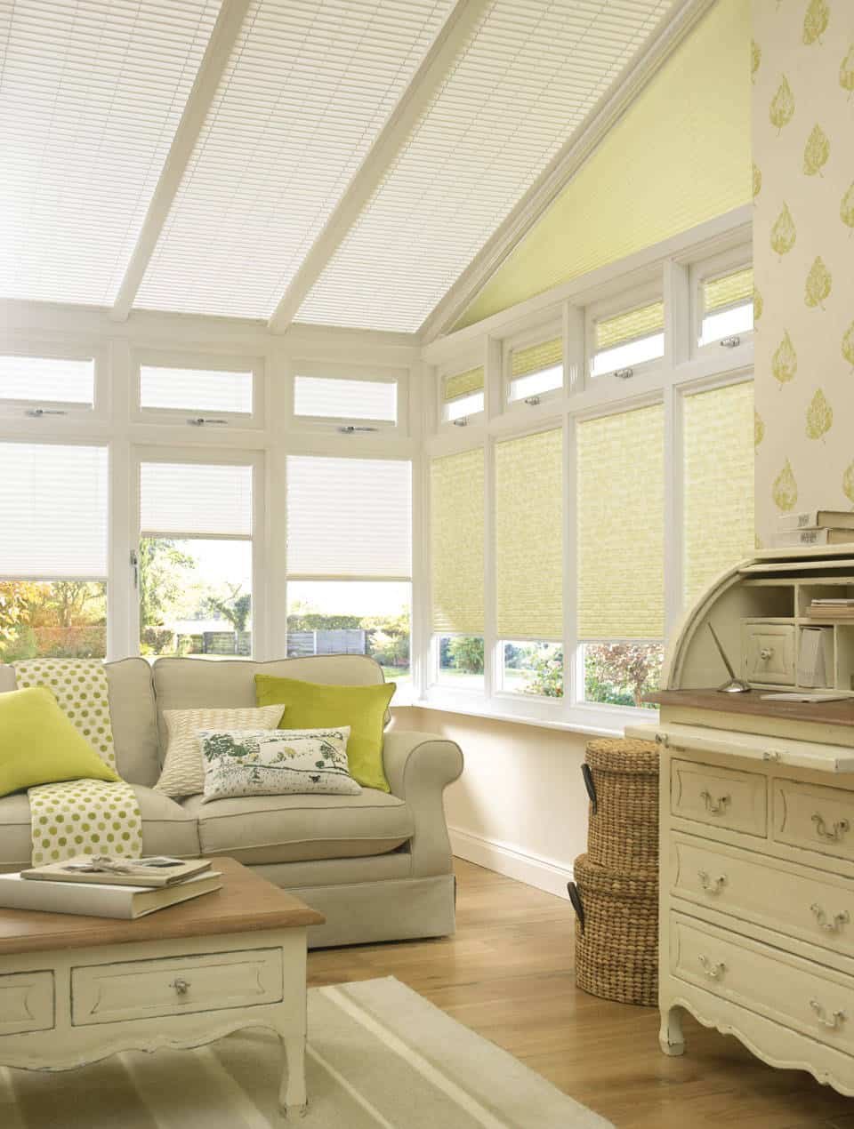
In recent design conversations, yellow paint has surged into mainstream interest, propelled by social media reels, home makeover shows, and influencer-led palettes. The trend presents sunny, optimistic aesthetics, often pairing citrus tones with white, gray, or wood finishes to create energetic, uplifting spaces. Yet the same dynamic energy that makes yellow appealing in short-form content can complicate real-world decisions: how a bright wall reads in varying light, how long the color remains aligned with personal taste, and how it affects adjoining rooms and resale value.
This article examines why embracing yellow paint as a dominant or lasting design choice in 2026 may warrant more caution than excitement. It considers practical aspects—lighting, room function, and maintenance—as well as broader implications for interior cohesion and long-term satisfaction. By balancing the allure of trend-driven color with prudent planning, homeowners can enjoy a touch of yellow without surrendering versatility and timeless appeal.
In-Depth Analysis
Yellow is a color historically associated with warmth, energy, and optimism. In interior design, it can energize spaces, reflect natural sunlight, and provide a cheerful backdrop for art, textiles, and furniture. The 2026 moment for yellow is largely driven by social platforms that showcase dramatic before-and-after transformations and bold accent walls. However, there are several structural considerations that designers and homeowners should weigh before adopting yellow as a central design element.
1) Light and Space: Yellow reflects light in distinctive ways. Softer yellows can brighten dim rooms by amplifying available daylight, but even gentle hues can appear differently depending on time of day and artificial lighting. Warm incandescent bulbs baselined to a yellow spectrum can intensify the hue, while cooler LEDs may mute it. In rooms with limited natural light or northern exposures, a bright or saturated yellow may feel overpowering, claustrophobic, or emotionally intense rather than welcoming. Conversely, rooms with ample sun exposure may amplify the color to a point where it competes with other design elements, such as artwork or architectural features.
2) Color Temperature and Undertones: Not all yellows are alike. Some lean toward lemon or canary tones (cooler undertones), while others drift into amber or saffron (warmer undertones). The undertone of the yellow affects adjacent colors, the perceived warmth of the space, and how it sits with existing materials like wood tones, stone, or fabric palettes. Mismatched undertones can create visual discord, making a room feel uneven or chaotic.
3) Function and Mood: Yellow is often associated with energy and sociability. In high-traffic family spaces, a bright yellow can contribute to a lively atmosphere but may become fatiguing over time, especially in rooms intended for relaxation or concentration. For bedrooms, studies, or quiet zones, more subdued or muted yellows are typically chosen to maintain comfort without the intensity of a primary color. The intention behind the space—whether it’s for rest, work, or socializing—should guide whether yellow is used extensively or sparingly.
4) Balance with Neutrals: Successful integration of yellow usually relies on balancing color intensity with neutral tones. Whites, creams, beiges, and cool or warm grays can anchor the space, allowing yellow accents to pop without overwhelming the eye. A common strategy is to use yellow on a single wall or as occasional hits in textiles, art, or accessories, rather than implementing a full-room yellow scheme. This approach preserves flexibility for future updates and reduces the risk of trend fatigue.
5) Longevity and Personal Preference: Trends are cyclical, and what’s current can quickly feel dated. Choosing a prominent wall color based on a trend can limit long-term satisfaction and complicate resale if future buyers favor more timeless aesthetics. Personal preference should take precedence over popularity. If you love yellow, consider how your tastes might evolve in five to ten years, and whether you’re prepared to repaint if the color no longer aligns with your vision.
6) Maintenance and Practicality: Yellow pigments, particularly highly saturated ones, can show dirt, wear, and smudges more readily than softer neutrals. In high-traffic areas or homes with children and pets, maintenance considerations become significant. Additionally, white or light-colored trim can brighten yellow areas, but the contrast must be carefully chosen to avoid visual clash or a “busy” feel along the edges of doors and moldings.
7) Global and Cultural Contexts: Paint color trends can be influenced by broader cultural moments, media depictions, and product availability. Yellow’s vitality aligns with optimism in times of societal change or economic recovery, but this alignment can fluctuate with shifts in consumer sentiment. Designers often recommend anchoring bold colors in accessible formats—powder rooms, accent walls, or decorative elements—while preserving a neutral foundation for overall interior coherence.
8) Practical Testing: Before committing to a full room, testing swatches in different lighting scenarios is essential. Several coats on a single wall may be required to assess saturation and undertone across morning, afternoon, and evening light. Observing a sample in relation to flooring, cabinetry, and fabrics helps ensure the hue harmonizes rather than competes. Some designers advocate applying paint to a large test panel or using peel-and-stick sample sheets to simulate wall coverage for extended periods.
9) Accessibility and Contrast: For spaces used by individuals with visual impairments or age-related changes in vision, color contrast and luminance are important. Intense yellows can affect readability of text and objects, especially in rooms used for work or study. Pairing yellow with contrasting neutrals and ensuring adequate lighting can mitigate accessibility concerns.
10) Alternatives and Depth: If the goal is a bright, energizing environment without committing to a full yellow wall, consider alternative approaches. Light yellow-tinted wallpapers, mustard accents, sunburst textiles, or art collections incorporating yellow can deliver the mood with less commitment. Layering textures, patterns, and metallics (such as brass or gold hardware) can add depth and warmth without saturating walls.
Taken together, the case against embracing a heavy yellow paint trend in 2026 rests on prioritizing flexibility, timelessness, and practicality. A bold color choice can be a powerful design tool, but it also introduces potential constraints that may complicate future updates and living arrangements. For many homeowners, a more measured approach—using yellow as an accent rather than a dominant wall color—offers the best balance of mood, style, and longevity.

*圖片來源:Unsplash*
Perspectives and Impact
As design ecosystems evolve, color trends reflect a confluence of media influence, manufacturing availability, and consumer appetite for experimentation. Yellow’s prominence in 2026 illustrates how trend cycles weave through social platforms, influencer marketing, and product sourcing channels. Yet the sustained impact of such a trend hinges on several factors:
Economic Considerations: The cost of repainting, the availability of durable paints in a given shade, and the need to maintain or refresh spaces under changing lifestyle demands all shape long-term value. If yellow becomes a short-lived fad, homeowners may face repainting expenses sooner than anticipated.
Environmental and Sustainability Angles: Durable, low-VOC paints in any color remain essential for indoor air quality and environmental responsibility. The choice of color is less about sustainability than the materials and manufacturing processes behind the paint itself. However, the frequency of repainting due to trend-driven color changes can carry a larger environmental footprint.
Market Preferences: In real estate markets, neutrals tend to appeal to a broad audience, potentially translating into faster sales or higher appraisal confidence. While a bold yellow interior can differentiate a home, it may limit buyer compatibility if the color choice is not universally appealing. Homeowners should weigh whether a bold interior aligns with longer-term property goals or if it will require later remediation for resale.
Design Education and Empowerment: The yellow trend has sparked conversations about color psychology, mood regulation, and the role of color in daily life. For some, yellow can promote creativity, optimism, and social warmth; for others, it can cause overstimulation or discomfort in spaces meant for rest. The ongoing discourse encourages more intentional color selection and a better understanding of how light, materials, and function interact with hue.
Practical Realities of Living Spaces: Rooms with high exposure to sunlight can amplify yellow’s intensity, while spaces with artificial lighting require careful calibration to maintain the desired mood. The reality of daily life—cooking odors, kid-friendly walls, pet traffic—also informs whether a hue will withstand the test of time.
In this broader context, yellow’s rise as a trend serves as a reminder that design decisions should be grounded in practicality as well as aesthetics. The most resilient interiors often blend bold ideas with strategic restraint, ensuring that color supports function, comfort, and personal taste over extended periods.
Key Takeaways
Main Points:
– Yellow interior trends offer energy and optimism but can create long-term readability and maintenance challenges.
– A bold wall color may limit future flexibility; neutrals and careful accent use enhance longevity.
– Testing across lighting conditions and considering room function helps ensure color decisions are sound.
Areas of Concern:
– Overcommitment to a trend can lead to costly repainting and buyer resistance during resale.
– Lighting variability can drastically alter the appearance and mood of yellow walls.
– High-traffic areas may show wear and dirt more quickly on saturated yellows.
Summary and Recommendations
If you are drawn to yellow for its brightness and welcoming vibe, approach the choice with balance and foresight. Use yellow primarily as an accent rather than a dominant wall color to preserve versatility and ease future updates. Conduct thorough in-room testing across different times of day and lighting scenarios to ensure the hue harmonizes with flooring, cabinetry, textiles, and artwork. Pair yellow with a well-considered neutral foundation—whites, creams, beiges, or cool grays—to create a stable backdrop that can accommodate evolving tastes or lifestyle changes without necessitating a full repaint.
For those who want the mood without the full commitment, consider alternatives such as yellow-tinted wallpapers, mustard accessories, or textile and art colorways that introduce the hue in measured doses. Incorporating metallic accents or warm wood tones can enhance warmth and depth without dominating the space. Ultimately, the decision should reflect personal preference and practical lifestyle needs, prioritizing adaptability and comfort over the lure of a fleeting trend.
If you choose to proceed with yellow, plan a phased approach: start with a single feature wall or select rooms where the color’s impact is most manageable, and ensure you can revisit the palette with minimal disruption in the future. By combining intention with flexibility, you can enjoy the bright energy of yellow while maintaining a living environment that remains harmonious, functional, and personally satisfying for years to come.
References
- Original: https://abeautifulspace.co.uk/why-you-should-not-embrace-the-yellow-paint-trend-in-2026/
- Additional references:
- Design and color psychology considerations for interior spaces
- Practical guidelines for testing paint colors under varying lighting
- Market dynamics and color trends in residential real estate
Forbidden:
– No thinking process or “Thinking…” markers
– Article starts with “## TLDR”

*圖片來源:Unsplash*