TLDR
• Core Points: The yellow paint trend in 2026 risks overstating mood-boosting effects, may clash with existing décor, and can create long-term maintenance and resale concerns.
• Main Content: Although bright yellow can energize spaces, practical drawbacks—lighting requirements, color fatigue, and cost—make it a less versatile choice for most interiors.
• Key Insights: Color trends are fleeting; personal taste and function should drive paint decisions, not social media hype.
• Considerations: Evaluate room purpose, lighting, and long-term comfort before committing; test swatches in multiple conditions.
• Recommended Actions: Start with smaller accents or washable finishes, demo different shades, and prioritize timeless neutrals combined with yellow accents.
Content Overview
The conversation around home décor trends often pushes bold color choices into the spotlight, and yellow paint has recently captured notable attention. On social media and design blogs, vibrant yellows are presented as feel-good, mood-boosting options that can brighten rooms and elevate spaces with sunlit energy. However, a closer look reveals that this trend may not be suitable for every home or every room. The central argument against embracing the yellow paint trend in 2026 centers on practicality, long-term satisfaction, and the ability to maintain a space that remains comfortable over time. This article examines why yellow paint, despite its sociable appeal, can pose challenges for daily living and home resale value, and offers guidance on how to approach color decisions with a balanced and informed perspective.
In-Depth Analysis
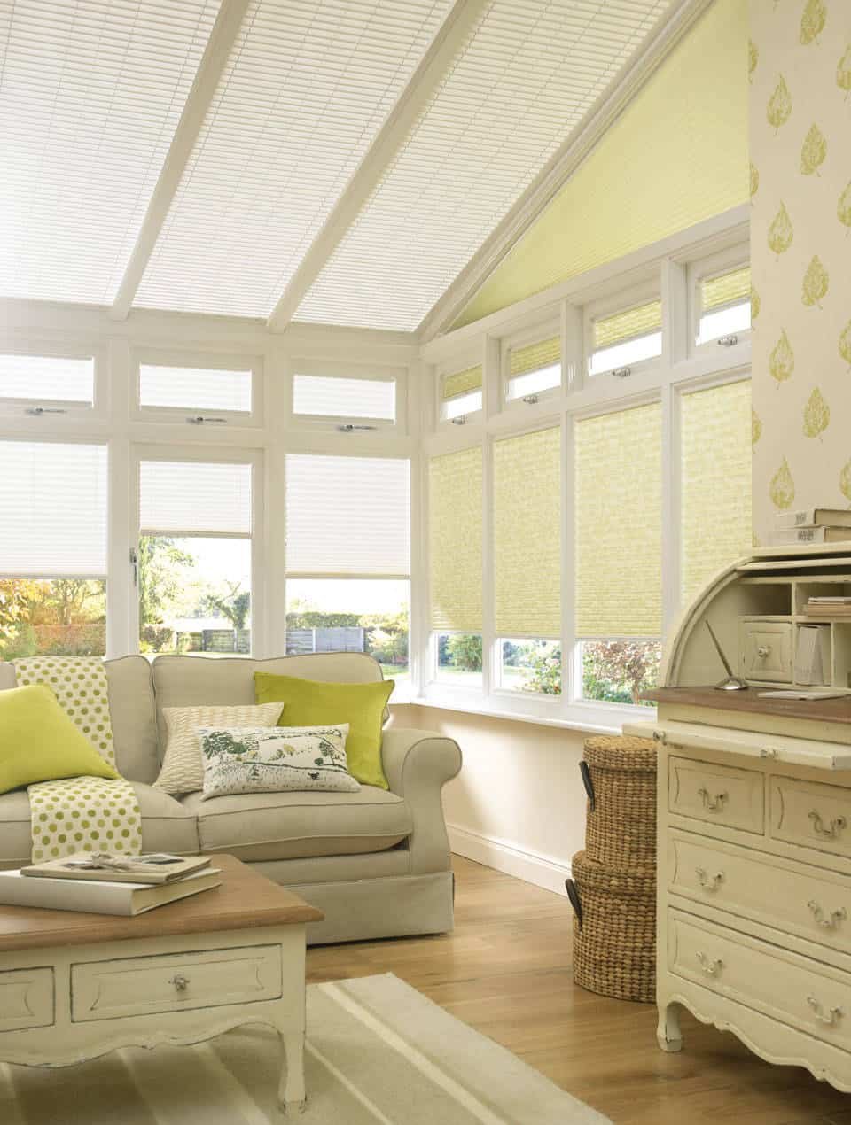
Yellow as a color carries strong associations with sunshine, warmth, and optimism. In interior design, it can create a lively focal point and inject a sense of playfulness into kitchens, dining rooms, and study areas. Proponents argue that yellow walls can stimulate conversation and energy, pairing well with white trim, natural wood tones, and certain metallic accents. Yet there are several practical considerations that temper this enthusiasm.
First, lighting plays a critical role in how yellow reads in a space. The perceived hue of any paint changes under different lighting conditions—natural daylight, warm incandescent bulbs, and cool LED lighting each cast distinct undertones. A yellow that appears vibrant and cheerful in daylight may shift toward a garish or washed-out tone at night or under artificial lighting. Homeowners often find themselves repainting after months of experimentation, nullifying the initial excitement and increasing overall cost.
Second, yellow’s intensity can clash with existing furnishings and architectural features. Many rooms rely on cool neutrals, grays, or earthy tones to create a cohesive backdrop. Introducing a bold yellow can require a comprehensive refresh of furnishings, textiles, and accents to avoid visual chaos. In open-plan interiors, a strong yellow wall can influence adjacent spaces, creating a cascading need to adjust color schemes throughout the home.
Third, maintenance and durability matter. High-contrast yellows may show dirt, scuffs, and wear more readily than softer tones. In high-traffic areas—hallways, kitchens, playrooms—the frequency of touch-ups and cleaning can increase, leading to ongoing maintenance costs and time. Additionally, some yellows are high in pigment concentration, which can lead to uneven coverage on certain plaster or textured surfaces, complicating repaint efforts.
Fourth, long-term satisfaction is a concern. Trends tend to be cyclical, with colors fading in and out of fashion. A yellow wall that feels contemporary today might feel dated in five or ten years. Homebuyers often favor more versatile, timeless palettes, and a prominent yellow feature could narrow the pool of potential buyers or require redecoration before resale.
From a psychological standpoint, color research highlights nuanced effects. Yellow can invigorate and stimulate the mind, which may be desirable in a sunlit kitchen or a creative workspace. However, for bedrooms or spaces intended for rest, too much yellow can be overstimulating and potentially impact sleep or relaxation. The balance between energy and serenity is delicate, and not all homeowners will experience the same outcomes.
Practical alternatives exist that deliver some benefits of yellow without the drawbacks. For example, using yellow accents in the form of décor, textiles, or art provides the mood-boosting vibe with far greater flexibility. Soft, golden, or mustard tones can introduce warmth without the high intensity of primary yellows. A strategic palette that combines a neutral base with muted yellow accents can achieve a similar effect while preserving versatility.
It’s also important to consider the overall color ecosystem of a home. Complementary colors, lighting schemes, and window treatments influence how a yellow wall will feel in a given space. If a home already leans toward warm neutrals or earthy textures, a bright yellow might disrupt harmony rather than enhance it. Conversely, in a studio or modern kitchen with abundant natural light and minimalist furnishings, a carefully chosen yellow can be striking and purposeful.
Finally, accessibility and inclusivity in design should guide decisions. Color contrast matters for readability and safety in certain spaces, such as playrooms or bathrooms. A bold yellow wall could complicate these factors if not paired with appropriately chosen trim, fixtures, and color contrasts that meet accessibility standards.
In summary, while yellow paint has strong visual appeal and momentary social momentum, a cautious approach is prudent. It is not inherently a poor choice, but the trend warrants careful planning, professional testing, and a realistic assessment of lifestyle, maintenance, and resale considerations. For most households, more muted or balanced applications of yellow—or alternative accent colors—offer a safer path to achieving warmth and personality without sacrificing practicality.

*圖片來源:Unsplash*
Perspectives and Impact
As with any design trend, the resurgence of yellow paint reflects broader cultural and social dynamics. The desire for brighter spaces often aligns with a collective push toward optimism and resilience, especially after periods of uncertainty. Designers and homeowners alike weigh the benefits of a space that feels lively and energized against the risks of fatigue, overstimulation, and costly mistakes.
From a market perspective, color trends tend to influence new builds and renovations, but they are not permanent directives. The durability of a color choice depends on multiple variables: interior architecture, geographic location, climate, and the type of lighting used in the home. Regions with abundant natural light may benefit more from certain yellows, while areas with limited sunlight could render yellows dull or grayish. For renters, the obstacle is greater still: many rental agreements constrain repainting or require landlord approval, making bold color experiments less feasible.
Cultural associations with color can also shape reception. Yellow has varied meanings across cultures, from positivity and luck to caution and warning. How a hue is perceived can depend on context, neighboring colors, and the viewer’s personal experiences. This variability underscores the importance of customization and avoiding a one-size-fits-all approach to color adoption.
Looking ahead, designers advocate for a balanced methodology: use color strategically rather than universally. An accent wall, a front door, or a small backsplash in a yellow hue can deliver impact with minimal commitment. For larger surfaces, softer or golden yellows with warm undertones may prove more adaptable. The integration of color psychology with practical considerations—like light, material quality, and maintenance—can lead to enduring results that align with both style and daily life.
In terms of future implications, households may increasingly prioritize flexibility and modularity in color choices. Removable wallpaper, color-changing lighting, and paint reformulation could offer means to experiment with color without the permanence or cost of traditional repainting. Educational resources that help homeowners test color in real conditions—swatches, dedicated paint rooms, or digital simulations—could mitigate the risk of impractical selections.
Overall, the yellow paint trend in 2026 should be approached as an option rather than a mandate. It can enrich a space when used thoughtfully and sparingly, but it is not universally suitable. The most successful outcomes will rely on a combination of personal taste, functional needs, and a measured understanding of how color interacts with light, furnishings, and daily routines.
Key Takeaways
Main Points:
– Yellow can energize a space but may read inconsistently under different lighting and with various furnishings.
– Bold yellows require careful planning to avoid fatigue, maintenance, and resale concerns.
– For most homes, muted yellows or yellow accents are safer and more versatile than fully painted yellow walls.
Areas of Concern:
– Lighting variability can distort yellow’s appearance over the day.
– Maintenance costs rise with high-contrast or highly saturated yellows.
– Trendiness may affect long-term satisfaction and resale value.
Summary and Recommendations
While the allure of a sunlit, energetic room is appealing, embracing a full-yellow paint trend in 2026 demands caution. If you are drawn to yellow’s warmth and energy, consider a graduated or limited approach that minimizes risk while preserving the option for future adjustments. Start with small accents or feature elements—such as cushions, art, or a single accent wall using a muted or golden yellow with warm undertones. Test color swatches in multiple lighting conditions across different times of day to observe true hue shifts before committing.
Choosing a color palette should prioritize longevity and comfort alongside style. Neutral bases—creams, beiges, and soft grays—offer resilience and flexibility, allowing you to introduce yellow accents that can be updated as trends evolve. If you decide to proceed with more substantial yellow exposure, select high-quality paint formulations that offer durable finishes and easier cleaning. Plan for cost and maintenance in advance, and consider future redecoration ambitions to preserve home value.
Ultimately, the most effective color decisions align with personal preferences, realistic usage patterns, and a thoughtful assessment of how color will perform over time. Yellow can be a powerful tool when used with restraint and intention, but it is not a universal solution for every space or lifestyle. By grounding color choices in practical considerations and testing rather than hype, homeowners can achieve spaces that are both stylish and enduring.
References
- Original: https://abeautifulspace.co.uk/why-you-should-not-embrace-the-yellow-paint-trend-in-2026/
- Additional references:
- Color psychology and interior design insights: https://www.decoist.com/color-psychology
- Lighting and color perception guidance: https://www.illumination.org/color-perception
- Practical guidelines for choosing accent walls: https://www.housebeautiful.com/room-decorating/color-trends/accent-wall-tainting

*圖片來源:Unsplash*