TLDR
• Core Points: Bright yellow paint trends can overwhelm spaces, clash with furnishings, and demand high maintenance; consider alternative hues and balanced palettes.
• Main Content: The yellow paint trend in 2026 is sensational online but often impractical for real homes, requiring careful coordination and durable finishes to avoid eye strain and dated looks.
• Key Insights: Color psychology, lighting, room size, and furniture interplay dramatically affect yellow effectiveness; long-term satisfaction hinges on undertones and architectural context.
• Considerations: Lighting conditions, room function, existing textures, and future resale value should inform yellow adoption; sample testing is essential.
• Recommended Actions: If you love yellow, test multiple undertones in key rooms, use accents rather than full-wall applications, and pair with neutrals or complementary colors.
Content Overview
The surge of yellow paint in home decor content across social media platforms has put this hue under the spotlight for 2026. Proponents highlight the mood-boosting properties and sunny energy that yellow can bring into a living space. However, for many homeowners, yellow is a high-stakes color choice that can backfire if not thoughtfully executed. This article examines why embracing a bold yellow paint trend may not be the best strategy for most homes, what factors influence the success or failure of yellow interiors, and practical alternatives that capture a similar vitality without the risks.
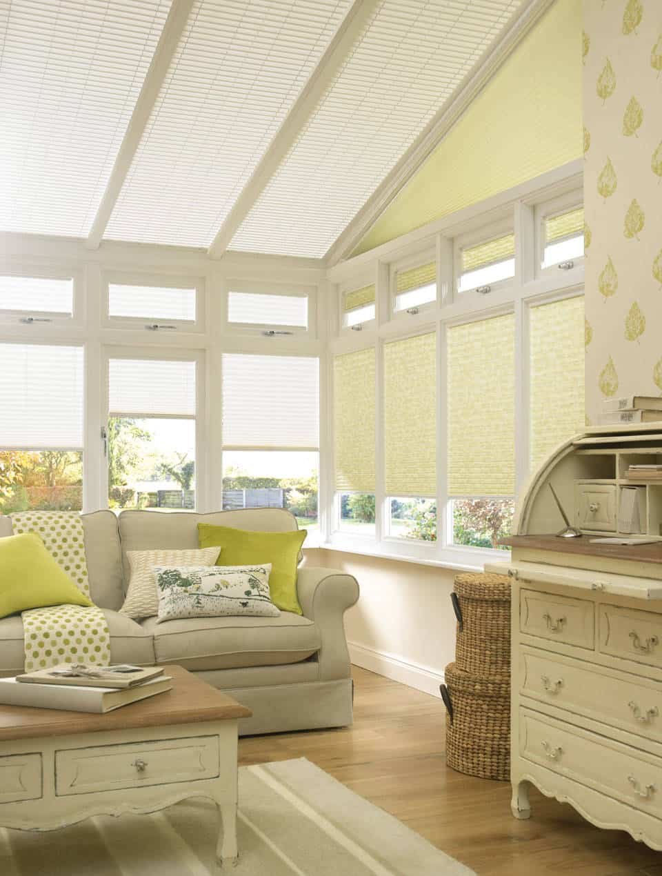
The appeal of yellow as a design color lies in its association with warmth, optimism, and light. In interior design, color choices are not merely aesthetic decisions; they influence mood, perceived space, and even behavior. Yellow is a vibrant hue that can energize a room, yet it is also notorious for demanding careful handling. Undertones ranging from lemon to mustard can produce very different effects, and the intensity of yellow can quickly overwhelm a space, especially if the room is small, poorly lit, or filled with busy patterns.
In recent years, interior design trends have shifted toward bold experimentation, with social media amplifying those trends at a rapid pace. While inspiration can be powerful, it is crucial to ground decisions in practical considerations, such as lighting conditions, existing furniture and fixtures, and long-term design goals. This article aims to provide a balanced perspective: acknowledging the appeal of yellow while outlining its potential drawbacks and offering strategies to integrate yellow hues in a measured, durable way.
In-Depth Analysis
Yellow is a color that occupies a unique space in the palette of interior design. It can reflect sunlight, create a focal point, and inject a sense of playfulness into spaces that might otherwise feel flat. Yet the same attributes that make yellow attractive—its brightness and high visibility—also present challenges.
Undertones matter more than the basic hue. A true lemon yellow can feel cheerful and airy in a room with abundant natural light, while a warm, golden yellow may create coziness in a space with softer lighting. Conversely, cooler yellows can appear medicinal or dated if paired incorrectly with furniture, flooring, and wall finishes. Undertones determine whether yellow reads as inviting or jarring, and they are often the deciding factor in whether a yellow-painted room remains comfortable over time.
Lighting plays a critical role in how yellow looks. North-facing rooms, which receive little natural light, will amplify the potential for yellow to feel cold or overpowering, while south-facing or sun-kissed rooms can intensify a yellow to the point of visual fatigue. Artificial lighting—LEDs, halogens, or warm incandescent bulbs—further modulates yellow’s appearance. The same swatch can look markedly different under varying light conditions, and this variability complicates the decision to paint large areas in a strong yellow.
Room size and layout influence yellow’s impact. In small spaces, bold yellows can visually compress the area or create a sense of busyness, especially when combined with busy textiles or graphic patterns. In larger rooms with ample light, yellow can function as a unifying accent, tying together disparate elements. However, even in expansive spaces, overly saturated yellows can dominate, reducing flexibility for future redecorating and potentially limiting resale appeal.
Pairing and context are essential. Yellow rarely acts in isolation; it interacts with adjacent colors, textures, and finishes. It often requires grounding neutrals (creams, whites, soft grays) or earthy tones to prevent the room from feeling chaotic. The choice of materials—paint finish (matte, eggshell, satin), furniture woods, fabrics, and flooring—affects how yellow sits in a room. A high-gloss finish on one wall, for instance, can reflect light and alter perception, changing the perceived intensity of the yellow.
Maintenance and practicality cannot be overlooked. Yellow walls show dirt, scuffs, and wear more readily than cooler neutrals, particularly in high-traffic areas or households with children and pets. Matte finishes, while modern, tend to reveal smudges more easily and require frequent touch-ups. Satin or eggshell finishes offer a balance between washability and appearance but may still show wear over time. Repainting a large yellow area after a few years can be costly and disruptive.
Cultural and emotional considerations also come into play. Yellow is often associated with happiness and energy, but it can also symbolize caution or anxiety in certain contexts. The emotional impact of color is subjective and culturally nuanced. Designers emphasize testing the color in the actual living space rather than relying solely on swatches or online inspiration. A color that feels uplifting in a showroom or a photo can feel jarring in a real room, depending on light, furniture, and personal preferences.
From a design strategy perspective, yellow should be considered a bold design statement rather than a background color. For many households, it serves better as an accent or feature color—applied to a single wall, trim, cabinetry, or accessories—rather than a dominant field color. This approach preserves flexibility for future redecorating and reduces the risk of over-commitment to a trend that could wane by the time a homeowner decides to re-paint.

*圖片來源:Unsplash*
The sustainability and longevity of the yellow trend are also worth noting. Trends come and go as consumer tastes shift, and color popularity can rise and fall quickly in a social media-driven climate. A color that is popular now may feel dated in a few years, which could impact property value or personal satisfaction if the choice cannot be easily updated or repurposed. Designers often advocate for timeless neutrals or adaptable color schemes that embrace both current taste and future versatility.
Practical recommendations for those who want to explore yellow without committing to a full-room application include testing multiple undertones in small, representative spaces and considering the room’s function. For example, a kitchen might benefit from a warm, sunny yellow that enhances energy, while a bedroom might benefit from a subtler, softer yellow that promotes calm. When incorporating yellow, it is prudent to pair it with neutral surroundings, such as white ceilings, off-white walls, or light wood tones, to temper intensity and create a cohesive look.
Finally, the cost implications should be weighed. High-quality interior paints with durable finishes and good coverage may carry a higher initial price, but they can save time and money over the life of the paint job by reducing touch-ups and repaints. In contrast, cheaper options might require more frequent maintenance and could degrade the appearance of a space more quickly, particularly in harsh lighting conditions where flaws become more noticeable.
In summary, the yellow paint trend offers a lively and uplifting aesthetic, but it comes with notable caveats. Homeowners should approach yellow with a careful plan, leveraging undertone testing, strategic placement, durable finishes, and complementary design choices to ensure a space that remains comfortable and timeless rather than transient.
Perspectives and Impact
The emergence of yellow as a trend color reflects broader shifts in interior design toward expressive, mood-driven spaces. As designers experiment with vibrant palettes, they push the boundaries of how color affects behavior, productivity, and emotional well-being. Yellow, in particular, is associated with optimism, creativity, and social interaction. In communal areas such as kitchens, dining rooms, and living rooms, a well-chosen yellow can inspire conversation and activity.
However, there are potential downsides to widespread adoption of yellow in home interiors. First, the risk of fatigue is real. Bright yellows can become tiring to look at after extended exposure, especially in rooms used for rest or concentration. Second, color fidelity and reproduction pose challenges. What appears as a warm, welcoming yellow in a showroom can shift under different lighting conditions and with varied materials, making consistent color communication with contractors and painters essential. Third, the limited shelf life of bold colors in a home setting can cancel the intended longevity of a design if personal preferences or trends change.
From a market perspective, the popularity of yellow may influence buyer perceptions. Some buyers may find bold colors refreshing and modern, while others may prefer more neutral schemes that offer broader appeal and easier resale. Real estate markets with high demand for contemporary, design-forward homes might tolerate or even celebrate bold yellows, particularly in open-plan living spaces or feature walls. Conversely, markets favoring timeless design may favor subdued neutrals that require less ongoing upkeep and align with long-term property valuation.
Sustainability considerations intersect with color choices as well. High-coverage paints with lower volatile organic compounds (VOCs) and durable finishes are preferable, reducing the need for frequent repainting and minimizing environmental impact. Local regulations and consumer preferences for low-VOC products can influence color selection and application practices. Designers increasingly emphasize longevity and adaptability, encouraging clients to invest in colors that can be repurposed or repainted with minimal disruption.
As trends evolve, designers advocate for a flexible approach. Instead of committing entire rooms to bold yellow, many recommend using yellow in controlled doses: accent walls, display cabinetry, trim, textiles, or decorative accessories. This strategy preserves the vibrancy and mood benefits of yellow while mitigating risks associated with intense, full-wall color. It also supports easier future updates, allowing homeowners to modulate the overall color mood with relative ease.
Ultimately, the impact of yellow in interior design will continue to hinge on the execution. The most successful implementations balance sunlight, texture, and context, crafting spaces that feel intentional and harmonious rather than reactive to a trending hashtag. For homeowners contemplating yellow, the lesson is to experiment thoughtfully—test undertones, consider room function, and prioritize enduring materials and finishes that will keep the space comfortable for years to come.
Key Takeaways
Main Points:
– Undertones and lighting determine yellow’s success; not all yellows are equal.
– Bold yellow is best used as an accent rather than a full-room color.
– Durability of finish and maintenance considerations are critical for long-term satisfaction.
Areas of Concern:
– Risk of visual fatigue in high-traffic or poorly lit spaces.
– Potentialdated look if trends shift before repaint cycles.
– Maintenance and cleaning demands of bright yellows.
Summary and Recommendations
Adopting a yellow paint trend in 2026 can inject energy and optimism into a home, but it requires deliberate planning and thoughtful execution. The most reliable path to a satisfying yellow experience involves selecting undertones carefully, testing colors in actual lighting conditions, and employing yellow primarily as an accent or feature rather than a dominant field color. Pair yellow with balanced neutrals and natural materials to create a cohesive, timeless look that remains adaptable as tastes evolve. Consider the room’s function, traffic, and maintenance requirements before committing, and opt for high-quality, durable finishes to minimize the need for frequent touch-ups. By approaching yellow with a measured strategy, homeowners can enjoy the mood-enhancing benefits without sacrificing comfort, practicality, or long-term design flexibility.
References
- Original: https://abeautifulspace.co.uk/why-you-should-not-embrace-the-yellow-paint-trend-in-2026/
- Additional references:
- https://www.apartmenttherapy.com/paint-color-yellow-trends
- https://www.realhomes.com/advice/yellow-paint-trends
- https://www.housebeautiful.com/room-decorating/colors/a26128672/yellow-paint-ideas/

*圖片來源:Unsplash*